Blog Archives
Pearls from artists* # 693

*an ongoing series of quotations – mostly from artists, to artists – that offers wisdom, inspiration, and advice for the sometimes lonely road we are on.
Earlier I wrote that I as an artist must concern myself with painting and not waste energy on trying to decipher other people’s intentions or motives. I still believe this to be correct.
(My main purpose in life is to paint, this is my profession. I am most happy when I am alone in the studio working. The other problems of politics exist outside my studio.)
note: I am not sure of this. I am sure of one thing that I am most happy when I am alone working in the studio. The distance between art + politics is one of grey. I have thought of my involvement in art as being one of combat—the paintings are weapons designed to destroy oppressors i.e., the establishment. Art is none of This! Art is Art.
A painting does not represent anything but itself. It shouldn’t look like anything else or make for any allusions. A painting is a painting just as a Rose is a Rose! May God bless Gertrude Stein!
Jack Whitten Notes From the Woodshed
Comments are welcome!
Q: When did you begin drawing and painting? (Question from “Cultured Focus Magazine”)
A: This is a long story because my path to becoming a professional artist has been unusually circuitous.
I grew up in a blue collar family in suburban New Jersey. My parents were both first-generation Americans and no one in my family had gone to college. I was a smart kid, who showed some artistic talent in kindergarten and earlier. At the age of 6, my sister, my cousin, and I enrolled in Saturday morning painting classes at the studio of a local artist. I continued the classes for about 8 years and became a fairly adept oil painter.
At the age of 15 my father decided that art was not a serious pursuit – he called it a hobby, not a profession – and abruptly stopped paying for my Saturday morning lessons. Unfortunately, there were no artists or suitable role models in my family. So with neither financial nor moral support to pursue art, I turned my attention to very different interests.
Cut to ten years later. When I was 25, I earned my private pilot’s license and spent the next two years amassing other flying licenses and ratings, culminating in a Boeing-727 flight engineer’s certificate.
At 29, I joined the Navy. By then I was an accomplished civilian pilot with thousands of flight hours so I expected to fly jets. However, in the early 1980s women were not allowed in combat. There were very few women Navy pilots and those few were restricted to training male pilots. There were no women pilots landing on aircraft carriers.
In the mid-1980s I was in my early 30s, a lieutenant on active duty in the Navy, working a soul-crushing job as a computer analyst on the midnight shift in a Pentagon basement. It was literally and figuratively the lowest point of my life. I was completely bored and miserable.
Remembering the joyful Saturdays of my youth when I had taken art classes with a local New Jersey painter, I enrolled in a drawing class at the Art League School in Alexandria, Virginia. Initially I wasn’t very good, but it was wonderful to be around other women and a world away from the mentality of the Pentagon. I was having fun again! I enrolled in more classes and became a very motivated full-time art student who worked nights at the Pentagon. As I studied and improved my skills, I quickly discovered my preferred medium – soft pastel on sandpaper.
Although I knew I had found my calling, for more than a year I agonized over whether or not to leave the financial security of a Navy paycheck. Finally I did make up my mind and resigned my commission, effective on September 30, 1989. With Bryan’s (my then boyfriend’s) support, I left the Navy to devote my time to making art.
I’m probably one of the few people who can name THE day I became a professional artist! That day was October 1, 1989. Fortunately, I have never needed another job. I remained in the Navy Reserve for the next 14 years, working primarily at the Pentagon for two days each month and two weeks each year. I commuted by train to Washington, DC after I moved to Manhattan in 1997. Finally on November 1, 2003, I officially retired as a Navy Commander.
Life as a self-employed professional artist is endlessly varied, fulfilling, and interesting. I have never regretted my decision to pursue art full-time.
Comments are welcome!
Q: Can you explain how you choose colors? (Question from Maria Cox via Instagram)

A: I am wild about color! As I work to create a pastel painting, I apply a color, back up from my easel to see how it interacts with and affects the rest of the painting, and then I make revisions. This process necessitates countless color changes and hundreds of hours during months of work. I apply pastel using a meticulous layering process. Were you to x-ray one of them, the earlier, discarded versions of a pastel painting would be visible. All the while I carefully fine-tune and refine how the colors and shapes interact with each other.
The goal is to make an exciting painting that no one, especially me as the maker, has ever seen before. I have no desire to repeat myself, to make art that resembles work by any other artist, or to be forced into a niche.
I try to select intense, vibrant colors that are exciting to look at, that work well in relationship to each other, and that will grab the viewer. Sometimes I deliberately choose colors for their symbolic meanings. For example, I selected a dark purple for the alternating triangles (the ones with the pink dots above) in “Overlord” because purple denotes royalty.
I have been working with soft pastel for 37 years so I have a fairly intricate science of color at my disposal. No doubt, many unconscious factors are at play, too. More on that in future posts.
Comments are welcome!
Pearls from artists* # 505

*an ongoing series of quotations – mostly from artists, to artists – that offers wisdom, inspiration, and advice for the sometimes lonely road we are on.
… I myself was once “at the top: – with a book that sat on the bestseller list for more than three years. I can’t tell you how many people said to me during those years, “How are you ever going to top that?” They’d speak of my great good fortune as though it were a curse, not a blessing, and would speculate about how terrified I must feel at the prospect of not being able to reach such phenomenal heights again.
But such thinking assumes there is a “top” – and that reaching that top (and staying there) is the only motive one has to create. Such thinking assumes that the mysteries of inspiration operate on the same scale as we do – on a limited human scale of success and failure, of winning and losing, of comparison and competition, of commerce and reputation, of units sold and influence wielded. Such thinking assumes that you must be constantly victorious – not only against your piers, but also against an earlier version of your own poor self. Most dangerously of all, such thinking assumes if you cannot win, then you must not continue to play.
But what does any of that have to do with vocation? What does any of that have to do with the pursuit of love? What does any of that have to do with the strange communion between the human and the magical? What does any of that have to do with faith? What does any of that have to do with the quiet glory of merely making things, and then sharing those things with an open heart and no expectations?
Elizabeth Gilbert in Big Magic: Creative Living Beyond Borders
Comments are welcome!
Q: Do you have a favorite art book?

Favorite art book
A: Since I have quoted numerous passages from it on Wednesdays in “Pearls from artists,” it should come as no surprise that I am enamored of “Reclaiming Art in the Age of Artifice: A Treatise, Critique, and Call to Action” by JF Martel. This gem has become a bible to be read and reread as an endless source of wisdom, inspiration, and solace for myself and for other contemporary artists. I even referred to it while writing the mission statement for New York Dreamers Art Group, the artists’ collective founded earlier this year.
Were someone to ask “what one book would you recommend that every visual artist read?”, Martel’s masterwork is my answer. It is a constant companion kept in my backpack to reread at odd times whenever I have spare moments. I keep finding new insights to savor and ponder and still cannot get enough of this terrific book!
Comments are welcome!
Q: Can you tell us about the different series of work you have created and what they embody?
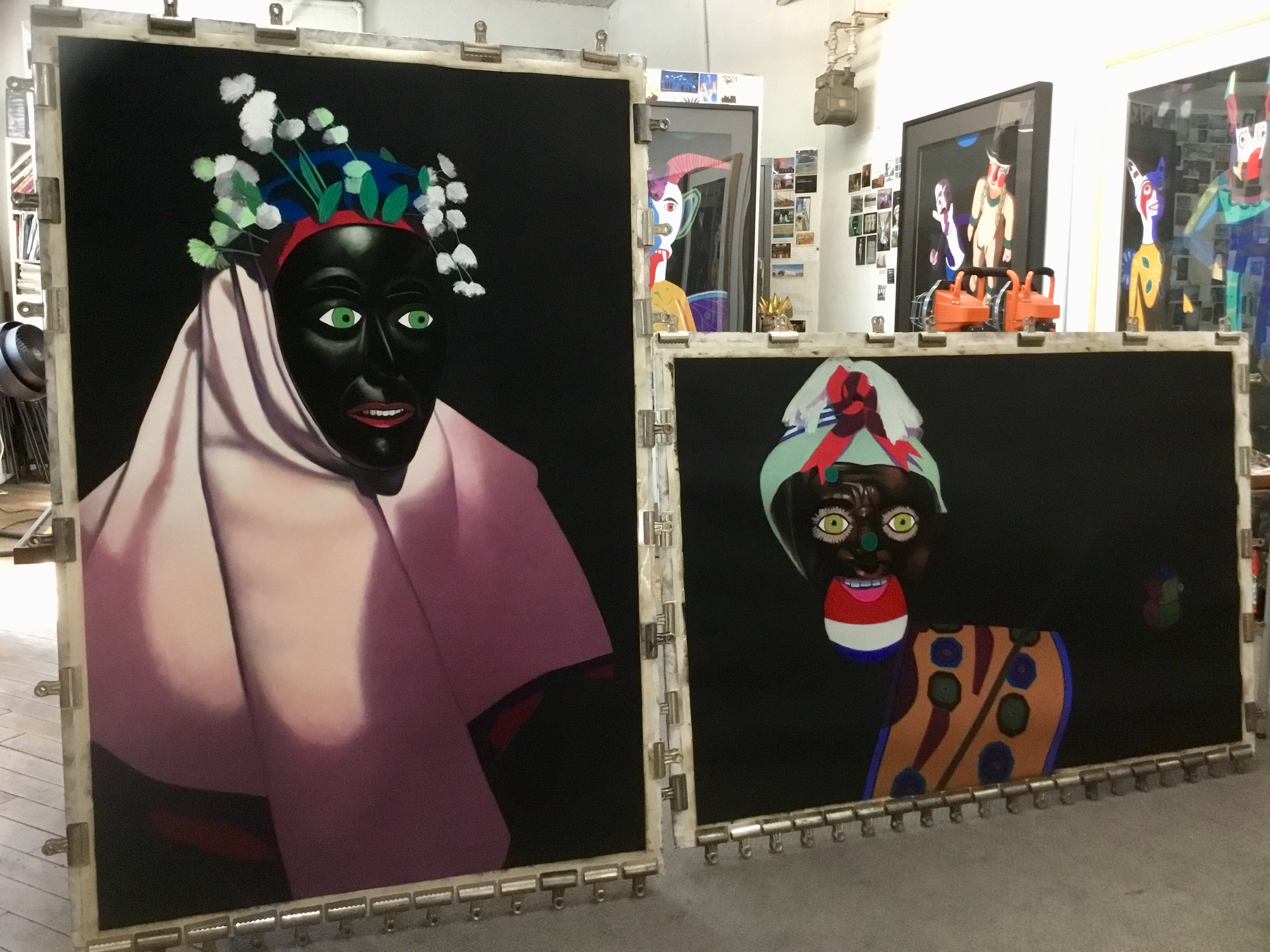
Barbara’s studio with work in progress
A: The Black Paintings series of pastel-on-sandpaper paintings grew directly from an earlier series, Domestic Threats. While both use cultural objects as surrogates for human beings acting in mysterious, highly-charged narratives, in the Black Paintings I replaced all background details of my actual setup (furniture, rugs, etc.) with lush black pastel. In this work the ‘actors’ are front and center.
While traveling in Bolivia two years ago, I visited a mask exhibition at the National Museum of Ethnography and Folklore in La Paz. The masks were presented against black walls, spot-lit, and looked eerily like 3D versions of my Black Paintings. I immediately knew I had stumbled upon a gift. So far I have completed nine pastel paintings in the Bolivianos series. One is awaiting finishing touches, one is in progress now, and I am planning the next one.
All of my pastel paintings are an example of a style called “contemporary conceptual realism” in which things are not quite as innocent as they seem. In this sense each painting is a kind of Trojan horse. There is plenty of backstory to my images, although I usually prefer not to over-explain them. Some mystery must always remain in art.
The world I depict is that of the imagination and this realm owes little debt to the natural world. I recently gave an art talk where I was reminded how fascinating it is to learn how others respond to my work. As New York art critic Gerrit Henry once remarked, “What we bring to a Rachko… we get back, bountifully.”
Comments are welcome!
Pearls from artists* # 354

“Epiphany,” soft pastel on sandpaper, 38″ x 58″
*an ongoing series of quotations – mostly from artists, to artists – that offers wisdom, inspiration, and advice for the sometimes lonely road we are on.
My earlier work had taught me that artistic activity is a form of reasoning, in which perceiving and thinking are indivisibly intertwined. A person who paints, writes, composes, dances, I felt compelled to say, thinks with his senses. This union of perception and thought turned out to be not merely a specialty of the arts. A review of what is known about perception, and especially about sight, made me realize that the remarkable mechanisms by which the senses understand the environment are all but identical with the operations described by the psychology of thinking. Inversely, there was much evidence that truly productive thinking in whatever area of cognition takes place in the realm of imagery. This similarity of what the mind does in the arts and what it does elsewhere suggested taking a new look at the long-standing complaint about the isolation and neglect of the arts in society and education. Perhaps the real problem was more fundamental: a split between sense and thought, which caused various deficiency diseases in modern man.
Rudolph Arnheim in Visual Thinking
Comments are welcome!
Q: Where did you grow up and what were some early milestones or experiences that contributed to you becoming an artist later in life?
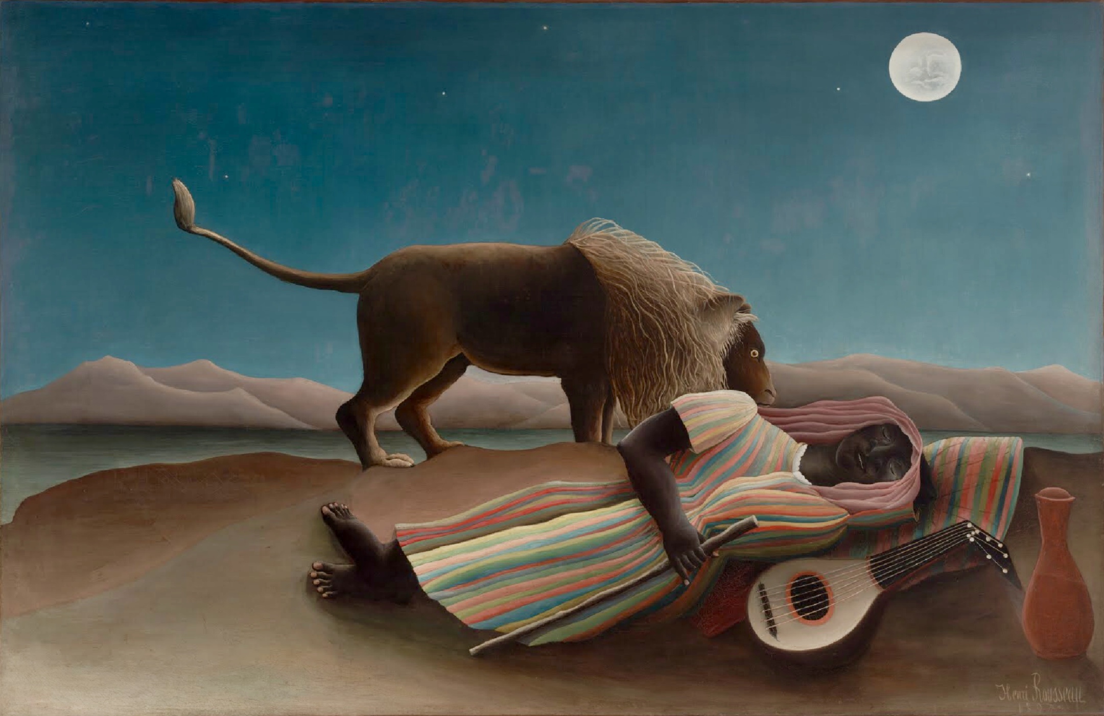
“The Sleeping Gypsy,” Henri Rousseau, oil on canvas, 1897
A: I grew up in a blue collar family in Clifton, New Jersey, a suburb about fifteen miles west of Manhattan. My father was a television repairman for RCA. My mother stayed home to raise my sister and me (at the time I had only one sister, Denise; my sister Michele was born much later). My parents were both first-generation Americans and no one in my extended family had gone to college yet. I was a smart kid who showed some artistic talent in kindergarten and earlier. I remember copying the Sunday comics, which in those days appeared in all the newspapers, and drawing small still lifes I arranged for myself. I have always been able to draw anything, as long as I can see it.
Denise, a cousin, and I enrolled in Saturday morning “art classes” at the studio of a painter named Frances Hulmes in Rutherford, NJ. I was about 6 years old. I continued the classes for 8 years and became a fairly adept oil painter. Since we lived so close to New York City, my mother often took us to museums, particularly to the Museum of Modern Art, the Metropolitan Museum of Art, and the Museum of Natural History. Like so many young girls, I fell in love with Rousseau’s “The Sleeping Gypsy” and was astonished by Picasso’s “Guernica” when it was on long-term loan to MoMA. I have fond memories of studying the dioramas at the Museum of Natural History (they are still my favorite part of the museum). As far as I know, there were no artists in my family so, unfortunately, I had no role models. At the age of 14 my father decided that art was not a serious pursuit – declaring, it is “a hobby, not a profession” – and abruptly stopped paying for my Saturday morning lessons. With no financial or moral support to pursue art, I turned my attention to other interests, letting my artistic abilities go dormant.
Comments are welcome!
Q: Would you talk about your use of Mexican and Guatemalan folk art as a convenient way to study formal properties such as color, shape, pattern, composition, etc. in your pastel paintings?
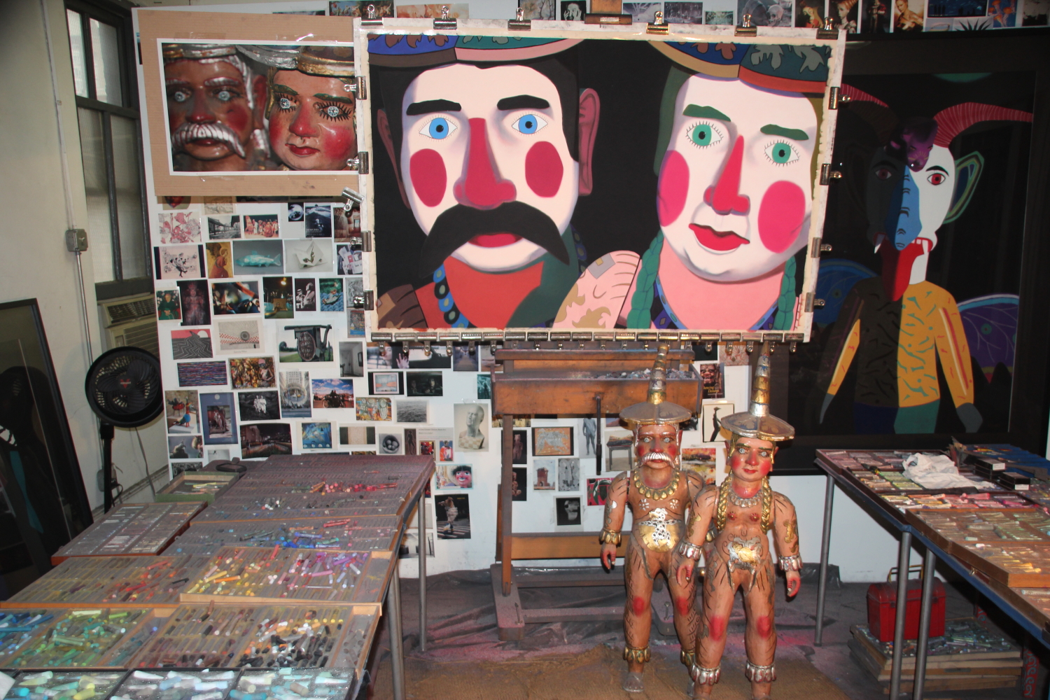
Models, reference photograph, and pastel painting in progress
A: For me an interesting visual property of these objects is that they readily present themselves as a vehicle for exploring formal artistic properties, like color, pattern, shape, etc. especially compared to my earlier subject matter: hyper-realistic portraits and still-lifes. Intent as I was on creating verisimilitude in the earlier work, there was little room for experimentation.
Many Mexican and Guatemalan folk art objects are wildly painted and being a lover of color, their brilliant colors and patterns are what initially attracted me. As a painter I am free to use their actual appearance as my starting point. I photograph them out-of-focus and through colored gels in order to change their appearance and make them strange, enacting my own particular version of “rendering the familiar strange.” Admittedly these objects are not so familiar to begin with.
When I make a pastel painting I look at my reference photograph and I also look at the objects, positioning them within eye-shot of my easel. There is no need whatsoever to be faithful to their actual appearance so my imagination takes over. As I experiment with thousands of soft pastels, with shape, with pattern, with composition, and all the rest, I have one goal in mind – to create the best pastel-on-sandpaper painting I am capable of making.
Comments are welcome!
Pearls from artists* # 139
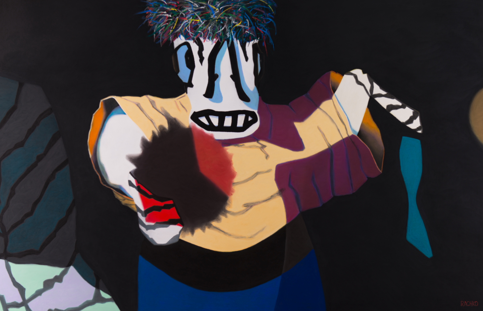
“Broken,” soft pastel on sandpaper, 38″ x 58″
* an ongoing series of quotations – mostly from artists, to artists – that offers wisdom, inspiration, and advice for the sometimes lonely road we are on.
Leaving a show of Pat Steir’s work called Winter Paintings at Cheim & Read Gallery, I thought back some years to when the Walker Art Center’s then curator Richard Flood was walking us through the Center’s collection and we came upon an abstract expressionist painting by Joan Mitchell that was so striking I asked him why it had taken so long for her to be recognized. He answered with a wry expression: “It’s the problem of beauty!”
A few days earlier our friends Kol and Dash came to lunch at our home, and Dash said at this time most visual art is conceptual. “It’s a way of thinking,” she said.
Story/Time: The Life of an Idea/Bill T. Jones
Comments are welcome!

