Blog Archives
Q: Can you explain how you choose colors? (Question from Maria Cox via Instagram)

A: I am wild about color! As I work to create a pastel painting, I apply a color, back up from my easel to see how it interacts with and affects the rest of the painting, and then I make revisions. This process necessitates countless color changes and hundreds of hours during months of work. I apply pastel using a meticulous layering process. Were you to x-ray one of them, the earlier, discarded versions of a pastel painting would be visible. All the while I carefully fine-tune and refine how the colors and shapes interact with each other.
The goal is to make an exciting painting that no one, especially me as the maker, has ever seen before. I have no desire to repeat myself, to make art that resembles work by any other artist, or to be forced into a niche.
I try to select intense, vibrant colors that are exciting to look at, that work well in relationship to each other, and that will grab the viewer. Sometimes I deliberately choose colors for their symbolic meanings. For example, I selected a dark purple for the alternating triangles (the ones with the pink dots above) in “Overlord” because purple denotes royalty.
I have been working with soft pastel for 37 years so I have a fairly intricate science of color at my disposal. No doubt, many unconscious factors are at play, too. More on that in future posts.
Comments are welcome!
Q: What does a pastel feel like in your hand?
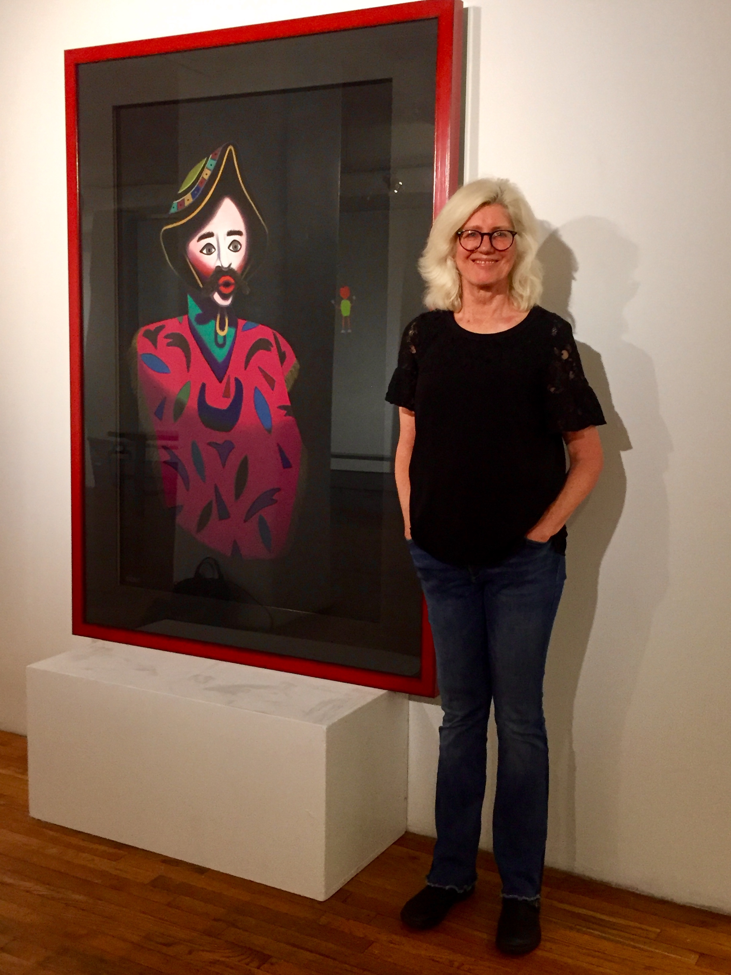
With “Prophecy,” 70” x 50,” at Westbeth Gallery
A: Each manufacturer uses distinct binders to hold the raw pigment together to form a pastel stick. Due mainly to this binder, each pastel feels slightly different. Rembrandts are medium-hard and I generally use them for the first few layers. The black backgrounds of my pastel paintings are achieved by layering lots of Rembrandt black.
I enjoy using Unison because they feel “buttery” as I apply them to the sandpaper. If you’ve been to my studio, you know that I use just about every soft pastel there is! Believe it or not, no two are the same color.
Each pastel has its own qualities and some are harder or more waxy than others. Henri Roche has the widest range of colors and they’re gorgeous! I want them to show so I use them for the final layer, the ‘icing on the cake.”
Comments are welcome!
Q: Would you speak about the meaning of your work and the different materials you use?
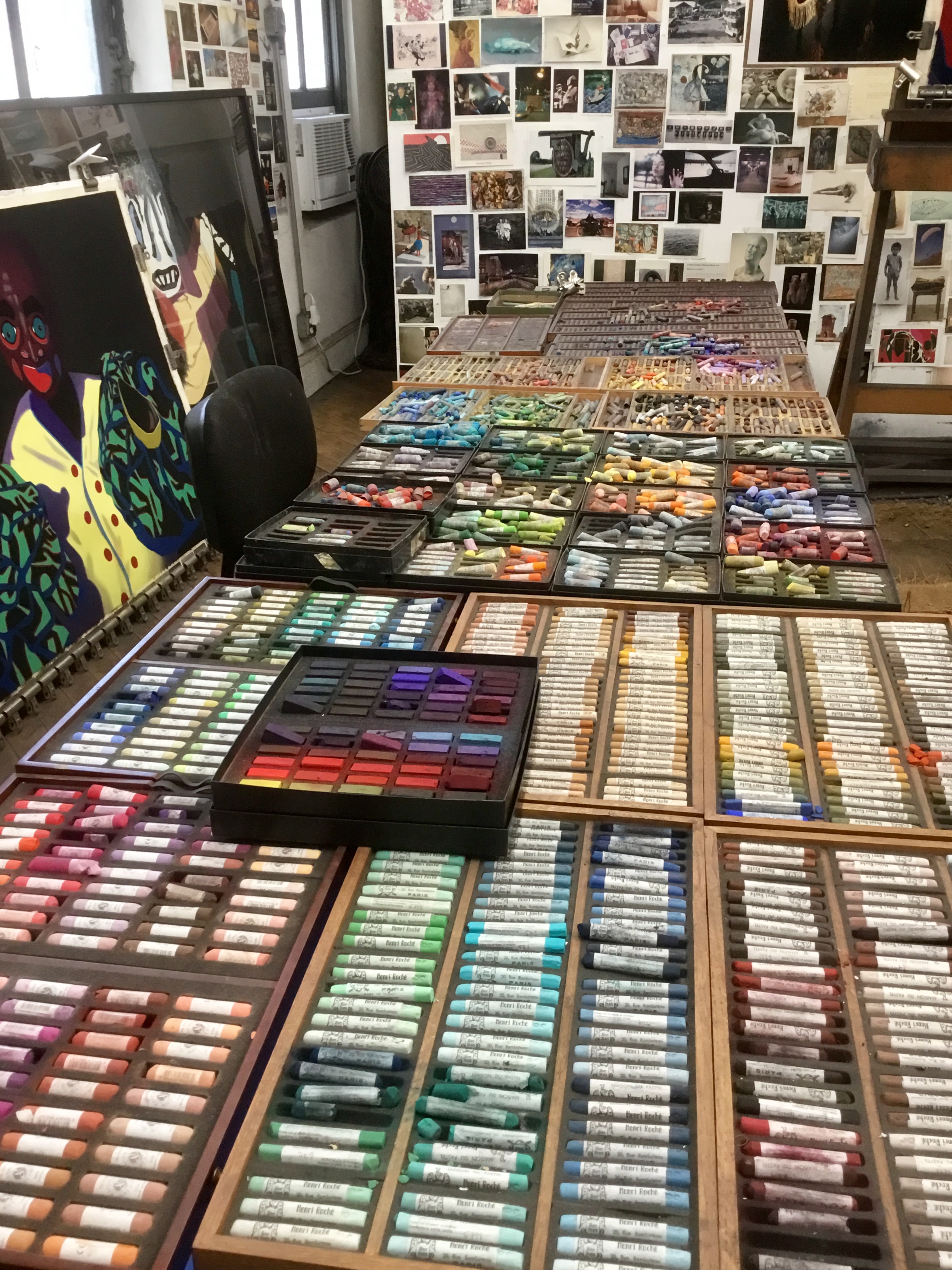
About half of Barbara’s pastels
A: It is as difficult to explain the meaning of my art as it is to interpret the meaning of life! I am invested in and concerned with process: foreign travel, prodigious reading, devotion to craft, months of slow meticulous work in the studio trying to create an exciting work of art that has never been seen before, etc. I love making pastel paintings! Many years ago I challenged myself to push the limits of what soft pastel can achieve. I am still doing so.
I leave it to others – viewers, arts writers, critics, art historians – to study my creative journey and talk about meanings. I believe an artist is inspired to create and viewers ponder the creation. I would not presume to tell anyone how to react to my work.
For many years I have been devoted to promoting soft pastel as a fine art medium. There are excellent reasons it has been around for five hundred years! It is the most permanent of media. There’s no liquid binder to cause oxidizing or cracking over time, as happens with oil paint. Pastel colors are intense because they are close to being pure pigment. Pastel allows direct application (no brushes) with no drying time and no color changes.
I use UArt acid-free sandpaper. This is not sandpaper from a hardware store. It is made for artists who work in pastel and allows me to build up layers of pigment without using a fixative. My process – slowly applying and layering pastels, blending and mixing new colors directly on the paper, making countless adjustments, searching for the best and/or most vivid colors – continually evolves. Each pastel painting takes months to create.
Comments are welcome!
Q: You have spoken about your pastel technique, which involves layering pigments on top of each other, up to 25 to 30 layers. When you do this are you putting the same colors on top of each other?

An early version of “Oracle,” soft pastel on sandpaper, 26″ x 20″

Finished
A: I do layer Rembrandt black soft pastels on top of each other to achieve the dark backgrounds in my “Black Paintings” and “Bolivianos” series. Black Rembrandts are the pastels I use most so I order them several dozen at a time. The 400 or 500 grit sandpaper requires at least four layers of pastel just to achieve even coverage. Over the next few months I add many more layers of black pastel to achieve the final rich look.
The figures and shapes in each pastel painting are a different story. Were you to x-ray them, you’d see many different colors underneath the final one. Sometimes subsequent colors are closely related to earlier ones. With each additional layer, I correct, refine, and strengthen my drawing so the objects depicted become more solid and/or three-dimensional.
In addition to the thousands of pastels I have to choose from, I mix and blend new colors directly on the sandpaper. As I proceed, I am searching for the ‘best’ colors, those that make the overall painting more resonant, more alive, and more exciting to look at. Of course, this is wholly subjective.
Comments are welcome!

