Blog Archives
Pearls from artists* # 688

*an ongoing series of quotations – mostly from artists, to artists – that offers wisdom, inspiration, and advice for the sometimes lonely road we are on.
Many artists see their studio practice as a religion. Like any other faith, it has rituals, beliefs, devotions, visionaries, martyrs, and even miracles. Our souls have a need to position themselves in the giant scheme of the universe, and art, like spiritual conviction, helps us do that. It allows us to decipher and process the complexities of the world around us. It can make us better humans by telling stories and sharing points of view that stoke compassion, understanding, and empathy. It holds the potential to redeem both the maker and the viewer, transcending quotidian dullness by evoking a deep significance we had forgotten.
Kate Kretz in Art From Your Core: A Holistic Guide to Visual Voice
Comments are welcome!
Pearls from artists* # 680

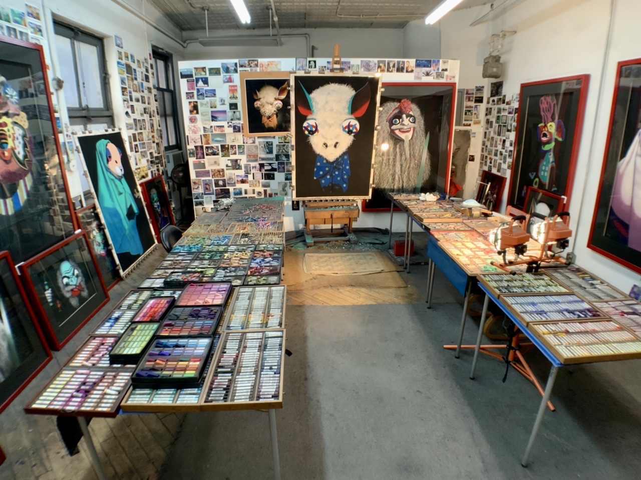
“Sacrificial” (on the wall) and “Trickster” (on the floor)
*an ongoing series of quotations – mostly from artists, to artists – that offers wisdom, inspiration, and advice for the sometimes lonely road we are on.
What makes a work transcendent and powerful is a personal intensity, an ‘extra’ quality. Yet that intensity is exclusive to each artist: extra strangeness, subtlety, causticity, bravado, sensuality, rawness, grandiosity, succinctness, mystery, vulnerability, truth, etc. For an individual artist to infuse an object or an experience with their own ‘extra’ quality requires not only skill or ideas, but the profound benevolence of consistently delivering in spades.
It is this passion and genuine feeling, specific to each creator, that lives on in the art as a gift. It is wrapped up in the work, forever suspended in time. The artist says,
Here… everything I possessed in this moment is embodied in this object… All skills I have painstakingly learned, all of the knowledge I possess, the joy and pain I have felt and all the experiences I have lived. I spun these into the perfect, most sublime form, and packed it up, but for you to unwrap anytime you need sustenance. It will nourish, comfort, and surround you, because you have chosen it.
Each viewer selects which works of art speak to them… which embodied feelings, concepts, and knowledge they value. An empathic connection is forged through the art object or experience. What is love, but to say to someone, ‘you are truly seen and understood?’ Art offers this as well, by reaching out to puncture through the membrane of our emotional isolation, to articulate how we feel in the moments when we cannot find words. It tells the artist and viewer alike, ‘You are not alone. You are not alone in how your brain works. You are not alone in the pain you feel. You are not alone in what you notice or appreciate, or in how much love you have to give.’
Pour that love into an art object. It can handle all the devotion you pack into it, and more.
Kate Kretz in Art From Your Core: A Holistic Guide to Visual Voice
Comments are welcome!
Q: How do you decide when a pastel painting is finished?

“Magisterial,” soft pastel on sandpaper, 58” x 38” in progress
A: During the months that it takes to create a pastel painting, I search for arresting colors that work well together. The goal is to make a painting that I have never seen before and that leads the viewer’s eyes around in interesting ways. To do this I build up and blend together as many as 25 to 30 layers of pigment. I am able to complete some areas, like the background, fairly easily – maybe with just six or seven layers of black Rembrandt pastel. The more realistic parts of a pastel painting take many more applications. In general, details always take plenty of time to refine and perfect.
No matter how many pastel layers I apply, however, I never use fixatives. It is difficult to see this in reproductions of my work, but some of the finished surfaces achieve a texture akin to velvet. My technique involves blending each layer with my fingers, pushing the pastel deep into the tooth of the sandpaper, and mixing new colors directly on the paper. Fortunately, the sandpaper holds plenty of pigment so I am able to include lots of details.
Before I pronounce a pastel painting finished, I let it sit against a wall in my studio for a few days so I can look at it later with fresh eyes. I consider a piece done when it is as good as I can make it, when adding or subtracting something would diminish what is there. Always, I try to push myself and my materials to their limits, using them in new and unexpected ways.
Comments are welcome.
Pearls from artists* # 656

At Storm King Art Center, Cornwall-On-Hudson, NY. Photo: Susan Erlichman
*an ongoing series of quotations – mostly from artists, to artists – that offers wisdom, inspiration, and advice for the sometimes lonely road we are on.
The world needs artists more than they know, and you are entitled to be one of them. We altruistically create gifts, with no assurance those gifts will be appreciated. Like social workers, we do not make a lot of money, but we improve the quality of people’s lives through ripple effects. When our work shifts the perceptions of one viewer, the transformation often radiates to others around them. That includes dialogue and pushes the world toward more truth or justice and inspires others to do the same.
Kate Kretz in Art From Your Core: A Holistic Guide to Visual Voice
Comments are welcome!
Pearls from artists* # 650

Some of Barbara’s Mexican and Guatemalan folk art collection
*an ongoing series of quotations – mostly from artists, to artists – that offers wisdom, inspiration, and advice for the sometimes lonely road we are on.
Art objects are not just gifts for the viewer: they can hold profound, even mystical, revelations for the maker. When actualizing work that comes from your core, one of the greatest sources of pleasure is the recording of your art life journey, with the serendipitous connections, the seminal players, and meaningful symbols that return again and again. Art is an unconscious language that knows more about you than you know about yourself.
Kate Kretz in Art From Your Core: A Holistic Guide to Visual Voice
Comments are welcome!
Q: Can you explain how you choose colors? (Question from Maria Cox via Instagram)

A: I am wild about color! As I work to create a pastel painting, I apply a color, back up from my easel to see how it interacts with and affects the rest of the painting, and then I make revisions. This process necessitates countless color changes and hundreds of hours during months of work. I apply pastel using a meticulous layering process. Were you to x-ray one of them, the earlier, discarded versions of a pastel painting would be visible. All the while I carefully fine-tune and refine how the colors and shapes interact with each other.
The goal is to make an exciting painting that no one, especially me as the maker, has ever seen before. I have no desire to repeat myself, to make art that resembles work by any other artist, or to be forced into a niche.
I try to select intense, vibrant colors that are exciting to look at, that work well in relationship to each other, and that will grab the viewer. Sometimes I deliberately choose colors for their symbolic meanings. For example, I selected a dark purple for the alternating triangles (the ones with the pink dots above) in “Overlord” because purple denotes royalty.
I have been working with soft pastel for 37 years so I have a fairly intricate science of color at my disposal. No doubt, many unconscious factors are at play, too. More on that in future posts.
Comments are welcome!
Pearls from artists* # 541
*an ongoing series of quotations – mostly from artists, to artists – that offers wisdom, inspiration, and advice for the sometimes lonely road we are on.
The artist has to make the viewer understand that his world is too narrow. To do this is a task for the humanist.
– Anthony Tapies
Comments are welcome!
Q: How do you account for your intense compositions? (Question from Robin Plati via Facebook)
A: If I do say so, composition is something I’m known for. During the months I work on them, I devote many hours to looking at the painting on my easel and figuring out how to move the viewer’s eyes around in interesting ways. Everything you see is carefully worked out after hundreds of studio hours. Finished pastel paintings always have an inevitability about them. Change one detail and the entire composition is thrown off.
Comments are welcome!
Pearls from artists* # 491
*an ongoing series of quotations – mostly from artists, to artists – that offers wisdom, inspiration, and advice for the sometimes lonely road we are on.
We look at ancient Egyptian painting today and may find it slightly comic, but what the Egyptians were trying to do with the figure was reveal the various aspects of the person’s body in the most characteristic aspect. The face is in profile because that reveals the most about the person’s face, but the shoulders are not in profile, they’re facing the viewer, because that’s the most revealing angle for the shoulders. The hips are not in profile, but the feet are. It gives a strange, twisted effect, but it was natural to the Egyptians. They were painting essences, and in order to paint an essence you have to paint it from its most characteristic angle. So they would simply combine the various characteristic essences of the human body. This was a piece of spiritual art. It wasn’t trying to reproduce photographic reality, it was trying to reproduce and combine all the essential features of a person within one figure.
Walter Murch in The Conversations: Walter Murch and the Art of Editing Film by Michael Ondaatje
Comments are welcome!
Pearls from artists* # 466

*an ongoing series of quotations – mostly from artists, to artists – that offers wisdom, inspiration, and advice for the sometimes lonely road we are on.
Within the initial artistic response to something is a core idea or feeling and most of our work comes from stripping away everything that is extraneous to it. To translate that vision means “to get across” the idea or feeling. How cleanly can that idea be isolated and honed, how much can be stripped away? Everything superfluous and tangential needs to be eliminated. Otherwise the idea may get buried and our intention deflected. And the viewer’s will also. The problem is seldom that an idea is too simple. Power comes from something deeply felt and simply stated. “Nothing astonishes men so much as common sense and plain dealing. All great actions have been simple, and all great pictures are.” (Quote from Ken Weber, The Eye of the Spirit, Shambala, 1998, p. 136).
Ian Roberts in Creative Authenticity: 16 Principles to Clarify and Deepen Your Artistic Vision
Comments are welcome!

