Blog Archives
In celebration of the 13th anniversary of my blog three days from now, I am republishing the very first post from July 15, 2012. Q: What does it take to be an artist, especially one living and working in New York?

Barbara’s Studio (in 2012) with works in progress.
A: The three Big P’s – Patience, Persistence, and Passion. Without all three you will not have the stamina to work tirelessly for very little external reward. You can expect help from no one.
There are so many obstacles to art-making and countless reasons to just give up. When you really think about it, it’s amazing that great art gets made at all. So why do we do it? Above all it’s about making our time on earth matter, about devotion to our innate gifts and love of our hard-fought creative process.
And, my God, it even gets harder as we get older! So what do we do? We dig in that much deeper. It’s a most noble and sacred calling – you know when you have it – and that’s what separates those of us who are in it for the long haul from the wimps, fakers, and hangers-on. I say to my fellow artists who continue to work despite the endless challenges, we are all true heroes!
These words still ring true and it’s good, even for me, to occasionally be reminded.
Most importantly, THANK YOU to my 222,000+ subscribers for taking this journey with me. When I began this blog in 2012, I had no idea it would prove to be so popular… WOW!
Comments are welcome!
Q: How do you persist despite the haters, nay-sayers, etc.? (Question from Bold Journey Publishing)

Barbara’s Studio
A: There are so many obstacles to art-making and countless reasons to just give up. When you really think about it, it’s amazing that great art gets made at all. So why do we do it? For artists I believe it’s all about making our time on earth matter, about devotion to our innate gifts, and a deep love of our hard-fought creative process.
I have been a full-time professional artist for 37 years. How and why do successful artists persist? It helps a lot to be stubborn! We just keep digging in that much deeper. Making art is a most noble and sacred calling – you know this if you are one of the called – and that’s what separates those of us who are in it for the long haul from the wimps, fakers, and hangers-on. I say to my fellow artists who continue to work despite the endless challenges, we artists who continue to struggle every day for recognition of our gifts are true heroes!
These words below by Mary Gabriel in Ninth Street Women, published in 2017, ring true for artists. It’s good, even for me, to occasionally reread them and be reminded.
The obstacles faced by women who hoped to leave a mark on humankind have, through the millennium, varied in height but not in stubborn persistence. And yet, a great many women have stubbornly ignored them. The desire to put words on a page or marks on a canvas was greater than the accrued social forces that told them they had no right to do so, that they were excluded by their gender from that priestly class called artist. The reason, according to Western tradition, was as old as creation itself: For many, God was the original artist and society had assigned its creator a gender – He. The woman who dared to declare herself an artist in defiance of centuries of such unwavering belief required monstrous strength, to fight not for equal recognition and reward but for something at once more basic and vital: her very life. Her art was her life. Without it, she was nothing. Having no faith that society would broaden its views on artists by dethroning men and accommodating women, in 1928 [Virginia] Woolf offered her fellow writers and painters a formula for survival that allowed them to create, if not with acceptance, then at least unimpeded. A woman artist, she said, needed but two possessions: “money and a room of her own.”
Furthermore, I think I persist because I do not believe in “big breaks.” Big breaks may sometimes happen, but in my experience an artist’s life is made up of single-minded dedication, persistence, hard work, and lots of small breaks. I recently finished reading “Failing Up: How to Take Risks, Aim Higher, and Never stop Learning” by Leslie Odom, Jr. I like what he has to say to artists here:
The biggest break is the one you give yourself by choosing to believe in your wisdom, in what you love, and in the gifts you have to offer the waiting world.
Comments are welcome!
Q: What advice would you give to a young artist with potential?

Barbara’s studio (since April 1997)
A: I last answered this question in my blog more than ten years ago and I would say similar things now to what I said then.
Be sure that you love your process unconditionally because there is no relationship between how hard you will work and how much money you will earn, period. Indeed, with inflation and rapidly evolving ways of doing business, it seems to cost more money every year to be an artist. As I’ve said often, be prepared to work very, very hard. Really it’s all about making the most of your gifts as an artist. If you don’t feel a deep responsibility to developing your talents as far as possible, you won’t have what it takes to keep going. Countless artists quit and no one can blame them. You absolutely must love your materials and your creative process and be willing to do whatever it takes to continue making art.
This is not a life for slackers!
Comments are welcome!
Q: Can you explain how you choose colors? (Question from Maria Cox via Instagram)

A: I am wild about color! As I work to create a pastel painting, I apply a color, back up from my easel to see how it interacts with and affects the rest of the painting, and then I make revisions. This process necessitates countless color changes and hundreds of hours during months of work. I apply pastel using a meticulous layering process. Were you to x-ray one of them, the earlier, discarded versions of a pastel painting would be visible. All the while I carefully fine-tune and refine how the colors and shapes interact with each other.
The goal is to make an exciting painting that no one, especially me as the maker, has ever seen before. I have no desire to repeat myself, to make art that resembles work by any other artist, or to be forced into a niche.
I try to select intense, vibrant colors that are exciting to look at, that work well in relationship to each other, and that will grab the viewer. Sometimes I deliberately choose colors for their symbolic meanings. For example, I selected a dark purple for the alternating triangles (the ones with the pink dots above) in “Overlord” because purple denotes royalty.
I have been working with soft pastel for 37 years so I have a fairly intricate science of color at my disposal. No doubt, many unconscious factors are at play, too. More on that in future posts.
Comments are welcome!
Pearls from artists* # 474

*an ongoing series of quotations – mostly from artists, to artists – that offers wisdom, inspiration, and advice for the sometimes lonely road we are on.
If ever an artist needed a degree of protection against his public, surely it is Vincent van Gogh. Reproductions of his most emblematic paintings, especially the gyrating nightscapes and the blazing series of sunflower studies made in his late years, adorn countless bedrooms, living rooms, and bathrooms all across what used to be known as the developed world. The popularity of the works executed in the great flowering of this last period, which began around the time of his revelatory visit in the autumn of 1885 to the newly completed Rijksmuseum, in Amsterdam, and ended when he died less than five years later at the age of thirty-seven, is unparalleled. Of the great ones among his contemporaries, and there were many, only Degas can come near to rivaling him as a mainstay of interior decoration.
John Banville in His Own Worst Enemy, The New York Review of Books, May 13, 2021
Comments are welcome!
Q: How did your ebook “From Pilot to Painter” come to be? (Question from “Arte Realizzata”)
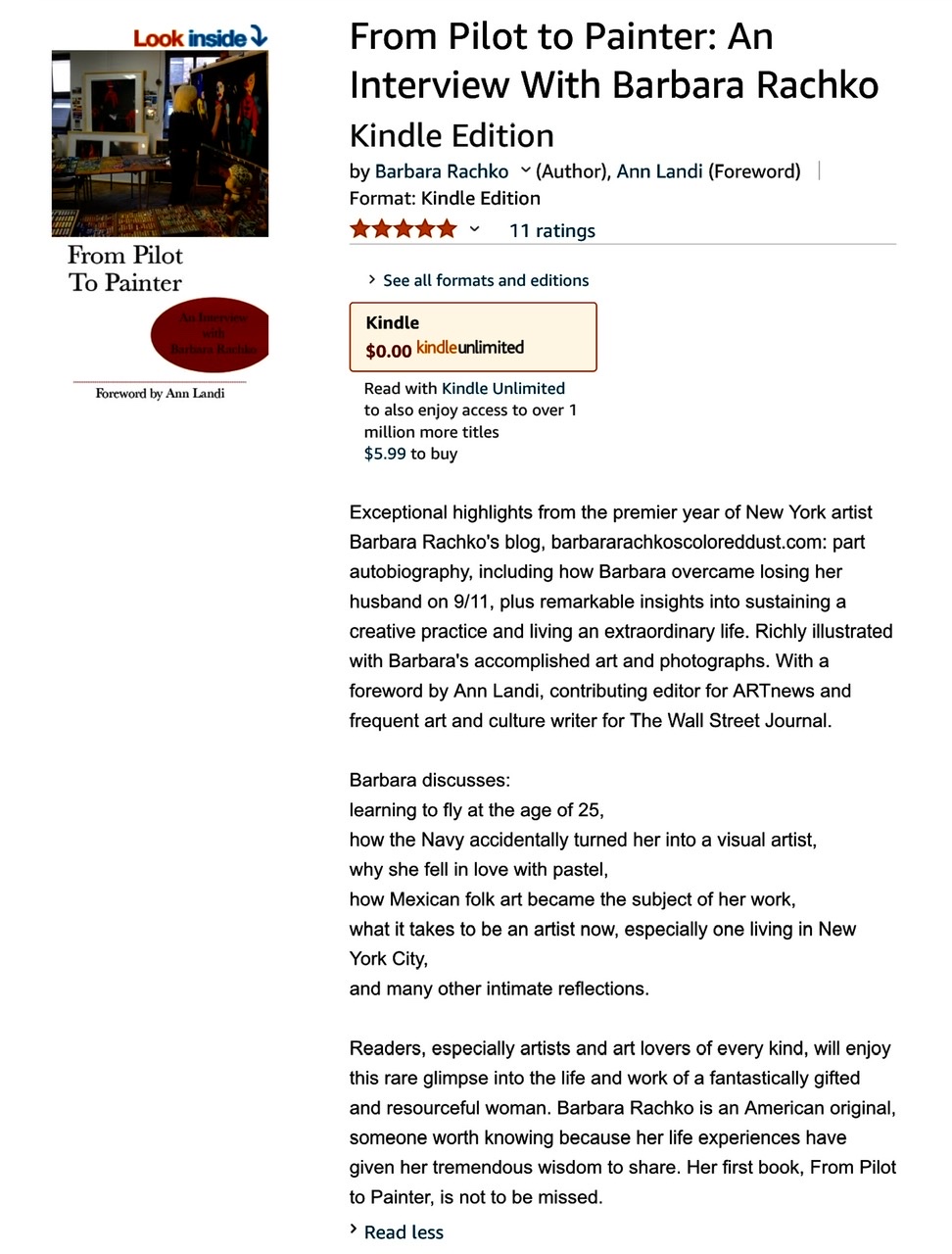
A: It was my longtime assistant, Barbra Drizin’s, idea and more than I’d care to admit, I was resistant. I said, “I am much too busy to write an ebook!” Barbra went on to explain that we could start with material I had already written for my blog, expand on it, add reproductions of my pastel paintings, etc. With her persuasion, I agreed! Barbra made the initial selections and together we added and revised text, organized the material, and worked out countless details. I asked my friend, Ann Landi, to write a foreword and Barbra found an editor to put everything into Amazon’s ebook format.
Now I am extremely pleased that my ebook FROM PILOT TO PAINTER is available not only on Amazon, but also on iTunes. It is based on my blog and is part memoir, including the loss of my husband on 9/11, insights into my creative practice, and intimate reflections on what it’s like to be an artist living in New York City. The ebook includes material not found on the blog, plus 25+ reproductions of my vibrant pastel-on-sandpaper paintings, a Foreword by Ann Landi, the founder of Vasari21.com and longtime critic for ARTnews, and more.
Comments are welcome!
Q: When did you start using the sandpaper technique and why (Question from “Arte Realizzata”)

A: In the late 1980s when I was studying at the Art League School in Alexandria, VA, I enrolled in a three-day pastel workshop with Albert Handel, an artist known for his southwest landscapes in pastel and oil paint. I had just begun working with soft pastel and was experimenting with paper. Handel suggested I try Ersta fine sandpaper. I did and nearly three decades later, I’ve never used anything else.
This paper is acid-free and accepts dry media, mainly pastel and charcoal. It allows me to build up layer upon layer of pigment and blend, without having to use a fixative. The tooth of the paper almost never gets filled up so it continues to hold pastel. (On the rare occasion when the tooth DOES fill up, which sometimes happens with problem areas that are difficult to resolve, I take a bristle paintbrush, dust off the unwanted pigment, and start again). My entire technique – slowly applying soft pastel, blending and creating new colors directly on the paper, making countless corrections and adjustments, rendering minute details, looking for the best and/or most vivid colors – evolved in conjunction with this paper.
I used to say that if Ersta ever went out of business and stopped making sandpaper, my artist days would be over. Thankfully, when that DID happen, UArt began making a very similar paper. I buy it in two sizes – 22″ x 28″ sheets and 56″ wide by 10-yard-long rolls. The newer version of the rolled paper is actually better than the old, because when I unroll it, it lays flat immediately. With Ersta I would lay the paper out on the floor for weeks before the curl would give way and it was flat enough to work on.
Comments are welcome!
Pearls from artists* # 410
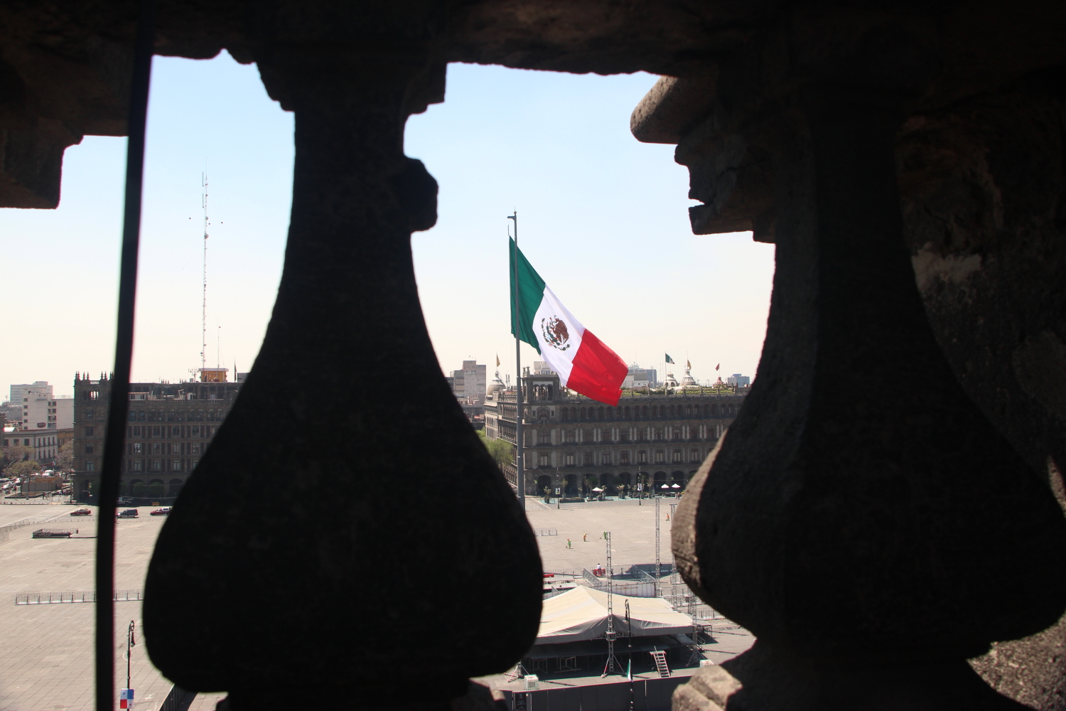
Mexico City
*an ongoing series of quotations – mostly from artists, to artists – that offers wisdom, inspiration, and advice for the sometimes lonely road we are on.
Faced with the disparities between lived reality and America’s professed ideals of inclusion and equity, countless artists have begun embracing the social role of art and using aesthetic means to speak out against all manner of injustice. In such a climate, the Mexican muralists [Jose Clemente Orozco, Diego Rivera, and David Alfaro Siqueiros] have once again emerged as models of how to marry aesthetic rigor and vitality to socially conscious subject matter that addresses the most fundamental questions concerning our collective pursuit of a more just and equitable society. Not withstanding the rich cultural ties and decades of migration that have long existed between the United States and Mexico, the relationship between the two countries has always been fraught, marked as much by mutual wariness and bouts of hostility as by a spirit of camaraderie and cooperation Yet the ugliness and xenophobia of the recent debates on the American side echoes the worst of the past. It thus seems more imperative than ever to acknowledge the profound and enduring influence Mexican muralism has had on artmaking in the United States and to highlight the beauty and power that can emerge from the free and vibrant cultural exchange between the two countries. As much as did American artists decades ago, artists in the United States today stand to benefit from an awareness of how dynamically and inventively the Mexican muralists used their art to project the ideals of compassion, justice, and solidarity. They remain a source of powerful inspiration for their seamless synthesis of ethics, art, and action.
Vida Americana: Mexican Muralists Remake American Art, 1925 – 1945, edited by Barbara Haskell
Comments are welcome!
Q: Would you speak about the meaning of your work and the different materials you use?
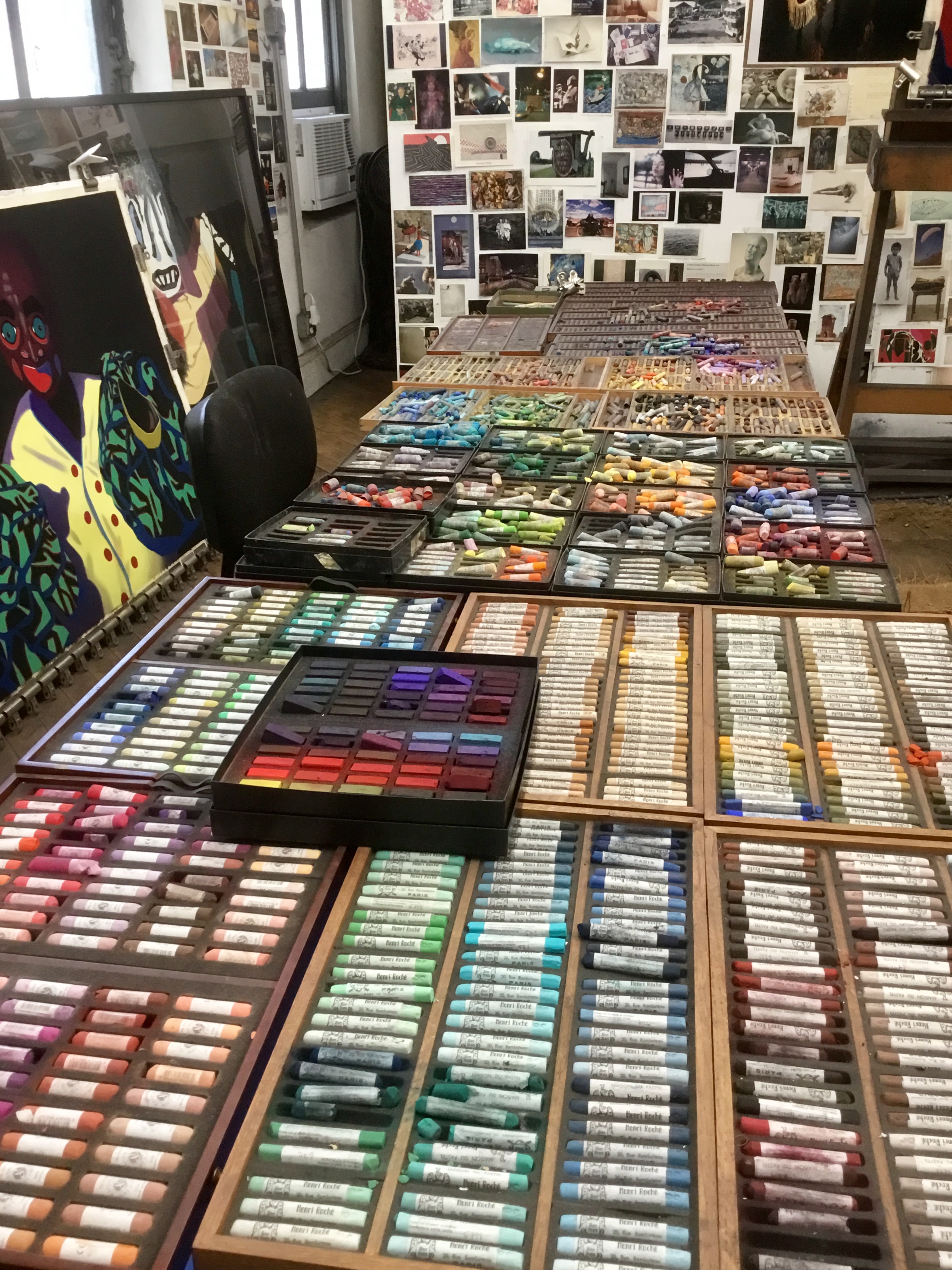
About half of Barbara’s pastels
A: It is as difficult to explain the meaning of my art as it is to interpret the meaning of life! I am invested in and concerned with process: foreign travel, prodigious reading, devotion to craft, months of slow meticulous work in the studio trying to create an exciting work of art that has never been seen before, etc. I love making pastel paintings! Many years ago I challenged myself to push the limits of what soft pastel can achieve. I am still doing so.
I leave it to others – viewers, arts writers, critics, art historians – to study my creative journey and talk about meanings. I believe an artist is inspired to create and viewers ponder the creation. I would not presume to tell anyone how to react to my work.
For many years I have been devoted to promoting soft pastel as a fine art medium. There are excellent reasons it has been around for five hundred years! It is the most permanent of media. There’s no liquid binder to cause oxidizing or cracking over time, as happens with oil paint. Pastel colors are intense because they are close to being pure pigment. Pastel allows direct application (no brushes) with no drying time and no color changes.
I use UArt acid-free sandpaper. This is not sandpaper from a hardware store. It is made for artists who work in pastel and allows me to build up layers of pigment without using a fixative. My process – slowly applying and layering pastels, blending and mixing new colors directly on the paper, making countless adjustments, searching for the best and/or most vivid colors – continually evolves. Each pastel painting takes months to create.
Comments are welcome!


Q: What kind of internal conversations do you tend to have when you are in the process of making art? (Question from Vedica Art Studios and Gallery)
Jan 10
Posted by barbararachkoscoloreddust
A: When standing at my easel creating a pastel painting, I focus on formal properties: composition, shape, color, and line. I always strive to produce a painting I’ve never seen before. Even as (perhaps especially as) the creator, I want to be surprised by the final result. My studio days are spent thinking, looking, reacting, and adjusting colors and composition as I refine increasingly tiny details, ensuring all elements work harmoniously. I determine which areas need to recede or advance, which require intricate details to appear three-dimensional, and which are better left as flat areas of color.
These countless adjustments ensure viewers’ eyes are guided around the finished painting in intriguing ways. I often recall something collectors of my pastel paintings shared: they mentioned a New York Times review of a Nan Goldin exhibition, in which the writer stated, “All of the pleasure circuits are fired in looking.” The collectors agreed this is exactly how they feel when viewing my work. Artists live for appreciative comments like these!
Comments are welcome!
Share this:
Posted in 2026, An Artist's Life, Creative Process, Studio, Working methods
Comments Off on Q: What kind of internal conversations do you tend to have when you are in the process of making art? (Question from Vedica Art Studios and Gallery)
Tags: adjusting, adjustments, advance, agreed, always, appear, appreciative, areas, around, artists, “Magisterial”, “New York Times”, better, circuits, collectors, colors, comments, composition, countless, creating, creator, details, determine, elements, ensure, ensuring, especially, exactly, exhibition, finished, fired, formal, guided, harmoniously, increasingly, intricate, intriguing, looking, mentioned, Nan Goldin, painting, pastel painting, perhaps, pleasure, produce, properties, question, reacting, recall, recede, refine, require, result, review, shared, something, stated, strive, Studio, surprised, thinking, three-dimensional, Vedica Art Studios and Gallery, viewers, viewing, working, writer