Blog Archives
Pearls from artists* # 623

*an ongoing series of quotations – mostly from artists, to artists – that offers wisdom, inspiration, and advice for the sometimes lonely road we are on.
At the time [the Renaissance], Bologna was unique in championing the professions of women. The home of Europe’s oldest university, which had supported female students since the thirteenth century, the city considered women artists as integral to its development. Praised by scholars, written about by biographers and adored by the locals, they were also supported by patrons of all social classes (from bankers to barbers), creating a varied culture of artistic patronage. (By contrast, in Florence and Naples, commissioning was reserved for select noble families.). Women were also encouraged to sign their work, as well as to paint self-portraits for the purpose of being known and, most importantly, remembered. No wonder scholars have recorded a staggering sixty-eight women artists working in the city between the fifteenth and sixteenth centuries.
These notable exceptions remind us that women have always been perfectly capable of being artists. But while there could have been an abundance of women working at this time, in reality female artists were an absolute rarity, seen as ‘tokens’ rather than pioneers. (After de Rossi’s death [in 1530], no female sculptor is mentioned in the city’s records for 200 years.). And little knowledge remains of those working during the Renaissance period. Most of what we know has been passed down by male scholars and through legal documents, rarely from the women themselves.
Katy Hessel in The Story of Art Without Men
Comments are welcome!
Q: Many artists can’t bear to face a blank canvas. How do you feel about starting a new piece?

Starting a 26” x 20”pastel painting!
A: That’s an interesting question because I happen to be re-reading The War of Art by Steven Pressfield and this morning I saw this:
You know, Hitler wanted to be an artist. At eighteen he took his inheritance, seven hundred kronen, and moved to Vienna to live and study. He applied to the Academy of Fine Arts and later to the school of architecture. Ever see one of his paintings? Neither have I. Resistance beat him. Call it overstatement but I’ll say it anyway: it was easier for Hitler to start World War II than it was for him to face a blank square of canvas.
I’ve never understood this fear of “the blank canvas” because I am always excited about beginning a new painting. When you think about it, artists can often say, “In the history of the planet no one has ever made what I am about to make!” Once again I am looking at something new on my easel, even if it is only a blank 26” x 20” piece of sandpaper clipped to a slightly larger piece of foam core.
Unlike artists who are paralyzed before “a blank canvas,” I am energized by the imagined possibilities of all that empty space! I spend three or four months on a pastel painting so this experience of looking at a blank piece of paper on my easel happens three or four times a year at most.
Excluding travel to remote places, which is essential to my work and endlessly fascinating, the first day I get to spend blocking in a new painting is the most exhilarating part of my whole creative process. It’s when I feel the freest! I select the pastel colors quickly, without thinking too much about them, first imagining them, then feeling, looking, and reacting intuitively, always correcting and trying to make the painting look better and better!
Comments are welcome!
Q: Many of the world’s cultures have a mask tradition. Is there something special about Bolivian masks that first attracted you to them?

Bolivian Carnival Mask
A: My subject matter emerges directly from my travels. I visited Bolivia in 2017. What I especially liked then – and now – about Bolivian Carnival masks, is that they include additional textures – feathers, fur, costume jewelry, sequins, fabric, etc. that add to their physical presence. Masks from most of the other countries I’ve visited tend to be made of wood and/or paper mache and nothing else. In my view such masks are not as dramatic nor do they offer much expressive potential. They feel dead. They lack a certain “soulfulness.”
Furthermore, textures are challenging to render in soft pastel. For more than three decades I have been striving to improve my pastel techniques. By now I have a vast repertoire from which to select. As was true in my earlier series, with “Bolivianos” an important personal goal is to keep adding to the repertoire.
It takes months to create a pastel painting, which means I need masks that will hold my attention every day over the course of three or four months. I never want to be bored in the studio. If I am bored while making the work, those feelings will be directly transferred and I will make a boring pastel painting, something I hope never to do! The masks need to have a really strong ‘presence.’ Then as I slowly make a pastel painting, one that is exciting to work on from start to finish, I can transform my subject into something surprising and powerful that has never existed before!
Comments are welcome!
Q: Can you explain how you choose colors? (Question from Maria Cox via Instagram)

A: I am wild about color! As I work to create a pastel painting, I apply a color, back up from my easel to see how it interacts with and affects the rest of the painting, and then I make revisions. This process necessitates countless color changes and hundreds of hours during months of work. I apply pastel using a meticulous layering process. Were you to x-ray one of them, the earlier, discarded versions of a pastel painting would be visible. All the while I carefully fine-tune and refine how the colors and shapes interact with each other.
The goal is to make an exciting painting that no one, especially me as the maker, has ever seen before. I have no desire to repeat myself, to make art that resembles work by any other artist, or to be forced into a niche.
I try to select intense, vibrant colors that are exciting to look at, that work well in relationship to each other, and that will grab the viewer. Sometimes I deliberately choose colors for their symbolic meanings. For example, I selected a dark purple for the alternating triangles (the ones with the pink dots above) in “Overlord” because purple denotes royalty.
I have been working with soft pastel for 37 years so I have a fairly intricate science of color at my disposal. No doubt, many unconscious factors are at play, too. More on that in future posts.
Comments are welcome!
Pearls from artists* # 521

*an ongoing series of quotations – mostly from artists, to artists – that offers wisdom, inspiration, and advice for the sometimes lonely road we are on.
But on the whole, I’m taking into consideration, at the point of the cut, where the audience’s eye is and what direction it’s moving, and with what speed. The editor has to imagine the audience’s point of attention when the film is projected, and has to be able to predict where ninety-nine percent of the audience is looking at any moment… I have to be able to say with some certainty that at such-and-such a moment ninety-nine percent of the audience will be looking at this point on the screen, and in the next second they will be looking here. That means that their eye is travelling, say, left to right, to the upper corner of the frame, at a certain speed. If I choose to cut at this point – at frame 17 – I know that at that moment their eye is right here, in the Cartesian grid of the screen.
That’s a very valuable piece of information. When I select the next shot, I choose a frame that has an interesting visual at exactly that point, where the audience’s eye is at the moment of the cut, to catch and redirect their attention somewhere else. Every shot has its own dynamic. One of the editor’s obligations is to carry, like a sacred vessel, the focus of attention of the audience and move it in interesting ways around the surface of the screen.
This is exactly what I do as I work to compose my pastel paintings! – BR
In The Conversations: Walter Murch and the Art of Editing Film by Michael Ondaatje
Comments are welcome!
Q; What was the spark that got you started? (Question from Barbara Smith via Facebook)

A: If I had to select one factor, I would say, profound unhappiness with my professional life. In 1986 I was a 33-year-old Navy Lieutenant working as a computer analyst at the Pentagon. I hated my job, was utterly miserable, and moreover, I was trapped because unlike many jobs, it’s not possible to resign a Naval commission with two weeks notice.
My bachelor’s degree had been in psychology. When I was in my 20s and before I joined the Navy, I had spent two years and my own money training to become a licensed commercial pilot and Boeing-727 Flight Engineer. I had planned to become an airline pilot, but due to bad timing (airlines were not hiring pilots when I was looking for a job), that did not come to pass.
So there I was with absolutely no interest, nor any training in computers, working for the Joint Chiefs of Staff, and completely bored. I knew I must have taken a wrong turn somewhere and resolved to make a significant change. Searching around, I discovered a local art school, the Art League School in Alexandria, VA, and began taking drawing classes.
One drawing class lead to more. Within a couple of years, due to being highly motivated to change my life, my technical skills rapidly improved. Even then, I believe, it was obvious to anyone who knew me that I had found my calling. I resigned my active duty Naval commission and have been a fulltime professional artist since October 1989. (Note: For fourteen more years I remained in the Naval Reserve working, mostly at the Pentagon, one weekend a month and two weeks each year, and retired as a Navy Commander in 2003).
Life as a self-employed professional artist is endlessly varied, fulfilling, and interesting. I have never once regretted my decision to pursue art fulltime!
Comments are welcome!
Q: Is there a pastel painting that you are most proud of?

“She Embraced It and Grew Stronger,” soft pastel on sandpaper, 58″ x 38,” 2003
A: Without a doubt I am most proud of “She Embraced It and Grew Stronger.”
After Bryan was killed on 9/11, making art again seemed an impossibility. When he was alive I would spend weeks setting up and lighting the tableau I wanted to paint. Then Bryan would shoot two negatives using his Toyo-Omega 4 x 5 view camera. I would select one and order a 20″ x 24″ reference photo to be printed by a local photography lab.
“She Embraced It…” is the first large pastel painting that I created without using a photograph taken by Bryan. This painting proved that I had learned to use his 4 x 5 view camera to shoot the reference photographs that were (and still are) integral to my process. My life’s work could continue!
Certainly the title is autobiographical. ‘She’ in “She Embraced It and Grew Stronger” is me and ‘It’ means continuing on without Bryan and living life for both of us.
Comments are welcome!
Q: What was the first painting you ever sold?
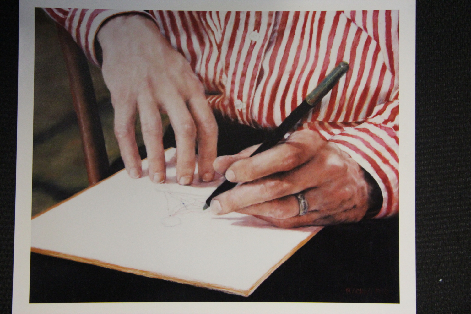
“Bryan’s Ph.D.”, 11″ x 13 1/2″, soft pastel on sandpaper
A: I believe my first sale was “Bryan’s Ph.D.” I made it in 1990 as one of several small paintings created to improve my skills at rendering human hands in pastel. I had recently left the Navy and was building a career as a portrait artist. Bryan, my late husband, was often my model for these studies, not only because it was convenient, but because he had such beautiful hands.
In 1990 Bryan was working on his Ph.D. in economics at the University of Maryland. In this painting he is drawing a diagram that illustrates a theoretical point about “international public goods,” the subject of his research. He was sitting in an old wooden rocking chair in our backyard in Alexandria, VA. I still own the chair and the house. I photographed his hands close-up and then created the painting. I don’t remember which of Bryan’s cameras I used, but it was one that took 35 mm film; perhaps his Nikon F-2. Somewhere I must still have the negative and the original reference photo.
“Bryan’s Ph.D.” is 11″ x 13 1/2″ and it sold for $500 at a monthly juried exhibition at The Art League in Alexandria. I have not seen it since 1990. (Above is a photograph of “Bryan’s Ph.D.” from my portfolio book).
Not long ago the owner contacted me, explaining that she had received the painting as a gift from her now ex-husband. She was selling it because it evoked bitter memories of her divorce. Her phone call was prompted by uncertainty about the painting’s value now. She had a likely buyer and needed to know what price to charge.
I was saddened because I have so many beautiful memories of this particular painting and of an idyllic time in my life with Bryan. He was on a leave of absence from the Pentagon to work on his dissertation, while I was finished with active duty. At last I was a full time artist, busily working in the spare bedroom that we had turned into my first studio.
My conversation with the owner was a reminder that once paintings are let out into the world, they take on associations that have nothing to do with the personal circumstances surrounding their creation. In short, what an artist creates solely out of love, stands a good chance of not being loved or appreciated by others. This is one reason to only sell my work to people I select personally. I ended the telephone conversation hoping that “Bryan’s Ph.D.” fares better in its new home.
Comments are welcome!
Q: Do you have any advice for a young painter or someone just starting out as an artist?
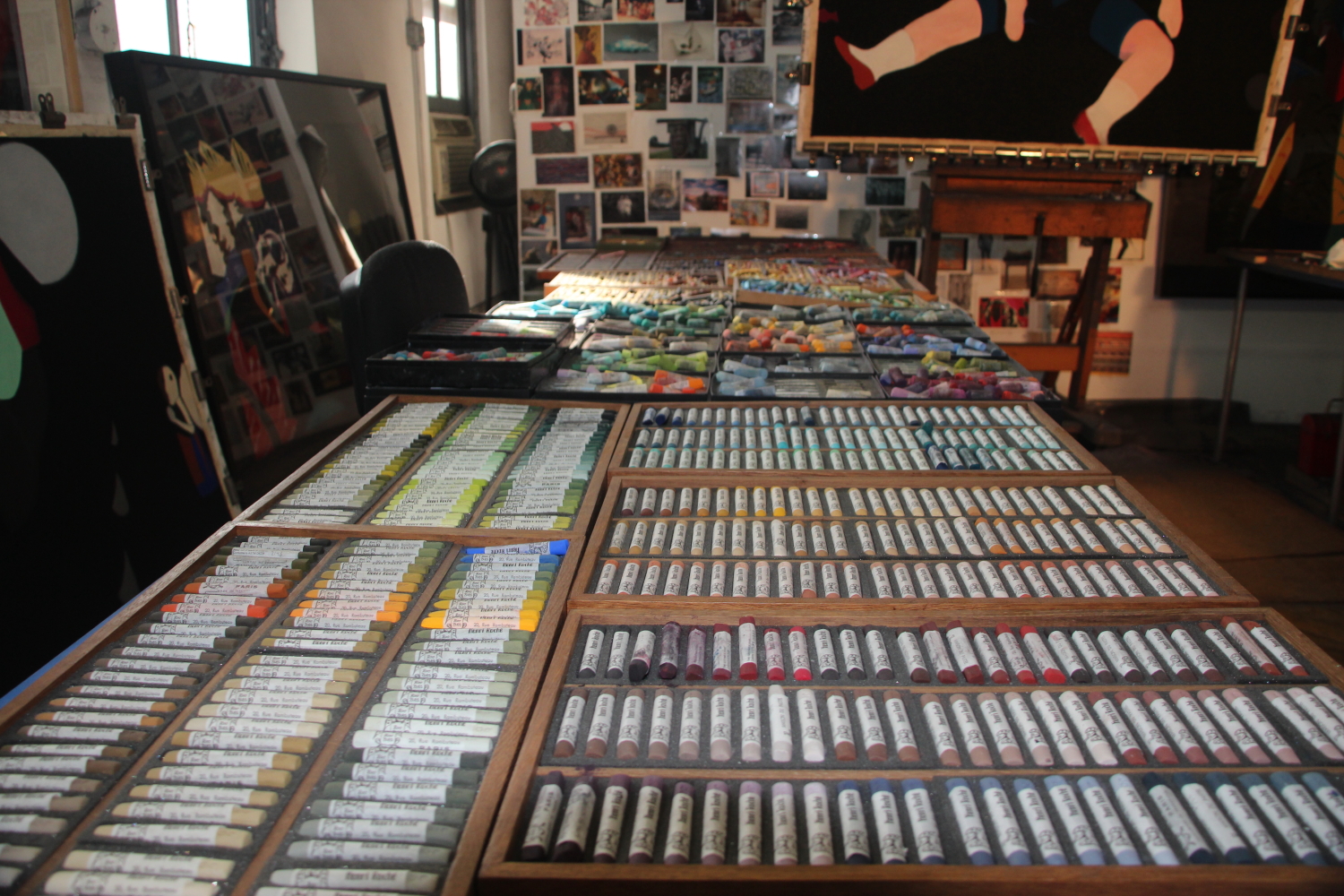
Studio
A: As artists each of us has at least two important responsibilities: to express things we are feeling for which there are no adequate words and to communicate to a select few people, who become our audience. By virtue of his or her own uniqueness, every human being has something to say. But self-expression by itself is not enough. As I often say, at it’s core art is communication. Without this element there is no art. When artists fail to communicate, perhaps they haven’t mastered their medium sufficiently so are unsuccessful in the attempt, or they may be being self-indulgent and not trying. Admittedly there is that rare and most welcome occurrence when an artistic statement – such as a personal epiphany – happens for oneself alone.
Most importantly, always listen to what your heart tells you. It knows and speaks the truth and becomes easier to trust as you mature. If you get caught up in the art world, step back and take some time to regain your bearings, to get reacquainted with the voice within you that knows the truth. Paint from there. Do not ever let a dealer or anyone else dictate what or how you should paint.
With perhaps the singular exception of artist-run cooperative galleries, be very suspicious of anyone who asks for money to put your work in an exhibition. These people are making money from desperate and confused artists, not from appreciative art collectors. With payment already in hand there is no financial incentive whatsoever for these people to sell your paintings and they won’t.
Always work in a beautiful and special place of your own making. It doesn’t need to be very large, unless you require a large space in which to create, but it needs to be yours. I’m thinking of Virginia Woolf’s “a room of one’s own” here. A studio is your haven, a place to experiment, learn, study, and grow. A studio should be a place you can’t wait to enter and once you are there and engaged, are reluctant to leave.
Be prepared to work harder than you ever have, unrelentingly developing your special innate gifts, whether you are in the mood to do so or not. Most of all remember to do it for love, because you love your medium and it’s endless possibilities, because you love working in your studio, and because you feel most joyously alive when you are creating.
Comments are welcome!
Q: Can you discuss your process, including how you actually use Mexican and Guatemalan folk art figures in your art?

A corner of Barbara’s studio
A: When I set up the figures to photograph for a painting, I work very intuitively, so how I actually cast them in an artwork is difficult to say. Looks count a lot – I select an object and put it in a particular place, look at it, move it or let it stay, and sometimes develop a storyline. I spend time arranging lights and looking for interesting cast shadows. With my first “Domestic Threats” series, all of this was done so that Bryan, my late husband, or I could shoot a couple of negatives with his Toyo Omega 4″ x 5″ view camera. For my “Black Paintings” series, begun in 2007, I shoot medium format negatives with a Mamiya 6 camera.
I always look at a 20″ x 24″ photograph for reference as I make a pastel-on-sandpaper painting, plus I also work from the ‘live’ objects. The photograph is mainly a catalyst because finished paintings are always quite different from their associated reference photos. Also, since I spend months creating them, the paintings’ interpretative development goes way beyond that of the photo.
I once completed 6 large (58” x 38”) pastel paintings in a single year, but more recently 4 or 5 per year is common. It takes approximately 3 months to make each one. During that time I layer and blend together as many as 25 to 30 layers of pastel. Of course, the colors get more intense as the painting progresses and the pigment accumulates on the sandpaper.
Comments are welcome!

