Blog Archives
Q: How do you think your recent trip to Bolivia will affect your work?
Reference photo from my trip to Bolivia
A: I have been back in the United States for one month and I know from past trips that there is always a long gestation period as I reflect on colorful new experiences, new sights, sounds, etc. My three and a half-weeks in Bolivia were non-stop, intense, and just full of so many high points. Bolivia is a fascinating country with profound cultural riches, and exceptionally warm and welcoming people. I experienced new friendships and events that were way beyond anything I could have imagined. In short, there’s a lot to process!
In the immediate aftermath, back in the studio I am deliberately selecting more vibrant colors and bumping up the contrast and drama in the painting on my easel (“Gatecrasher”) as I attempt to reflect some of what I saw and experienced in Oruro during Carnaval. I have begun to plan a pastel painting based on the mask pictured above, which I photographed in La Paz. We shall see what new work is created over the coming months and years. For now, it’s exciting to be reenergized and to have new subject matter with which to work. And, at this early date, I can barely conceive what our new Bolivia documentary will be like!
Comments are welcome!
Q: Over your 40-year career as an artist, you have managed to keep presentation, technical, subject matter, conceptual consistencies in your art practice and work. How do you manage to filter out inspirations that might be luring at that moment but do not support your art practice? For example, you master pastel works. There must have been moments when you might have been inspired to make oil works. How do you keep such inspirations aside. (Question from Vedica Art Studios and Gallery)

A: About thirty-five years ago, when my pastel paintings were becoming larger—around 60” x 40”—I had to choose between transitioning to oil on canvas or continuing with pastel. Framing was the main concern. I wasn’t certain large pastels could be framed, and even if they could, the cost might be prohibitive. However, I had already fallen in love with pastel and knew no other medium could offer such vibrant colors or velvety textures. Determined, I resolved the framing issue (art-making is fundamentally problem-solving), committed myself fully to soft pastel, and have continued inventing and refining techniques ever since.
My goal from the beginning has always been improvement as an artist. If an activity doesn’t contribute to my growth—as a person or as an artist—I typically don’t pursue it. Time and energy are finite resources, so I try to use them wisely.
Comments are welcome!
Q: What kind of internal conversations do you tend to have when you are in the process of making art? (Question from Vedica Art Studios and Gallery)

A: When standing at my easel creating a pastel painting, I focus on formal properties: composition, shape, color, and line. I always strive to produce a painting I’ve never seen before. Even as (perhaps especially as) the creator, I want to be surprised by the final result. My studio days are spent thinking, looking, reacting, and adjusting colors and composition as I refine increasingly tiny details, ensuring all elements work harmoniously. I determine which areas need to recede or advance, which require intricate details to appear three-dimensional, and which are better left as flat areas of color.
These countless adjustments ensure viewers’ eyes are guided around the finished painting in intriguing ways. I often recall something collectors of my pastel paintings shared: they mentioned a New York Times review of a Nan Goldin exhibition, in which the writer stated, “All of the pleasure circuits are fired in looking.” The collectors agreed this is exactly how they feel when viewing my work. Artists live for appreciative comments like these!
Comments are welcome!
Q: How do you decide when a pastel painting is finished?

“Magisterial,” soft pastel on sandpaper, 58” x 38” in progress
A: During the months that it takes to create a pastel painting, I search for arresting colors that work well together. The goal is to make a painting that I have never seen before and that leads the viewer’s eyes around in interesting ways. To do this I build up and blend together as many as 25 to 30 layers of pigment. I am able to complete some areas, like the background, fairly easily – maybe with just six or seven layers of black Rembrandt pastel. The more realistic parts of a pastel painting take many more applications. In general, details always take plenty of time to refine and perfect.
No matter how many pastel layers I apply, however, I never use fixatives. It is difficult to see this in reproductions of my work, but some of the finished surfaces achieve a texture akin to velvet. My technique involves blending each layer with my fingers, pushing the pastel deep into the tooth of the sandpaper, and mixing new colors directly on the paper. Fortunately, the sandpaper holds plenty of pigment so I am able to include lots of details.
Before I pronounce a pastel painting finished, I let it sit against a wall in my studio for a few days so I can look at it later with fresh eyes. I consider a piece done when it is as good as I can make it, when adding or subtracting something would diminish what is there. Always, I try to push myself and my materials to their limits, using them in new and unexpected ways.
Comments are welcome.
Q: How do you decide when a pastel painting is finished?

Signing “Apparition,” soft pastel on sandpaper, 58” x 38”
A: During the several months that I work on a pastel painting, I search for the best, most eye-popping colors, as I build up and blend together as many as 25 to 30 layers of pigment. I am able to complete some areas, like the background, fairly easily – maybe with six or seven layers – but the more realistic parts take more applications because I am continually refining and adding details. Details always take time to perfect.
No matter how many pastel layers I apply, however, I never use fixatives. It is difficult to see this in reproductions of my work, but the finished surfaces achieve a texture akin to velvet. My technique involves blending each layer with my fingers, pushing pastel deep into the tooth of the sandpaper. The paper holds plenty of pigment and because the pastel doesn’t flake off, there is no need for fixatives.
I consider a given painting complete when it is as good as I can make it, when adding or subtracting anything would diminish what is there. I know my abilities and I know what each individual stick of pastel can do. I continually try to push myself and my materials to their limits.
Comments are welcome.
Q: Pastel dust can be toxic. Do you use air filters in your work space?

Barbara’s Studio
A: No, but I wear a surgical mask when I work, to prevent breathing pastel dust. Also, I use a barrier cream, called Artgard, to prevent pigment being absorbed into my skin through cuts. I take care that my head is always higher than my hand as I work, so the dust is below my mouth and nose. It’s difficult to tell from the photo but my easel is tilted forward, allowing pastel dust to fall onto the easel and floor.
I am well aware of the toxicity of pastel, especially with colors that contain cadmium, and believe I take the proper precautions. After forty years working with soft pastel, so far I’ve managed to stay healthy.
Comments are welcome.
Q: Why do you have so many pastels?

Barbara’s Studio
A: Our eyes can see infinitely more colors than the relative few that are made into pastels. When I layer pigments onto the sandpaper substrate, I mix new colors directly on the paper. The short answer is, I need lots of pastels so that I can make new colors.
I have been working exclusively with soft pastel for 40 years. Whenever I feel myself getting into a rut in how I select and use my colors, I look around for new materials to try. Fortunately, new brands of soft pastels are continually coming onto the market. There are pastels that are handmade by artists – I love discovering these – and new colors manufactured by well-known pastel companies. Some sticks of soft pastel are oily, some are buttery, some more powdery, some crumble easily, some are more durable. Each one feels distinct in my hand.
Furthermore, they each have unique mixing properties. It’s an under-appreciated science that I stumbled upon (or maybe I invented it, I’m not sure since I cannot know how other pastel painters work). In this respect soft pastel is very different from other paint media. Oil painters, for example, need only a few tubes of paint to make any color in the world. I don’t go in much for studying color theory as a formal discipline. If you want to really understand and learn how to use color, try soft pastel and spend 10,000+ hours (the amount of time Malcolm Gladwell says, in his book, “Outliers,” that it takes to master a skill) figuring it all out for yourself!
Comments are welcome.
Q: Why do you have so many pastels?

Barbara’s Studio
A: Our eyes can see infinitely more colors than the relative few that are made into pastels. When I layer pigments onto the sandpaper substrate, I mix new colors directly on the painting. This has the result of making many of my colors unrepeatable. The short answer is, I need lots of pastels so that I can mix new colors.
I have been working exclusively with soft pastel for nearly 40 years. Each pastel stick has unique mixing properties that depend on what was used as a binder to hold the dry pigment together. Some soft pastels are oily, some are buttery, some are powdery, some crumble easily, some are harder. Each one feels slightly different when I apply it to the sandpaper.
Soft pastel is distinct among paint media. Oil painters need only a few tubes of paint to make any number of colors, but pastels are not easily combined to form new colors. I learned how to mix colors by experimenting. In the process I developed a personal and unique science of color-mixing and blending. This is one of the factors that makes my work so recognizable and sets it apart from that of other pastel painters.
Comments are welcome.
Q: Are there any artists you admire? (Question from “Cultured Focus” Magazine)

“Henri Matisse: Forms in Freedom,” The National Arts Center, Tokyo, Japan
A: Among historical painters, I adore Henri Matisse and André Derain, for their striking compositions and bold use of colors. Among living photographers, I am most fascinated by the Pictures Generation, namely, Cindy Sherman, Laurie Simmons, Sandy Skoglund, and Gregory Crewdson. I am drawn to these photographers, I think, because my earliest pastel painting series involved staged photography.
Comments are welcome!


Pearls from artists* # 706
Jun 10
Posted by barbararachkoscoloreddust
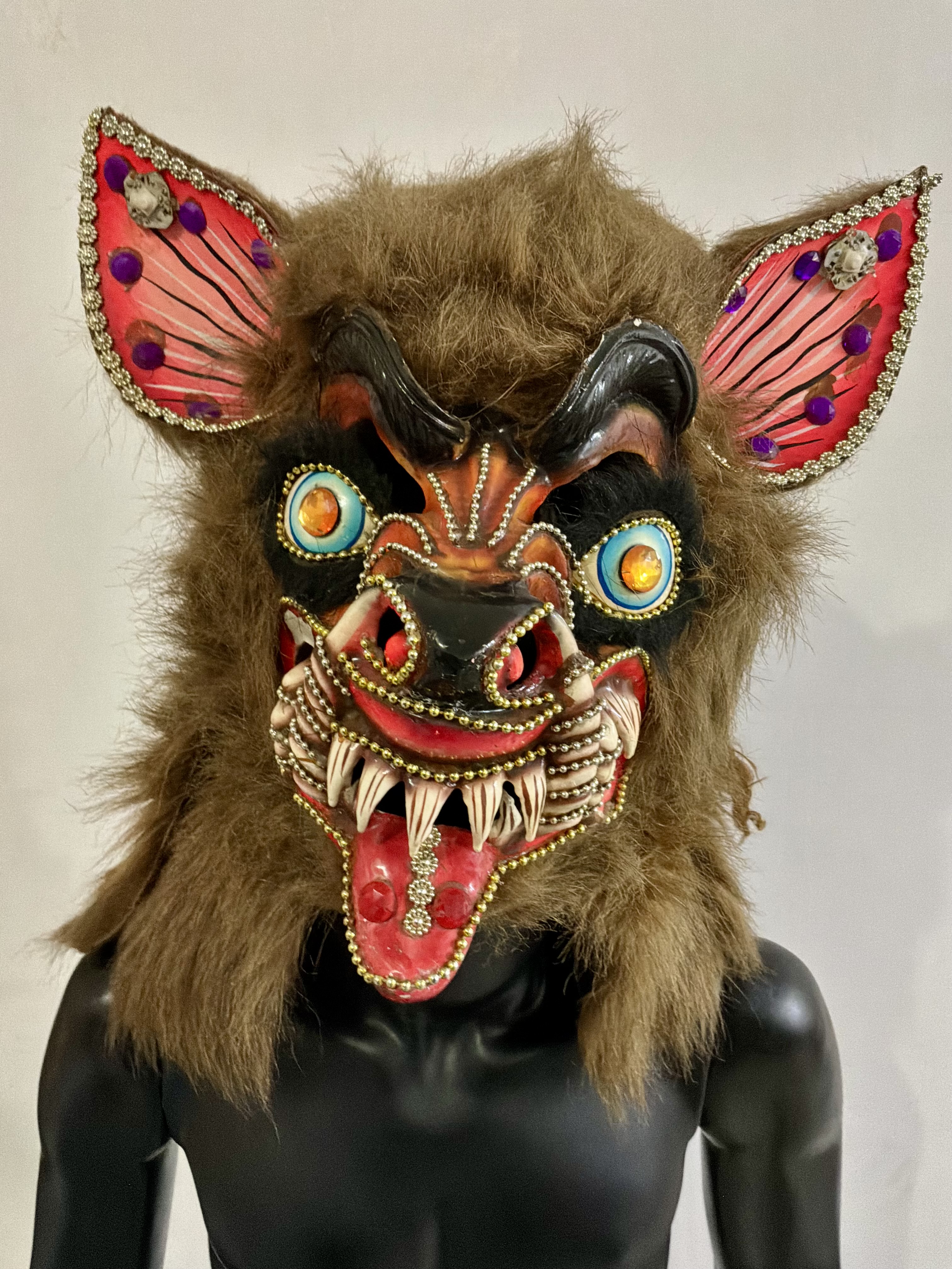
Carnival mask, MUSEF La Paz, Bolivia
*an ongoing series of quotations – mostly from artists, to artists – that offers wisdom, inspiration, and advice for the sometimes lonely road we are on.
Several observers have commented that Saint Michael seems “pallid and emasculated” compared to the fearsome devils that oppose him. During the dancing that filled the parade ground immediately before and after the play’s performance, Michael was visually outshone and vastly outnumbered. While a few archangels danced up and down in pink and white, hundreds of devils cavorted in a wild array of colors splashed liberally across their high boots, skintight trousers, beaded capes and tunics, long wigs, and monstrous masks. Their masks are among the most complex headpieces in the festive world: “bulging, billiard-ball eyes studded with bright artificial stones and huge grinning silver teeth, hideously pointed, leer grotesquely out of an exuberant triangle of horns and ears and tusks, painted in a wild cacophony of colors, and crowned by a three-headed viper or other misshapen reptile.” Some masks are crowned with whole stuffed condors. No two masks are alike. Dancing alongside the devils, a number of China Supays provocatively swing their hips and twirled their skirts. The odds were stacked against the virtuous archangel. The audience’s eyes were on the devil’s masks and the China Supay’s thighs. Winning the aesthetic war in performance is a common folk means of challenging an officially scripted defeat.
Max Harris in Carnival and Other Christian Festivals: Folk Theology and Folk Performance
Comments are welcome!
Share this:
Posted in 2026, Bolivia, Inspiration, Pearls from Artists, Quotes
Leave a comment
Tags: aesthetic, against, alongside, archangel, artificial, audience, “Carnival and Other Christian Festivals: Folk Theology and Folk Performance”, beaded, billiard-ball, Bolivia, bulging, cacophony, Carnival mask, cavorted, challenging, China Supay, colors, commented, common, compared, complex, condors, crowned, danced, dancing, defeat, devils, emasculated, exuberant, fearsome, festive, filled, grinning, grotesquely, headpieces, hideously, hundreds, immediately, liberally, Max Harris, misshapen, monstrous, MUSEF La Paz, number, observers, officially, oppose, other, outnumbered, outshone, painted, pallid, parade ground, performance, pointed, provocatively, reptile, Saint Michael, scripted, several, silver, skintight, skirts, splashed, stacked, stones, studded, stuffed, thighs, three-headed, triangle, trousers, tunics, twirled, vastly, virtuous, visually, winning