Blog Archives
Pearls from artists* # 467
*an ongoing series of quotations – mostly from artists, to artists – that offers wisdom, inspiration, and advice for the sometimes lonely road we are on.
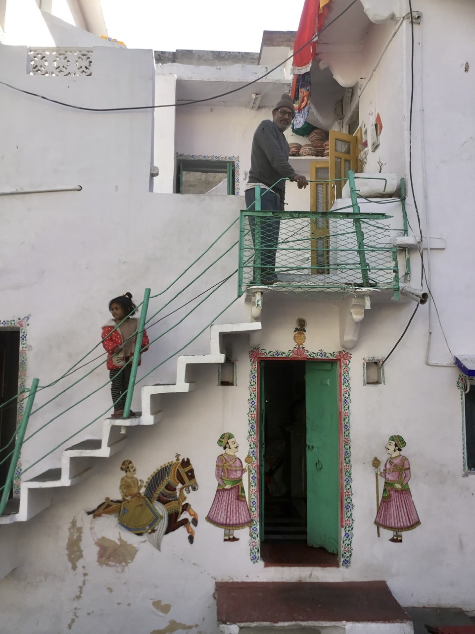
As students confronted with images of India through film and photography, we are challenged to begin to be self-conscious of who we are as “seers.” Part of the difficulty of entering the world of another culture, especially one with as intricate and elaborate a visual articulation as India’s, is that, for many of us, there are no “manageable models.” There are no self-evident ways of recognizing the shapes and forms of art, iconography, ritual life and daily life that we see. Who is Śiva, dancing wildly in a ring of fire? What is happening when the priest pours honey and yogurt over the image of Viṣṇu? Why does the woman touch the feet of the ascetic beggar? For those who enter the visible world of India through the medium of film, the onslaught of strange images raises a multitude of questions. These very questions should be the starting point for our learning. Without such self-conscious questions, we cannot begin to “think” with what we see and simply dismiss it as strange. Or worse, we are bound to misinterpret what we see by placing it solely within the context of what we already know from our own world of experience.
Diana L. Eck in Darsan: Seeing the Divine Image in India
Comments are welcome!
Pearls from artists* # 358
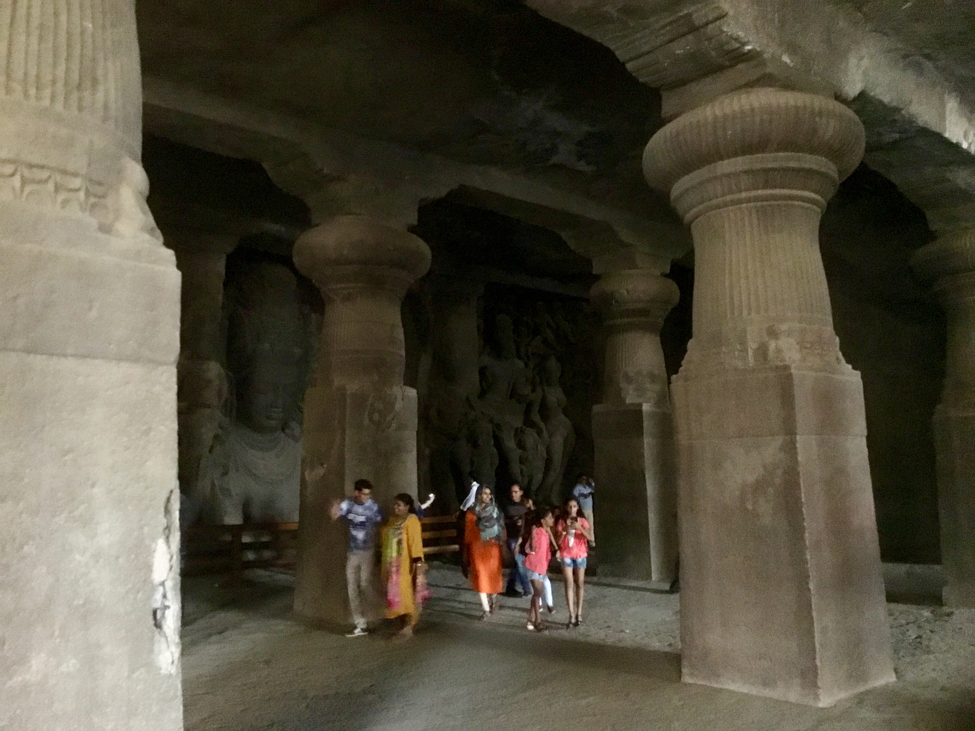
Elephanta Caves, India
*an ongoing series of quotations – mostly from artists, to artists – that offers wisdom, inspiration, and advice for the sometimes lonely road we are on.
According to [Rudolph] Arnheim, the way in which we reach out for and grasp the “object we see, either in our immediate range of perception or through the medium of photography, is dependent upon who we are and what we recognize from past experience.” The visual imprint of an image, an object, or a scene upon the eye is not at all “objective.” In the image-making process of thinking, we see, sort, and recognize according to the visual phenomenology of our own experience. What people notice in the “same” image – be it an image of a dancing Siva or a film of a Hindu festival procession – depends to some extent on what they can recognize from the visual experience of the past. In the case of film, of course, it also depends on what the photographer has seen and chosen to show us. Arnheim writes that the eye and the mind, working together in the process of cognition, cannot simply note down images that are “already there.” “We find instead that direct observation, far from being a mere ragpicker, is an exploration of the form-seeking, form-imposing mind, which needs to understand but cannot until it casts what it sees into manageable models.”
Diana L. Eck in Darsan: Seeing the Divine Image in India
Comments are welcome!
Q: What does a pastel feel like in your hand?
With “Prophecy,” 70” x 50,” at Westbeth Gallery
A: Each manufacturer uses distinct binders to hold the raw pigment together to form a pastel stick. Due mainly to this binder, each pastel feels slightly different. Rembrandts are medium-hard and I generally use them for the first few layers. The black backgrounds of my pastel paintings are achieved by layering lots of Rembrandt black.
I enjoy using Unison because they feel “buttery” as I apply them to the sandpaper. If you’ve been to my studio, you know that I use just about every soft pastel there is! Believe it or not, no two are the same color.
Each pastel has its own qualities and some are harder or more waxy than others. Henri Roche has the widest range of colors and they’re gorgeous! I want them to show so I use them for the final layer, the ‘icing on the cake.”
Comments are welcome!
Q: What is it about soft pastel that you find so intriguing that you use it as your primary fine art medium?

Some of Barbara’s pastels
A: For starters it’s the medium that I fell in love with many years ago. I recently read this article online, “What is Pastel?” by Mike Mahon, and will quote it because it neatly sums up what I love about working with pastel.
Pastel is the most permanent of all media when applied to conservation ground and properly framed. Pastel has no liquid binder that may cause it to oxidize with the passage of time as oftentimes happens with other media.
In this instance, Pastel does not refer to pale colors, as the word is commonly used in cosmetic and fashion terminology. The pure, powdered pigment is ground into a paste with a minimum amount of gum binder, rolled into sticks and dried. The infinite variety of colors in the Pastel palette range from soft and subtle to hard and brilliant.
An artwork is created by stroking the stick of dry pigment across an abrasive ground, embedding the color in the “tooth” of the ground. If the ground is completely covered with Pastel, the work is considered a Pastel painting; whereas, leaving much of the ground exposed produces a Pastel sketch. Techniques vary with individual artists. The Pastel medium is favored by many artists because it allows a spontaneous approach. There is no drying time, therefore, no change in color occurs after drying as it does in other media.
Did you know that a particle of Pastel pigment seen under a microscope looks like a diamond with many facets? It does! Therefore, Pastel paintings reflect light like a prism. No other medium has the same power of color or stability.
Historically, Pastel can be traced back to the 16th century. Its invention is attributed to the German painter, Johann Thiele. A Venetian woman, Rosalba Camera, was the first to make consistent use of Pastel. Chardin did portraits with an open stroke, while La Tour preferred the blended finish. Thereafter, a galaxy of famous artists—Watteau, Copley, Delacroix, Millet, Manet, Renoir, Toulouse Lautrec, Vuillard, Bonnard, Glackens, Whistler, Hassam, William Merritt Chase—used Pastel for a finished work rather than for preliminary sketches.
Pastels from the 16th century exist today, as fresh as the day they were painted. Edgar Degas was the most prolific user of Pastel and its champion. His protégé, Mary Cassat, introduced Pastel to her friends in Philadelphia and Washington, and thus to the United States. In the Spring of 1983, Sotheby Parke Bernet sold at auction, two Degas Pastels for more than $3,000,000 each! Both Pastels were painted about 1880.
Note: Do not confuse Pastel with “colored chalk.” Chalk is a porous, limestone substance impregnated with dyes, whereas, Pastel is pure pigment—the same as is used in other permanent painting media.
Today, Pastel paintings have the stature of oil and watercolor as a major fine art medium. Many of our most renowned, living artists have distinguished themselves in Pastel and have enriched the art world with this beautiful medium.
So knowing all this, I often wonder, why don’t more artists use pastel? Is it because framing is a big issue? Works on paper need to be framed and pastel paintings have unique problems (see my April 27, 2013 blog post). Second only to the cost of maintaining a studio in New York City, frames are my single largest business expense. Sometimes I am grateful that pastel is a very slow medium. I typically finish 4 or 5 paintings in a year, which means I only have to pay for 4 or 5 frames!
Comments are welcome!
Pearls from artists* # 27
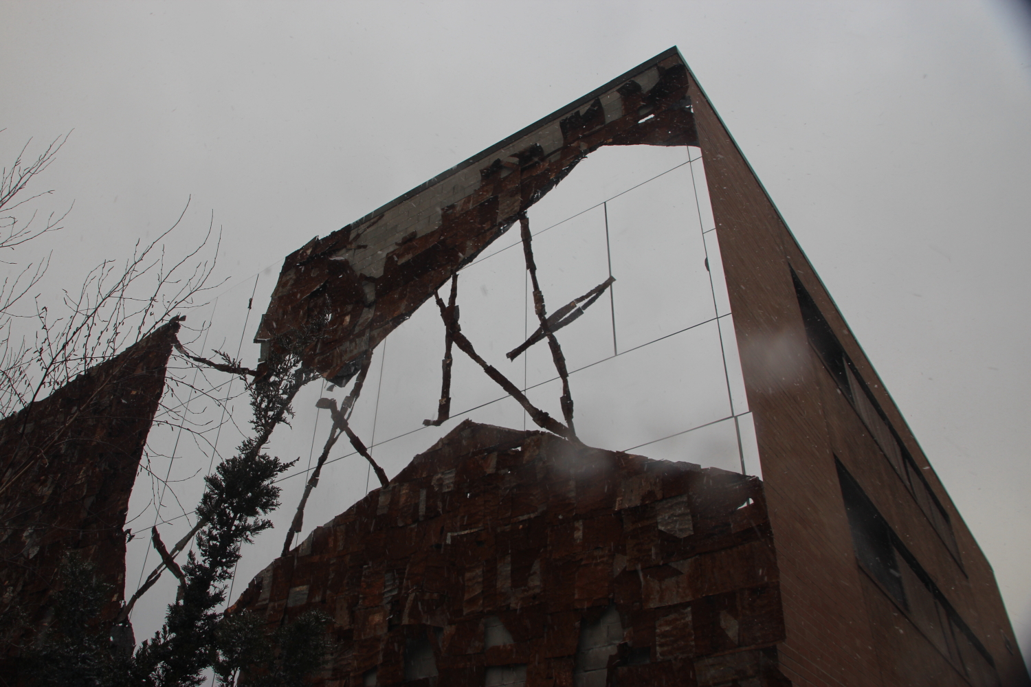
Broken Bridge II, by El Anatsui, on the High Line
* an ongoing series of quotations – mostly from artists, to artists – that offers wisdom, inspiration, and advice for the sometimes lonely road we are on.
Of course, when people said a work of art was interesting, this did not mean that they necessarily liked it – much less that they thought it beautiful. It usually meant no more than that they thought they ought to like it. Or that they liked it, sort of, even though it wasn’t beautiful.
Or they might describe something as interesting to avoid the banality of calling it beautiful. Photography was the art where “the interesting” first triumphed, and early on: the new, photographic way of seeing proposed everything as a potential subject for the camera. The beautiful could not have yielded such a range of subjects; and it soon came to seem uncool to boot as a judgment. Of a photograph of a sunset, a beautiful sunset, anyone with minimal standards of verbal sophistication might well prefer to say, “Yes, the photograph is interesting.”
What is interesting? Mostly, what has not previously been thought beautiful (or good). The sick are interesting, as Nietzsche points out. The wicked, too. To name something as interesting implies challenging old orders of praise; such judgments aspire to be found insolent or at least ingenious. Connoisseurs of “the interesting” – whose antonym is “the boring” – appreciate clash, not harmony. Liberalism is boring, declares Carl Schmitt in The Concept of the Political, written in 1932. (The following year he joined the Nazi Party). A politics conducted according to liberal principles lacks drama, flavor, conflict, while strong autocratic politics – and war – are interesting.
Paolo Dilonardo and Anne Jump, editors, Susan Sontag: At the Same Time
Comments are welcome!

