Blog Archives
Q: How has photography changed your approach to painting?

Untitled chromogenic print, 24″ x 24″ on 30″ x 40″ Fujicolor crystal archives paper, edition of 5
A: From the beginning in the 1980s I used photographs as reference material and my late husband, Bryan, would shoot 4” x 5” negatives of my elaborate setups using his Toyo-Omega view camera. In those days I rarely picked up a camera except when we were traveling.
After Bryan was killed on 9/11, I inherited his extensive camera collection – old Nikons, Leicas, Graphlex cameras, etc. – and I wanted to learn how to use them. Starting in 2002 I enrolled in a series of photography courses (about 10 over 4 years) at the International Center of Photography in New York. I learned how to use all of Bryan’s cameras and how to make my own big color prints in the darkroom.
Along the way I discovered that the sense of composition and color I had developed over many years as a painter translated well into photography. The camera was just another medium with which to express my ideas. Astonishingly, in 2009 I had my first solo photography exhibition in New York.
It’s wonderful to be both a painter and a photographer. Pastel painting will always be my first love, but photography lets me explore ideas much faster than I ever could as a painter. Paintings take months of work. Photographs – from the initial impulse to create a setup to hanging a framed chromogenic print on the wall – can be made in minutes.
Comments are welcome!
Q: Why do you make art?

“Why Do I Make Art” by Ursula von Rydingsvard
A: Last spring I viewed Ursula von Rydingsvard’s exhibition at the National Museum of Women in the Arts. One thing that stayed with me is her wall text, “Why Do I Make Art by Ursula von Rydingsvard” in which she listed a few dozen benefits that art-making has brought to her life.
I want to share some of my own personal reasons here, in no particular order. My list keeps changing, but these are true at least for today.
1. Because I love the entire years-long creative process – from foreign travel whereby I discover new source material, to deciding what I will make, to the months spent in the studio realizing my ideas, to packing up my newest pastel painting and bringing it to my Virginia framer’s shop, to seeing the framed piece hanging on a collector’s wall, to staying in touch with collectors over the years and learning how their relationship to the work changes.
2. Because I love walking into my studio in the morning and seeing all of that color! No matter what mood I am in, my spirit is immediately uplifted.
3. Because my studio is my favorite place to be… in the entire world. I’d say that it is my most precious creation. It’s taken more than twenty-two years to get it this way. I hope I never have to move!
4. Because I get to listen to my favorite music all day or to Public Radio stations.
5. Because when I am working in the studio, if I want, I can tune out the world and all of it’s urgent problems. The same goes for whatever personal problems I am experiencing.
6. Because I am devoted to my medium. How I use pastel continually evolves. It’s exciting to keep learning about its properties and to see what new techniques will develop.
7. Because I have been given certain gifts and abilities and that entails a sacred obligation to USE them. I could not live with myself were I to do otherwise.
8. Because art-making gives meaning and purpose to my life. I never wake up in the morning wondering, how should I spend the day? I have important work to do and a place to do it. I know this is how I am supposed to be spending my time on earth.
9. Because I have an enviable commute. To get to my studio it’s a thirty-minute walk, often on the High Line early in the morning before throngs of tourists have arrived.
10. Because life as an artist is never easy. It’s a continual challenge to keep forging ahead, but the effort is also never boring.
11. Because each day in the studio is different from all the rest.
12. Because I love the physicality of it. I stand all day. I’m always moving and staying fit.
13. Because I have always been a thinker more than a talker. I enjoy and crave solitude. I am often reminded of the expression, “She who travels the farthest, travels alone.” In my work I travel anywhere.
14. Because spending so much solitary time helps me understand what I think and feel and to reflect on the twists and turns of my unexpected and fascinating life.
15. Because I learn about the world. I read and do research that gets incorporated into the work.
16. Because I get to make all the rules. I set the challenges and the goals, then decide what is succeeding and what isn’t. It is working life at its most free.
17. Because I enjoy figuring things out for myself instead of being told what to do or how to think.
18. Because despite enormous obstacles, I am still able to do it. Art-making has been the focus of my life for thirty-three years – I was a late bloomer – and I intend to continue as long as possible.
19. Because I have been through tremendous tragedy and deserve to spend the rest of my life doing exactly what I love. The art world has not caught up yet, but so be it. This is my passion and my life’s work and nothing will change that.
20. Because thanks to the internet and via social media, my work can be seen in places I have never been to and probably will never go.
21. Because I would like to be remembered. The idea of leaving art behind for future generations to appreciate and enjoy is appealing.
Comments are welcome!
Q: Do you plan your work in advance or is it improvisation?
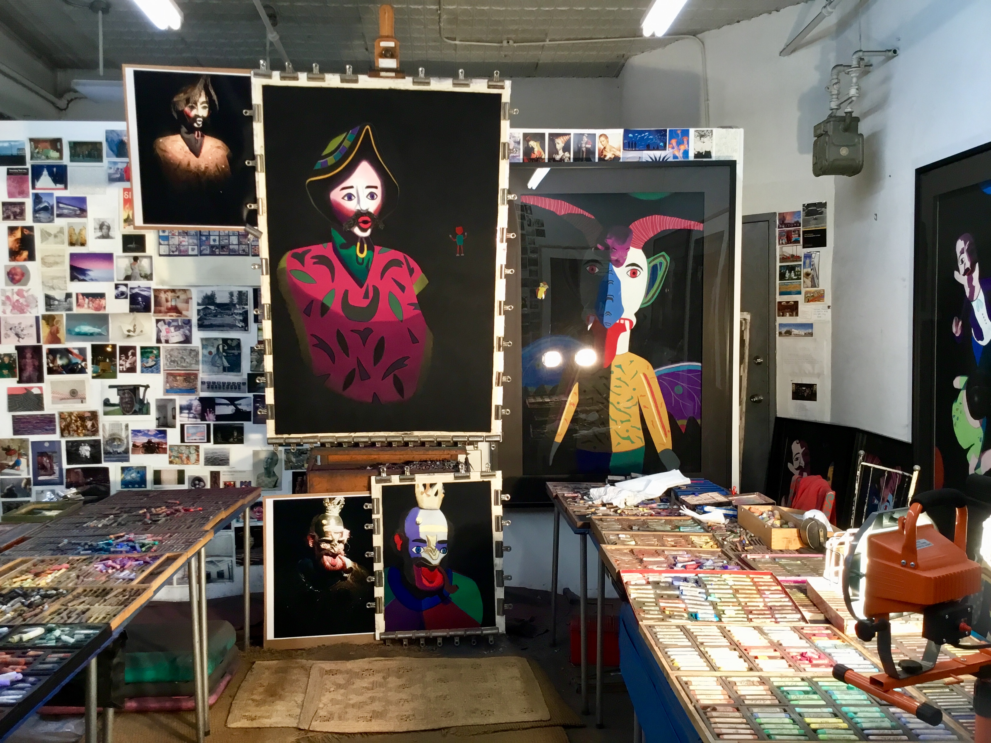
Barbara’s studio
A: My process is somewhere in between those two. I work from my own set-up or on-site photographs and make a preliminary sketch in charcoal before I start a pastel painting. Thousands of decisions about composition, color, etc. occur as I go along.
Although it starts out somewhat planned, I have no idea what a pastel painting will look like when it’s finished. Each piece takes about three months, not counting foreign travel, research, and a gestation period of several months to determine what the next pastel painting will even be.
Comments are welcome!
Q: What is more important to you, the subject of the painting or the way it is executed?

“Sam and Bobo,”soft pastel on sandpaper, 36″ x 31”, 1989
A: In a sense my subject matter – folk art, masks, carved wooden animals, papier mâché figures, toys – chose me. With it I have complete freedom to experiment with color, pattern, design, and other formal properties. In other words, although I am a representational artist, I can do whatever I want since the depicted objects need not look like real things. Execution is everything now.
This was not always the case. I started out in the 1980s as a traditional photorealist, except I worked in pastel on sandpaper. (For example, see the detail in Sam’s sweater above). As I slowly learned and mastered my craft, depicting three-dimensional people and objects hyper-realistically in two dimensions on a piece of sandpaper was thrilling… until one day it wasn’t.
My personal brand of photorealism became too easy, too limiting, too repetitive, and SO boring to execute! In 1989 I had at last extricated myself from a dull career as a Naval officer working in Virginia at the Pentagon. Then after much planning, in 1997 I was a full-time professional artist working in New York.
Certainly I was not going to throw away this opportunity by making boring photorealist art. I wanted to do so much more as an artist: to experiment with techniques, with composition, to see what I could make pastel do, to let my imagination play a larger role in the paintings I made. I was ready to devote the time and do whatever it took to push my art further.
After spending the early creative years perfecting my technical skills, I built on what I had learned. I began breaking rules – slowly at first – in order to push myself onward. And I continue to do so, never knowing what’s next. Hopefully, in 2018 my art is richer for it.
Comments are welcome!
Pearls from artists* # 282

“The Champ,” soft pastel on sandpaper, 26″ x 20″
*an ongoing series of quotations – mostly from artists, to artists – that offers wisdom, inspiration, and advice for the sometimes lonely road we are on.
The longstanding, at one time almost universal, dismissal of one of the greatest artists of the twentieth century as essentially decorative and superficial is based, at any rate in part, on a simplistic response to the poise, clarity and radiant colour of Matisse’s work that fails to take account of the apprehensive and at times anguished emotional sensibility from which it sprang.
Hilary Spurling in Matisse the Master, A Life of Henri Matisse: The Conquest of Colour, 1909 – 1954
Comments are welcome!
Q: Would you talk about a few of the technical properties that made pastel your medium of choice?
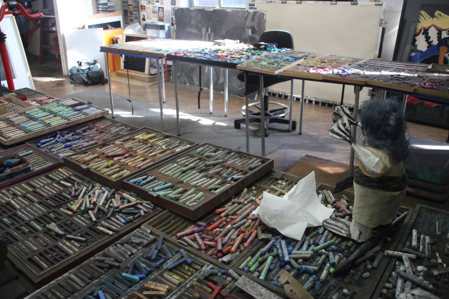
Barbara’a pastels
A: Pastel is a time-tested medium that has been in use for five hundred years. I fell in love with it nearly thirty years ago and it has been my primary medium ever since.
Pastel is known to be the most permanent of all media. It has no liquid binder that might cause oxidizing with the passage of time as often happens with other painting media. Pastel colors are intense because they are the closest artists get to working with pure pigment. Artists throughout history have generally favored pastel because it allows a spontaneous approach with no drying time and no change of color.
Comments are welcome!
Q: Would you talk about your use of Mexican and Guatemalan folk art as a convenient way to study formal properties such as color, shape, pattern, composition, etc. in your pastel paintings?
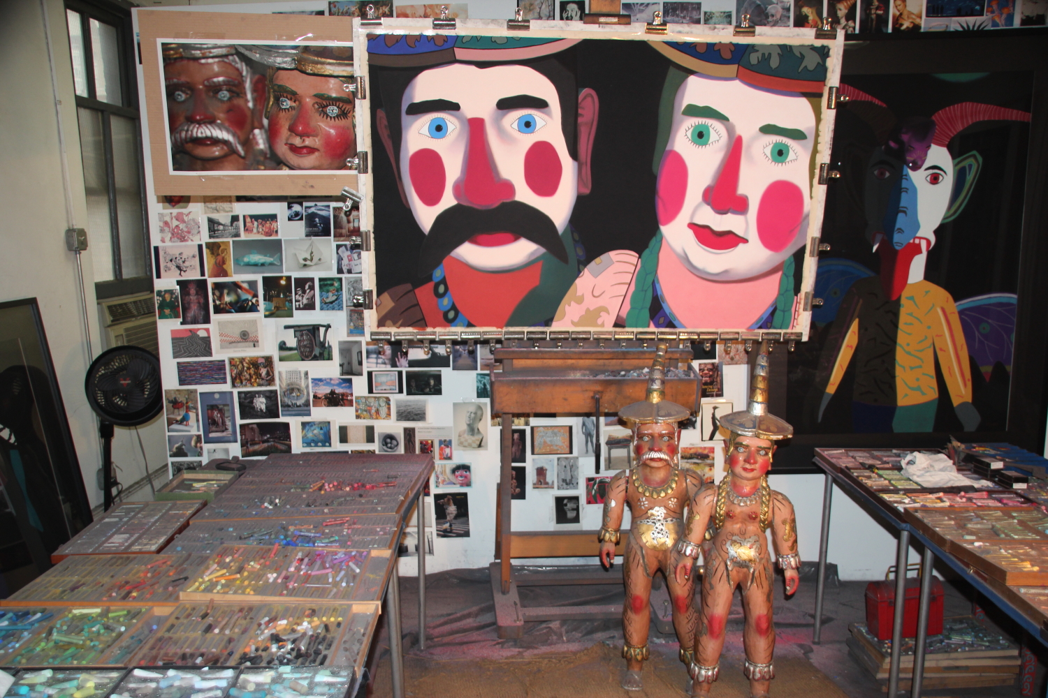
Models, reference photograph, and pastel painting in progress
A: For me an interesting visual property of these objects is that they readily present themselves as a vehicle for exploring formal artistic properties, like color, pattern, shape, etc. especially compared to my earlier subject matter: hyper-realistic portraits and still-lifes. Intent as I was on creating verisimilitude in the earlier work, there was little room for experimentation.
Many Mexican and Guatemalan folk art objects are wildly painted and being a lover of color, their brilliant colors and patterns are what initially attracted me. As a painter I am free to use their actual appearance as my starting point. I photograph them out-of-focus and through colored gels in order to change their appearance and make them strange, enacting my own particular version of “rendering the familiar strange.” Admittedly these objects are not so familiar to begin with.
When I make a pastel painting I look at my reference photograph and I also look at the objects, positioning them within eye-shot of my easel. There is no need whatsoever to be faithful to their actual appearance so my imagination takes over. As I experiment with thousands of soft pastels, with shape, with pattern, with composition, and all the rest, I have one goal in mind – to create the best pastel-on-sandpaper painting I am capable of making.
Comments are welcome!
Pearls from artists* # 141

Painting, subject, reference photo
* an ongoing series of quotations – mostly from artists, to artists – that offers wisdom, inspiration, and advice for the sometimes lonely road we are on.
It would be very interesting to record photographically not the stages of a painting, but its metamorphoses. One would see perhaps by what course a mind finds its way towards the crystallization of its dream. But what is really very curious is to see that the picture does not change basically, that the initial vision remains almost intact in spite of appearances. I see often a light and dark, when I have put them in my picture, I do everything I can to ‘break them up,’ in adding a color that creates a counter effect. I perceive, when this work is photographed, that which I have introduced to correct my first vision has disappeared, and that after all the photographic image corresponds to my first vision, before the occurrence of the transformation brought about by my will.
The picture is not thought out and determined beforehand, rather while it is being made it follows the mobility of thought. Finished, it changes further, according to the condition of him who looks at it. A picture lives its life like a living creature, undergoing the changes that daily life imposes on us. That is natural, since a picture lives only through him who looks at it.
Christian Zervos: Conversation with Picasso in The Creative Process, edited by Brewster Ghiselin
Comments are welcome!
Q: How do you achieve such richness of color in your pastel-on-sandpaper paintings?
“Motley,” soft pastel on sandpaper, 38″ x 58″
A: This results from the several months of studio time and many layers of soft pastel that go into creating each painting. In a sense my technique is analogous to glazing done by the Old Masters. They slowly built up layers of thin paint to achieve a high degree of finish. Colors were not mixed physically, but optically. I gradually build up layers of soft pastel, as many as 30, to create a pastel painting. After a color is applied, I blend it with my fingers and push it into the sandpaper’s tooth. It mixes with the color beneath to create a new color, continually adding richness, saturation, and intensity to the overall painting.
Comments are welcome!
Q: In January you traveled to south India to study ancient Hindu temples. Would you share some photographs from your trip?
A: Yes, I spent three weeks in south India. Having embarked from brown and gray New York City in winter, I was quite stunned by all of the gorgeous color. Since I already posted many photos onto my Facebook and Pinterest pages (see links on sidebar), I will focus on Madurai, perhaps the most photogenic city I visited.

Tirumalai Nayaka Palace, Madurai

Tirumalai Nayaka Palace, Madurai

Madurai

Madurai

Madurai

Madurai

Madurai

Madurai

Meenaksi Sundaresvarar Temple, Madurai

Meenaksi Sundaresvarar Temple, Madurai

Outside Meenaksi Sundaresvarar Temple, Madurai
Comments are welcome!

