Blog Archives
Travel photo of the month*

Lake Titicaca from Isla de La Luna, Bolivia
*favorite travel photos that have not yet appeared on this blog
What I love about this photo, besides the fact that you can see for miles in clear, gorgeous light at 12,000’, is that cactus and snow-covered Andean peaks are visible in the same image.
Comments are welcome!
Pearls from artists* # 649

*an ongoing series of quotations – mostly from artists, to artists – that offers wisdom, inspiration, and advice for the sometimes lonely road we are on.
Some of us spend our entire creative lives digging at the buried parts of ourselves to solve unknown mysteries that we are not even aware of. Unearthing those aspects is not an easy process, because our true psychic reality does not lie in our daily waking thoughts. It exists in the unconscious, in the form of an unfathomable, nonverbal sensory language, one that is so complex and runs so deep that we can only grasp at it, to attain small, amorphous bits. These bits can take any form, even uncharacteristic, surprising ones. We access, process, and finally transform them into what Saint Augustine called ‘visible signs of invisible realities.’
Kate Kretz in Art From Your Core: A Holistic Guide to Visual Voice”
Comments are welcome!
Q: How do you feel about the fact that more people view an artist’s work online than ever see it in person?

A: This has been a dilemma for decades. Don’t get me wrong. Artists are indeed fortunate to have alternative ways to share our art, such as on the internet, but there is just no substitute for seeing art in person! I remember friends telling me about a review of a Nan Goldin exhibition that said, “All of the pleasure circuits are fired in looking.” That rarely happens when you view art online. Yet this is how most people experience our work – at a remove and on a small screen.
Nowadays, a global audience will see art on their phones instead of in our studios or in a gallery or museum. My pastel paintings are quite large and very detailed so when people finally see them in person, they are often surprised. They had gotten used to seeing them in a much smaller scale online, where very few of the meticulous and subtle details I incorporate into them are visible.
Comments are welcome!
Pearls from artists* # 560

*an ongoing series of quotations – mostly from artists, to artists – that offers wisdom, inspiration, and advice for the sometimes lonely road we are on.
In describing her technique, Joan [Mitchell] once said, “I don’t go off and slop and drip. I ‘stop, look, and listen!’ at railroad tracks. I really want to be accurate.” One can imagine every stroke applied, every drizzle of pigment – both those visible in the finished work and those buried beneath its many layers – being the result of just such consideration. The majesty of Joan’s painting, which she would call City Landscape, was a quality it shared with all great art – the sense that it had always existed, and that during one inspired moment it had been dredged from the subconscious depths by a hand and mind graced with the talent and vision to retrieve it for the rest of us. That revealing work, so exuberant, so deep, so masterful, and so unlike the shards and violent explosions that had been her signature, was the result of Joan’s having survived a personal hell and her own imperfections. It was her prize for having persevered, and all who saw it were the beneficiaries.
Mary Gabriel in Ninth Street Women
Comments are welcome!
Q: Can you explain how you choose colors? (Question from Maria Cox via Instagram)

A: I am wild about color! As I work to create a pastel painting, I apply a color, back up from my easel to see how it interacts with and affects the rest of the painting, and then I make revisions. This process necessitates countless color changes and hundreds of hours during months of work. I apply pastel using a meticulous layering process. Were you to x-ray one of them, the earlier, discarded versions of a pastel painting would be visible. All the while I carefully fine-tune and refine how the colors and shapes interact with each other.
The goal is to make an exciting painting that no one, especially me as the maker, has ever seen before. I have no desire to repeat myself, to make art that resembles work by any other artist, or to be forced into a niche.
I try to select intense, vibrant colors that are exciting to look at, that work well in relationship to each other, and that will grab the viewer. Sometimes I deliberately choose colors for their symbolic meanings. For example, I selected a dark purple for the alternating triangles (the ones with the pink dots above) in “Overlord” because purple denotes royalty.
I have been working with soft pastel for 37 years so I have a fairly intricate science of color at my disposal. No doubt, many unconscious factors are at play, too. More on that in future posts.
Comments are welcome!
Q: There are so many instances in the art world where paintings are discovered to be fakes. Do you think this is a potential problem where your work is concerned? Can your pastel paintings be forged?


A: For the record, a little-appreciated fact about my pastel-on-sandpaper paintings is that they can never be forged. To detect a fake, you would only need to x-ray them. If dozens of layers of revisions are not visible under the final pastel painting, you are not looking at an original Rachko, period.
My completed paintings are the results of thousands of decisions. They are the product of an extremely meticulous, labor-intensive, and self-invented process. This is the difference between spending months thinking about and creating a painting, as I do, or a single day. It’s highly doubtful that my rigorous creative process can EVER be duplicated.
Comments are welcome!
Pearls from artists* # 467
*an ongoing series of quotations – mostly from artists, to artists – that offers wisdom, inspiration, and advice for the sometimes lonely road we are on.
As students confronted with images of India through film and photography, we are challenged to begin to be self-conscious of who we are as “seers.” Part of the difficulty of entering the world of another culture, especially one with as intricate and elaborate a visual articulation as India’s, is that, for many of us, there are no “manageable models.” There are no self-evident ways of recognizing the shapes and forms of art, iconography, ritual life and daily life that we see. Who is Śiva, dancing wildly in a ring of fire? What is happening when the priest pours honey and yogurt over the image of Viṣṇu? Why does the woman touch the feet of the ascetic beggar? For those who enter the visible world of India through the medium of film, the onslaught of strange images raises a multitude of questions. These very questions should be the starting point for our learning. Without such self-conscious questions, we cannot begin to “think” with what we see and simply dismiss it as strange. Or worse, we are bound to misinterpret what we see by placing it solely within the context of what we already know from our own world of experience.
Diana L. Eck in Darsan: Seeing the Divine Image in India
Comments are welcome!
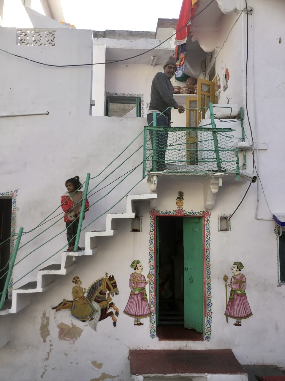
Pearls from artists* # 357
Udaipur, India
*an ongoing series of quotations – mostly from artists, to artists – that offers wisdom, inspiration, and advice for the sometimes lonely road we are on.
The term hermeneutics has been used to describe the task of understanding and interpreting ideas and texts. In a similar way, we need to set for ourselves the task of developing a hermeneutic of the visible, addressing the problem of how we understand and interpret what we see, not only in the classical images and art forms created by the various religious traditions, but in the ordinary images of people’s traditions, rites, and daily activities which are presented to us through the film-image.
Rudolph Arnheim, in his extensive work on visual perception, has shown that the dichotomy between seeing and thinking which runs through much of the Western tradition, is a very problematic one. In Visual Thinking, he contends that visual perception is integrally related to thought. It is not the case, according to Arnheim, that the eyes present a kind of raw data to the mind which, in turn, processes it and refines it by thought. Rather, those visual images are the shapers and bearers of thought. Jan Gonda, in writing on the Vedic notion dhi, sometimes translated as “thought,” finds similarly that the semantic fields of the word in Vedic literature does not correspond as much to our words for “thinking” as it does to our notions of “insight,” “vision,” and “seeing.” Suzanne Langer has also written of the integral relation of thought to the images we see in the “mind’s eye.” The making of all of those images is the fundamental “imaginative” human activity. One might add that it is the fundamental activity of the religious imagination as well. She writes, “Images are, therefore, our readiest instruments for abstracting concepts from the tumbling streams of actual impressions.”
Diana L. Eck in Darsan: Seeing the Divine Image in India
Comments are welcome!
Pearls from artists* # 349
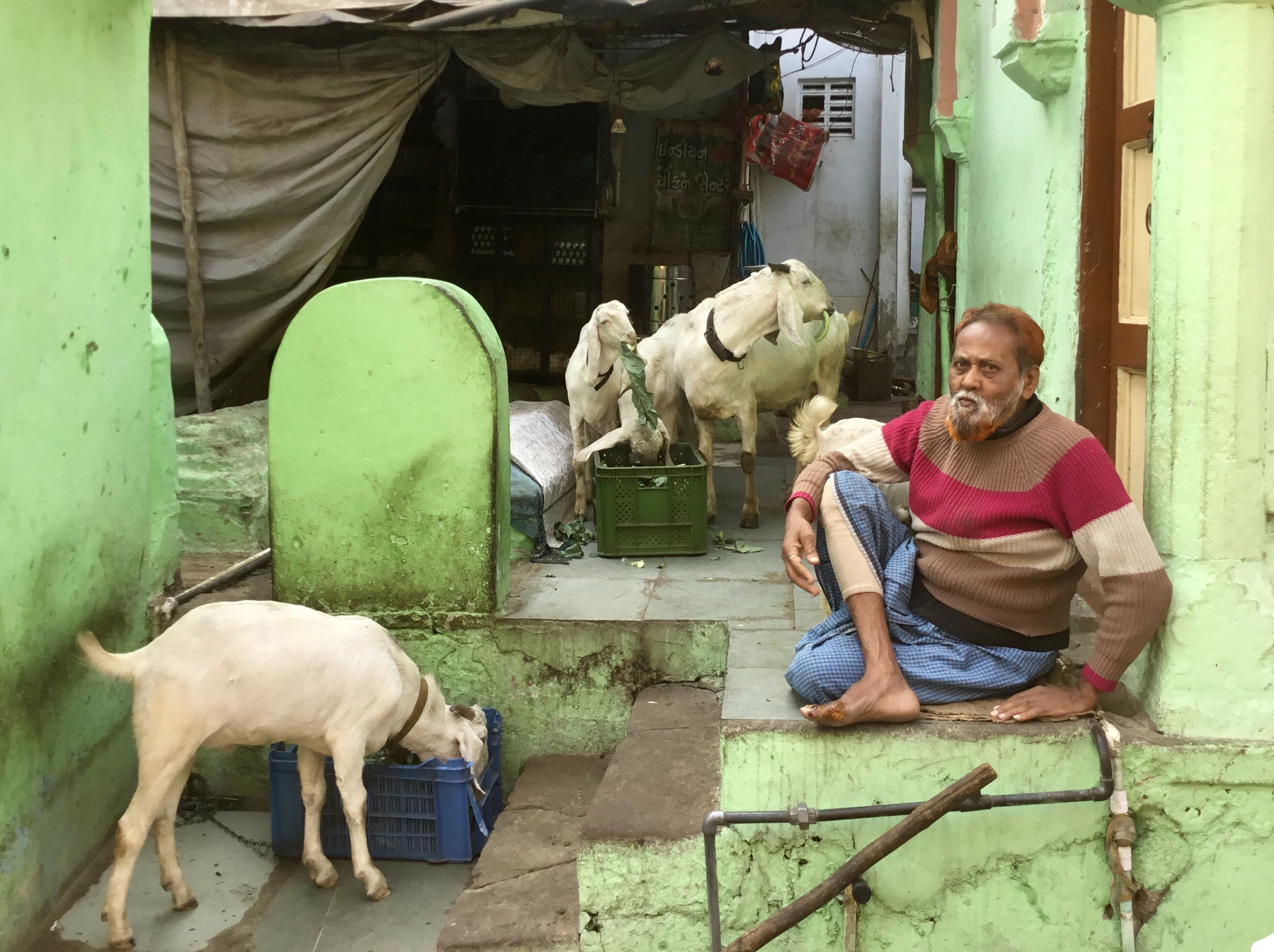
Ahmedabad, India
*an ongoing series of quotations – mostly from artists, to artists – that offers wisdom, inspiration, and advice for the sometimes lonely road we are on.
India presents to the visitor an overwhelmingly visual impression. It is beautiful, colorful, sensuous. It is captivating and intriguing, repugnant and puzzling. It combines the intimacy and familiarity of English four o’clock tea with the dazzling foreignness of carpisoned elephants or vast crowds bathing in the Ganga during an eclipse. India’s display of multi-armed images, it’s processions and pilgrimages, it’s beggars and kings, it’s street life and markets, it’s diversity of peoples – all appear to the eye in a kaleidoscope of images. Much that is removed from public view in the modern West and taken into the privacy of rest homes, asylums, and institutions is open and visible in the life of an Indian city or village. The elderly, the infirm, the dead awaiting cremation – these sights, while they may have been expunged from the childhood palace of the Buddha, are not isolated from the public eye in India. Rather, they are present daily in the visible world in which Hindus, and those who visit India, move in the course of ordinary activities. In India, one sees everything. One sees people at work and at prayer; one sees plump, well-endowed merchants, simple renouncers, fraudulent “holy” men, frail widows, and emaciated lepers; one sees the festival procession, the marriage procession, and the funeral procession. Whatever Hindus affirm of the meaning of life, death, and suffering, they affirm with their eyes wide open.
Diana L. Eck in Darsan: Seeing the Diving Image in India
Comments are welcome!
Pearls from artists* # 154
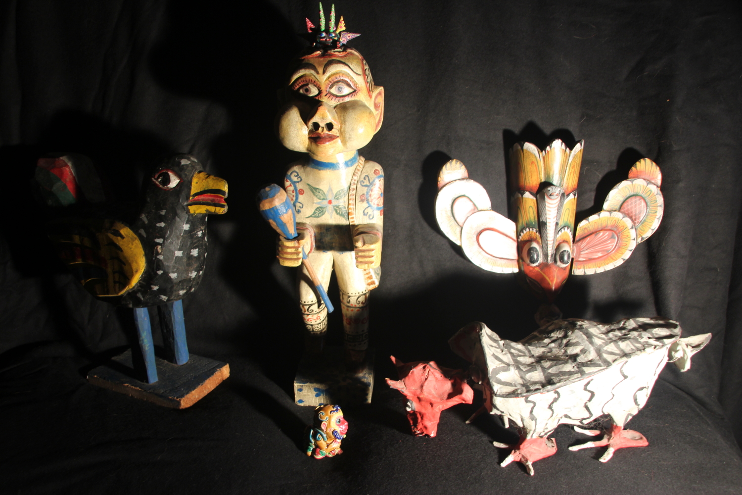
Idea for a painting
* an ongoing series of quotations – mostly from artists, to artists – that offers wisdom, inspiration, and advice for the sometimes lonely road we are on.
Often the public forms an idea of inspiration that is quite false, almost a religious notion. Alas! I do not believe that inspiration falls from heaven. I think it rather the result of a profound indolence and of our incapacity to put to work certain forces in ourselves. These unknown forces work deep within us, with the aid of the elements of daily life, its scenes and passions, and, they burden us and oblige us to conquer the kind of somnolence in which we indulge ourselves like invalids who try to prolong dream and dread resuming contact with reality, in short when the work that makes itself in us and in spite of us demands to be born, we can believe that this work comes to us from beyond and is offered by the gods. The artist is more slumberous in order that he shall not work. By a thousand ruses, he prevents his nocturnal work from seeing the light of day.
For it is at the moment that consciousness must take a precedence and that it becomes necessary to find the means which permit the unformed work to take form, to render it visible to all. To write, to conquer ink and paper, accumulate letters and paragraphs, divide them with periods and commas, is a different matter than carrying the dream of a play or of a book.
Jean Cocteau: The Process of Inspiration in The Creative Process, edited by Brewster Ghiselin
Comments are welcome!

