Blog Archives
Q: Why do you prefer not to explain your titles and imagery?
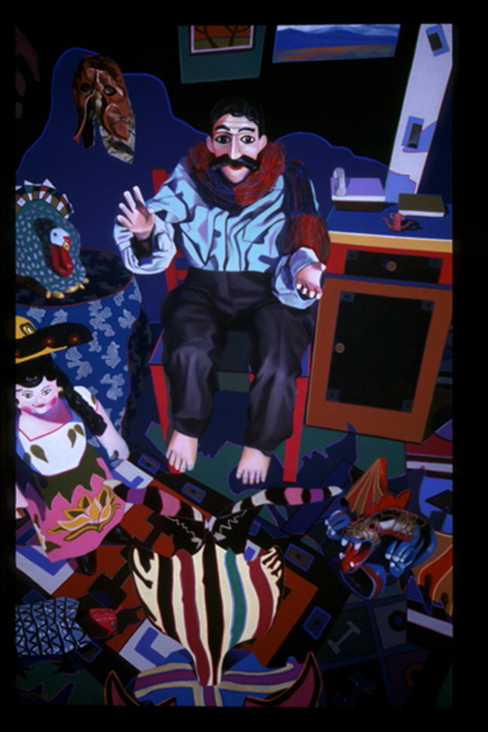
“Truth Betrayed by Innocence,” soft pastel on sandpaper, 58″ x 38″
A: It’s mainly because answers close down imagination and creativity. I enjoy hearing alternative interpretations of my pastel paintings. People are wildly imaginative and each person brings unique insights to their art viewing. By leaving meanings open, conversation is generated. Most artists want viewers to talk about their work.
Once at a public artist’s talk that I attended, I was told by an artist that my interpretation of her title was completely wrong. First of all, how can an interpretation honestly expressed by your audience be “wrong?” Art is as open to interpretation as a Rorschach test (art IS a kind of Rorshach test). Then she explained the thinking behind her title and succeeded in cutting off all further conversation. I felt belittled. Later several people told me that my interpretation was much more compelling. Still, the experience was mortifying and I hope to never do that to anyone.
Comments are welcome!
Pearls from artists* # 138

A corner of Barbara’s studio
* an ongoing series of quotations – mostly from artists, to artists – that offers wisdom, inspiration, and advice for the sometimes lonely road we are on.
BM: … so many artists value the sense of retaining something of the child, like the strangeness that children have where they’ll just make a gesture or say something that we filter as adults.
MM: Sometimes people think that it is childish, but it’s not, it is child-like. People get confused. One of the things we are trying to do as artists – it’s not romantic – is to get to a point where we are seeing things in a fresh way, in a way that we’ve never seen them before, the way children do. So we are acknowledging the magic in every moment we have.
BM: And it’s not a form of nostalgia, but the history of an entire human being.
MM: Exactly. Rather than nostalgia it is teaching us how to be present.
Conversations with Meredith Monk by Bonnie Marranca
Comments are welcome!
Pearls from artists* # 105

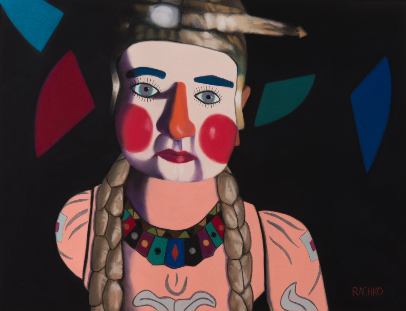
“Blind Faith,” 38″ x 58″, soft pastel on sandpaper
* an ongoing series of quotations – mostly from artists, to artists – that offers wisdom, inspiration, and advice for the sometimes lonely road we are on.
Serendipitously, I read two memoirs in close proximity, Julia Child’s account of her life in France and how she learned to be a first-rate cook, and Renee Fleming’s story of becoming a world-class opera diva. While there were many differences between the women and the skills they set out to master, I was struck in both books by how extraordinarily hard each one worked in private for years and years before going public, certainly before becoming famous, and how each managed shame. Both women loved what they did and thus brought to bear a similar, and I suspect key, willingness to stay with their efforts through eons of study, practice, and improvement. Both had the ability to hear criticism and to make corrections repeatedly without becoming terminally discouraged; to bear the anxiety of their efforts; neither was too proud to learn and keep learning. This willingness to be taught and corrected, without feeling ashamed, sometimes over and over again, is a huge asset when you are seeking to do something very well. And one way shame impedes people is by making them take criticism too personally – as about them rather than about what they’re trying to learn.
Janna Malamud Smith in An Absorbing Errand: How Artists and Craftsmen Make Their Way to Mastery
Comments are welcome!
Pearls from artists* # 76
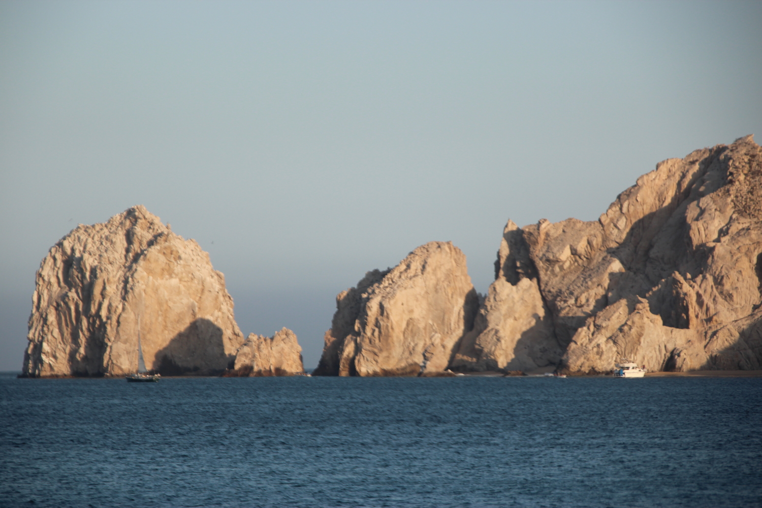
Cabo San Lucas, Mexico
* an ongoing series of quotations – mostly from artists, to artists – that offers wisdom, inspiration, and advice for the sometimes lonely road we are on.
What stops us in our tracks? I am rarely stopped by something or someone I can instantly know. In fact, I have always been attracted to the challenge of getting to know what I cannot instantly categorize or dismiss, whether an actor’s presence, a painting, a piece of music, or a personal relationship. It is the journey towards the object of attraction that interests me. We stand in relation to one another. We long for the relationships that will change our vistas. Attraction is an invitation to an evanescent journey, to a new way of experiencing life or perceiving reality.
An authentic work of art embodies intense energy. It demands response. You can either avoid it, shut it out, or meet it and tussle. It contains attractive and complicated energy fields and a logic all its own. It does not create desire or movement in the receiver, rather it engenders what James Joyce labeled ‘aesthetic arrest.’ You are stopped in your tracks. You cannot easily walk by it and go on with your life. You find yourself in relation to something that you cannot readily dismiss.
Anne Bogart in A Director Prepares: Seven Essays on Art and Theater
Comments are welcome!
Q: What is it about soft pastel that you find so intriguing that you use it as your primary fine art medium?

Some of Barbara’s pastels
A: For starters it’s the medium that I fell in love with many years ago. I recently read this article online, “What is Pastel?” by Mike Mahon, and will quote it because it neatly sums up what I love about working with pastel.
Pastel is the most permanent of all media when applied to conservation ground and properly framed. Pastel has no liquid binder that may cause it to oxidize with the passage of time as oftentimes happens with other media.
In this instance, Pastel does not refer to pale colors, as the word is commonly used in cosmetic and fashion terminology. The pure, powdered pigment is ground into a paste with a minimum amount of gum binder, rolled into sticks and dried. The infinite variety of colors in the Pastel palette range from soft and subtle to hard and brilliant.
An artwork is created by stroking the stick of dry pigment across an abrasive ground, embedding the color in the “tooth” of the ground. If the ground is completely covered with Pastel, the work is considered a Pastel painting; whereas, leaving much of the ground exposed produces a Pastel sketch. Techniques vary with individual artists. The Pastel medium is favored by many artists because it allows a spontaneous approach. There is no drying time, therefore, no change in color occurs after drying as it does in other media.
Did you know that a particle of Pastel pigment seen under a microscope looks like a diamond with many facets? It does! Therefore, Pastel paintings reflect light like a prism. No other medium has the same power of color or stability.
Historically, Pastel can be traced back to the 16th century. Its invention is attributed to the German painter, Johann Thiele. A Venetian woman, Rosalba Camera, was the first to make consistent use of Pastel. Chardin did portraits with an open stroke, while La Tour preferred the blended finish. Thereafter, a galaxy of famous artists—Watteau, Copley, Delacroix, Millet, Manet, Renoir, Toulouse Lautrec, Vuillard, Bonnard, Glackens, Whistler, Hassam, William Merritt Chase—used Pastel for a finished work rather than for preliminary sketches.
Pastels from the 16th century exist today, as fresh as the day they were painted. Edgar Degas was the most prolific user of Pastel and its champion. His protégé, Mary Cassat, introduced Pastel to her friends in Philadelphia and Washington, and thus to the United States. In the Spring of 1983, Sotheby Parke Bernet sold at auction, two Degas Pastels for more than $3,000,000 each! Both Pastels were painted about 1880.
Note: Do not confuse Pastel with “colored chalk.” Chalk is a porous, limestone substance impregnated with dyes, whereas, Pastel is pure pigment—the same as is used in other permanent painting media.
Today, Pastel paintings have the stature of oil and watercolor as a major fine art medium. Many of our most renowned, living artists have distinguished themselves in Pastel and have enriched the art world with this beautiful medium.
So knowing all this, I often wonder, why don’t more artists use pastel? Is it because framing is a big issue? Works on paper need to be framed and pastel paintings have unique problems (see my April 27, 2013 blog post). Second only to the cost of maintaining a studio in New York City, frames are my single largest business expense. Sometimes I am grateful that pastel is a very slow medium. I typically finish 4 or 5 paintings in a year, which means I only have to pay for 4 or 5 frames!
Comments are welcome!


Q: Another interesting series of yours that has impressed me is your recent “Black Paintings.” The pieces in this series are darker than the ones in “Domestic Threats.” You create an effective mix between the dark background and the few bright tones, which establish such a synergy rather than a contrast, and all the dark creates a prelude to light. It seems to reveal such a struggle, a deep tension, and intense emotions. Any comments on your choice of palette and how it has changed over time?
Dec 6
Posted by barbararachkoscoloreddust
West 29th Street studio
A: That is a great question!
You are correct that my palette has darkened. It’s partly from having lived in New York for so long. This is a generally dark city. We famously dress in black and the city in winter is mainly greys and browns.
Also, the “Black Paintings” are definitely post-9/11 work. My husband, Bryan, was tragically killed onboard the plane that crashed into the Pentagon. Losing Bryan was the biggest shock I ever have had to endure, made even harder because it came just 87 days after we had married. We had been together for 14 ½ years and in September 2001 were happier than we had ever been. He was killed so horribly and so senselessly. Post 9/11 was an extremely difficult, dark, and lonely time.
In the summer of 2002 I resumed making art, continuing to make “Domestic Threats” paintings. That series ran its course and ended in 2007. Around then I was feeling happier and had come to better terms with losing Bryan (it’s something I will never get over but dealing with loss does get easier with time). When I created the first “Black Paintings” I consciously viewed the background as literally, the very dark place that I was emerging from, exactly like the figures emerging in these paintings. The figures themselves are wildly colorful and full of life, so to speak, but that black background is always there.
Comments are welcome!
Share this:
Posted in 2014, An Artist's Life, Art in general, Art Works in Progress, Black Paintings, Creative Process, Domestic Threats, Inspiration, Painting in General, Pastel Painting, Photography, Studio, Working methods
Comments Off on Q: Another interesting series of yours that has impressed me is your recent “Black Paintings.” The pieces in this series are darker than the ones in “Domestic Threats.” You create an effective mix between the dark background and the few bright tones, which establish such a synergy rather than a contrast, and all the dark creates a prelude to light. It seems to reveal such a struggle, a deep tension, and intense emotions. Any comments on your choice of palette and how it has changed over time?
Tags: after, always, another, around, art, background, better, between, biggest, black, Black Paintings, bright, browns, Bryan, changed, choice, city, colorful, comments, consciously, continuing, contrast, correct, course, crashed, create, dark, dealing, deep, difficult, Domestic Threats, dress, easier, effective, emerging, emotions, ended, endure, establish, exactly, extremely, famously, feeling, figures, first, full, generally, great, greys, happier, harder, horribly, however, husband, impressed, intense, interesting, killed, life, light, literally, lived, lonely, losing, loss, mainly, making, married, mix, New York, onboard, paintings, palette, partly, Pentagon, pieces, plane, post-9/11, prelude, question, rather, recent, resumed, reveal, senselessly, September, series, shock, something, speak, struggle, summer, synergy, tension, terms, themselves, time, together, tones, tragically, viewed, wildly, winter, work