Blog Archives
Q: Have you always signed your work on the front? (Question from Anna Rybat)

A: Yes, I have no other choice. I frame all of my pastel paintings under plexiglas soon after they’re completed. Were I to sign on the reverse, as do many painters, my signature would be hidden. Moreover, I sign using pastel pencils so the letters would get smudged.
As I compose and work to complete a pastel painting, I reserve a specific location for my signature. I sign discreetly so as not to interfere with the depicted imagery. In most cases you have to look closely to see my name.
Comments are welcome!
Q: I especially enjoy your “Black Paintings” series. You mention being influenced by the story of how Miles Davis developed cool jazz, making this work uniquely American all around. How did you use jazz history in this series?

“Between,” soft pastel on sandpaper, 20″ x 26″
A: In 2007 I finished the Domestic Threats series and was blocked, certain that a strong body of work was behind me. But what would come next?
The idea for the Black Paintings began when I attended a jazz history course at Lincoln Center and learned how Miles Davis developed cool jazz from bebop. In bebop the notes were played hard and fast as musicians showcased their musical virtuosity. Cool jazz was a much more relaxed style with fewer notes being played. In other words, the music was pared down to its essentials. Similarly, the Black Paintings evolved from dense, intricate compositions into paintings that depicted only the essential elements. As the series evolved, what was left out became more important, resulting in more demands being placed on the viewer.
Eventually, after much reflection, I had an epiphany and my painful creative block ended. “Between,” with drastically simplified imagery, was the first in a new series called Black Paintings. I like to think this series includes work that is richer and more profound than the previous Domestic Threats.
Comments are welcome!
Q: How much of your work is autobiographical?

“The Champ,” soft pastel on sandpaper, 26″ x 20″
A: I suppose all of it is, in the sense that often I can look at a particular pastel painting and remember what was happening in my life when I made it. As I get older, however, it’s becoming more difficult to remember the circumstances surrounding my earliest work. Certainly, the cultures of an ever-expanding number of countries – Bolivia last year – are influencing my imagery for the better.
Comments are welcome!
Travel photo of the month*
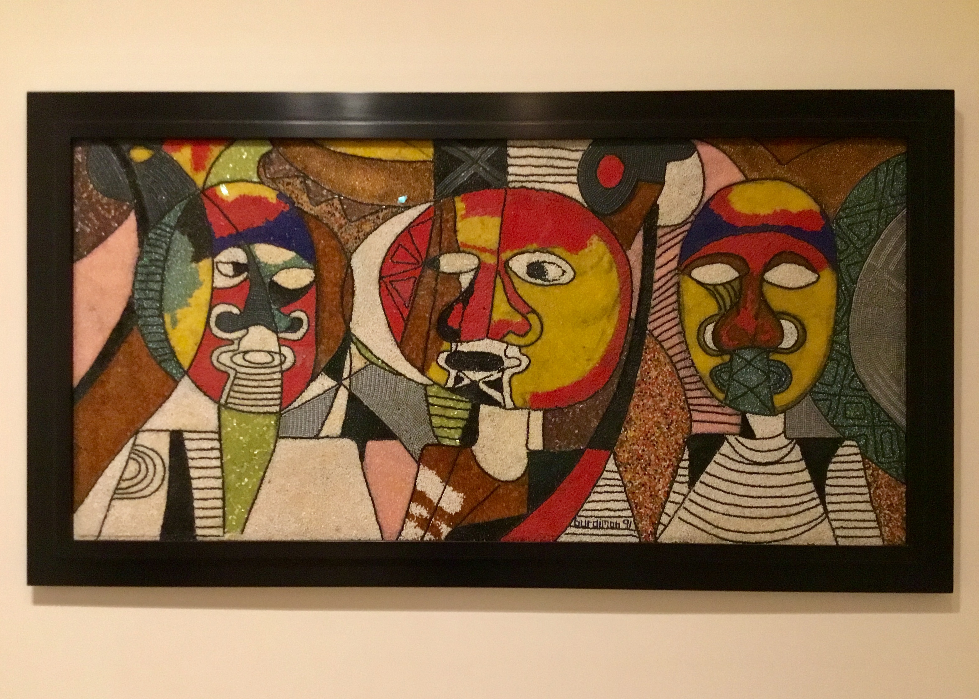
“The Three Wise Men,” Jimoh Buraimoh, Glass beads, plastic cylinders, cotton, epoxy, plywood, 1991
* Favorite travel and other photographs that have not yet appeared in this blog.
A: I saw this painting at the Baltimore Museum of Art and was intrigued by the intracacy and textures of the beads, cylinders, and other items used by Jimoh Buraimoh, a Nigerian modernist. The figures are his portrayal of the three men who traveled to England in 1960 to negotiate Nigeria’s independence. Buraimoh honors the nation’s founders with materials that glorify Yoruba heritage and artistic traditions. His title also associates the men with the three wise men of the Bible. I enjoy this work very much and couldn’t help being reminded of imagery by Picasso.
Comments are welcome!
Q: What has been your scariest experience as an artist?
“Between,” soft pastel on sandpaper, 20″ x 26″
A: It was the approximately six months in 2007 when I finished the “Domestic Threats” series and was blocked, certain that a strong body of work was behind me, yet not knowing what in the world to do next! For a professional artist who had been working non-stop for 21 years, this was a profoundly painful, confusing, and disorienting time. I remember continuing to force myself to go to the studio and for lack of anything much to do there, spending long hours reading and thinking about art.
Eventually after all of this reflection, I had an epiphany. “Between,” with drastically simplified imagery, was the first in a new series called, “Black Paintings.” I like to think this series includes work that is considerably richer and more profound than the previous “Domestic Threats.”
Comments are welcome!
Q: The imagery used throughout your work evoked glimmers of childhood memories, specifically “Punch and Judy” puppet shows. Would you talk about your use of this kind of slightly sinister iconography?

Barbara and Tomas in Panajachel
A: I don’t really see my iconography as sinister, although I know some people do.
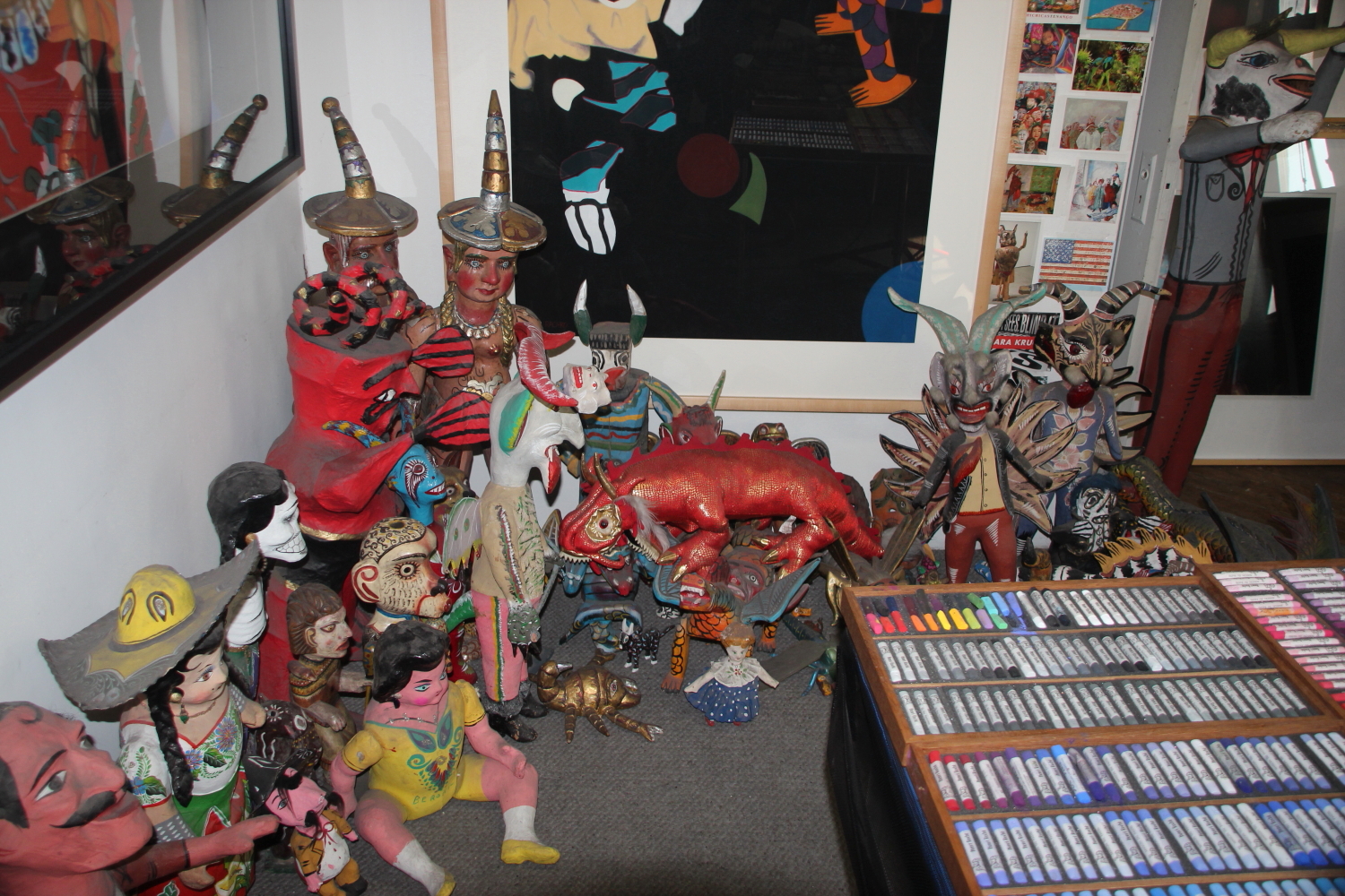
I search the markets and bazaars of Mexico, Guatemala, and elsewhere for folk art objects – masks, carved wooden animals, papier mache figures, children’s toys – to bring back to New York to photograph and paint.
Color is very important – the brighter and the more eye-catching the patterns are on these objects the better – plus they must be unique and have lots of personality. I try not to buy anything mass-produced or obviously made for the tourist trade. The objects must have been used or otherwise look like they’ve had a life (i.e., been part of religious festivities) to draw my attention. How and where each one comes into my possession is an important part of the creative process. Making this work is a long, complex undertaking with many facets. Finished paintings are always an idiosyncratic blend of reality, fantasy, and autobiography.
Finding, buying, and getting the objects back to the U.S. is sometimes circuitous, but that, too, is part of the process, an adventure, and often a good story. Here’s an example.
In 2009 I was in a small town on the shores of Lake Atitlan in Guatemala, called Panajachel. After returning from a boat ride across the lake, my friends and I were walking back to our hotel when we discovered a wonderful mask store. How fortuitous! I spent some time looking around, made my selections, and was ready to buy five exquisitely-made standing wooden figures, when I learned that Tomas, the store owner, did not accept credit cards. I was heart-broken and thought, “Oh, no, I’ll have to leave these Panajachelitos behind.”
However, thanks to my good friend, Donna, whose Spanish was much more fluent than mine, the three of us brain-stormed until finally, Tomas had an idea. I could pay for the figures at a nearby hotel and in a few days when the hotel was paid by the credit card company, the hotel would pay Tomas. Fabulous! Tomas, Donna, and I walked to the hotel, where the transaction was made and the first hurdle was overcome.
Working out the packing and shipping arrangements took another hour or two. This was a small village off the beaten track so boxes and packing materials were scarce. As we figured out the details, Tomas and I realized we liked and trusted each other, became friends, and exchanged telephone numbers. The store did not even have a telephone so he gave me the phone number of the post office next door, saying that when I called, he could easily run next door!
Most wonderfully, the package was waiting for me in New York when I returned home from Guatemala. All of the objects were unbroken and in excellent condition.
As I travel I am drawn to each of these figures because it possesses a powerful presence that resonates with me. It’s a mystery really. I am not sure exactly how or why, but I know each object has lessons to teach as it assumes various roles in yet-to-be-created paintings.
Coming upon a new find I wonder, who made this thing? How? Why? Where? When? I feel connected to each object’s creator and curiosity leads me to become a detective and an archaeologist to find out more about it and to figure out how to most effectively use it in my work.
The best way I can describe it: after three decades of seeking out, collecting, and using these folk art figures as personal symbols in my work, the process has become an enriching personal journey towards greater knowledge and wisdom. They are a vehicle for learning more about the world and and about myself. And what artist doesn’t love to learn?
Comments are welcome!
Q: Why do you prefer not to explain your titles and imagery?
“Truth Betrayed by Innocence,” soft pastel on sandpaper, 58″ x 38″
A: It’s mainly because answers close down imagination and creativity. I enjoy hearing alternative interpretations of my pastel paintings. People are wildly imaginative and each person brings unique insights to their art viewing. By leaving meanings open, conversation is generated. Most artists want viewers to talk about their work.
Once at a public artist’s talk that I attended, I was told by an artist that my interpretation of her title was completely wrong. First of all, how can an interpretation honestly expressed by your audience be “wrong?” Art is as open to interpretation as a Rorschach test (art IS a kind of Rorshach test). Then she explained the thinking behind her title and succeeded in cutting off all further conversation. I felt belittled. Later several people told me that my interpretation was much more compelling. Still, the experience was mortifying and I hope to never do that to anyone.
Comments are welcome!
Q: Can you talk a little bit about your process? What happens before you even begin a pastel painting?

Barbara in Bali (far right)
A: My process is extremely slow and labor-intensive.
First, there is foreign travel – often to Mexico, Guatemala or someplace in Asia – to find the cultural objects – masks, carved wooden animals, paper mâché figures, and toys – that are my subject matter. I search the local markets, bazaars, and mask shops for these folk art objects. I look for things that are old, that look like they have a history, and were probably used in religious festivals of some kind. Typically, they are colorful, one-of-a- kind objects that have lots of inherent personality. How they enter my life and how I get them back to my New York studio is an important part of my art-making practice.
My working methods have changed dramatically over the nearly thirty years that I have been an artist. My current process is a much simplified version of how I used to work. As I pared down my imagery in the current series, “Black Paintings,” my creative process quite naturally pared down, too.
One constant is that I have always worked in series with each pastel painting leading quite naturally to the next. Another is that I always set up a scene, plan exactly how to light and photograph it, and work with a 20″ x 24″ photograph as the primary reference material.
In the setups I look for eye-catching compositions and interesting colors, patterns, and shadows. Sometimes I make up a story about the interaction that is occurring between the “actors,” as I call them.
In the “Domestic Threats” series I photographed the scene with a 4″ x 5″ Toyo Omega view camera. In my “Gods and Monsters” series I shot rolls of 220 film using a Mamiya 6. I still like to use an old analog camera for fine art work, although I have been rethinking this practice.
Nowadays the first step is to decide which photo I want to make into a painting (currently I have a backlog of photographs to choose from) and to order a 19 1/2″ x 19 1/2″ image (my Mamiya 6 shoots square images) printed on 20″ x 24″ paper. They recently closed, but I used to have the prints made at Manhattan Photo on West 20th Street in New York. Now I go to Duggal. Typically I have in mind the next two or three paintings that I want to create.
Once I have the reference photograph in hand, I make a preliminary tonal charcoal sketch on a piece of white drawing paper. The sketch helps me think about how to proceed and points out potential problem areas ahead.
Only then am I ready to start actually making the painting.
Comments are welcome!
Q: What does your creative process look like when you are ready to begin a new painting?

Preliminary sketch
A: My working methods have changed dramatically over the years with my current process being a much-simplified version of how I used to work. In other words as I pared down my imagery in the “Black Paintings,” my process quite naturally pared down, too.
One constant is that I have always worked in series with each pastel painting leading quite logically to the next. Another is that I always have set up a scene, lit and photographed it, and worked with a 20″ x 24″ photograph as the primary reference material. In the “Domestic Threats” series I shot with a 4″ x 5″ view camera. Nowadays the first step is to decide which photo I want to make into a painting (currently I have a backlog of images to choose from) and to order a 19 1/2″ x 19 1/2″ image (my Mamiya 6 shoots square images and uses film) printed on 20″ x 24″ paper. I get the print made at Manhattan Photo on West 20th Street in New York. Typically I have in mind the next two or three paintings that I want to create.
Once I have the reference photograph in hand, I make a preliminary tonal charcoal sketch on a piece of white drawing paper. The sketch helps me think about how to proceed and points out potential problem areas ahead. For example, in the photograph above I had originally thought about creating a vertical painting, but changed to horizontal format after discovering spatial problems in my sketch.
Also, I decided to make a small painting now because it has been two years since I last worked in a smaller (than my usual 38″ x 58″) size. I am re-using the photograph on which “Epiphany” is based. Using a photograph a second time lets me see how my working methods have evolved over time.
Comments are welcome!
Pearls from artists* # 85
Studio
* an ongoing series of quotations – mostly from artists, to artists – that offers wisdom, inspiration, and advice for the sometimes lonely road we are on.
Credo
I believe in art.
I do not believe in the “art world” as
it is today.
I do not believe in art as a commodity.
Great art is in exquisite balance. It is
restorative.
I believe in the energy of art, and through
the use of that energy, the artist’s ability
to transform his or her life and, by ex-
ample, the lives of others.
I believe that through our art, and through
the projection of transcendent imagery, we
can mend and heal the planet.
Audrey Flack in Art & Soul: Notes on Creating
Comments are welcome!

