Category Archives: Pastel Painting
Pearls from artists* # 59

Studio
* an ongoing series of quotations – mostly from artists, to artists – that offers wisdom, inspiration, and advice for the sometimes lonely road we are on.
Friends sometimes ask, “Don’t you get lonely sitting by yourself all day?” At first it seemed odd to hear myself say No. Then I realized that I was not alone; I was in the book; I was with the characters. I was with my Self.
Not only do I not feel alone with my characters; they are more vivid and interesting to me than the people in my real life. If you think about it, the case can’t be otherwise. In order for a book (or any project or enterprise) to hold our attention for the length of time it takes to unfold itself, it has to plug into some internal perplexity or passion that is of paramount importance to us. The problem becomes the theme of our work, even if we can’t at the start understand or articulate it. As the characters arise, each embodies infallibly an aspect of that dilemma, that perplexity. These characters might not be interesting to anyone else but they’re absolutely fascinating to us. They are us. Meaner, smarter, sexier versions of ourselves. It’s fun to be with them because they’re wrestling with the same issue that has its hooks into us. They’re our soul mates, our lovers, our best friends. Even the villains. Especially the villains.
Stephen Pressfield in The War of Art
Comments are welcome!
Q: You recently spent several weeks in Sri Lanka. After experiencing so many new sights and sounds, is it difficult to get back to work in your studio?
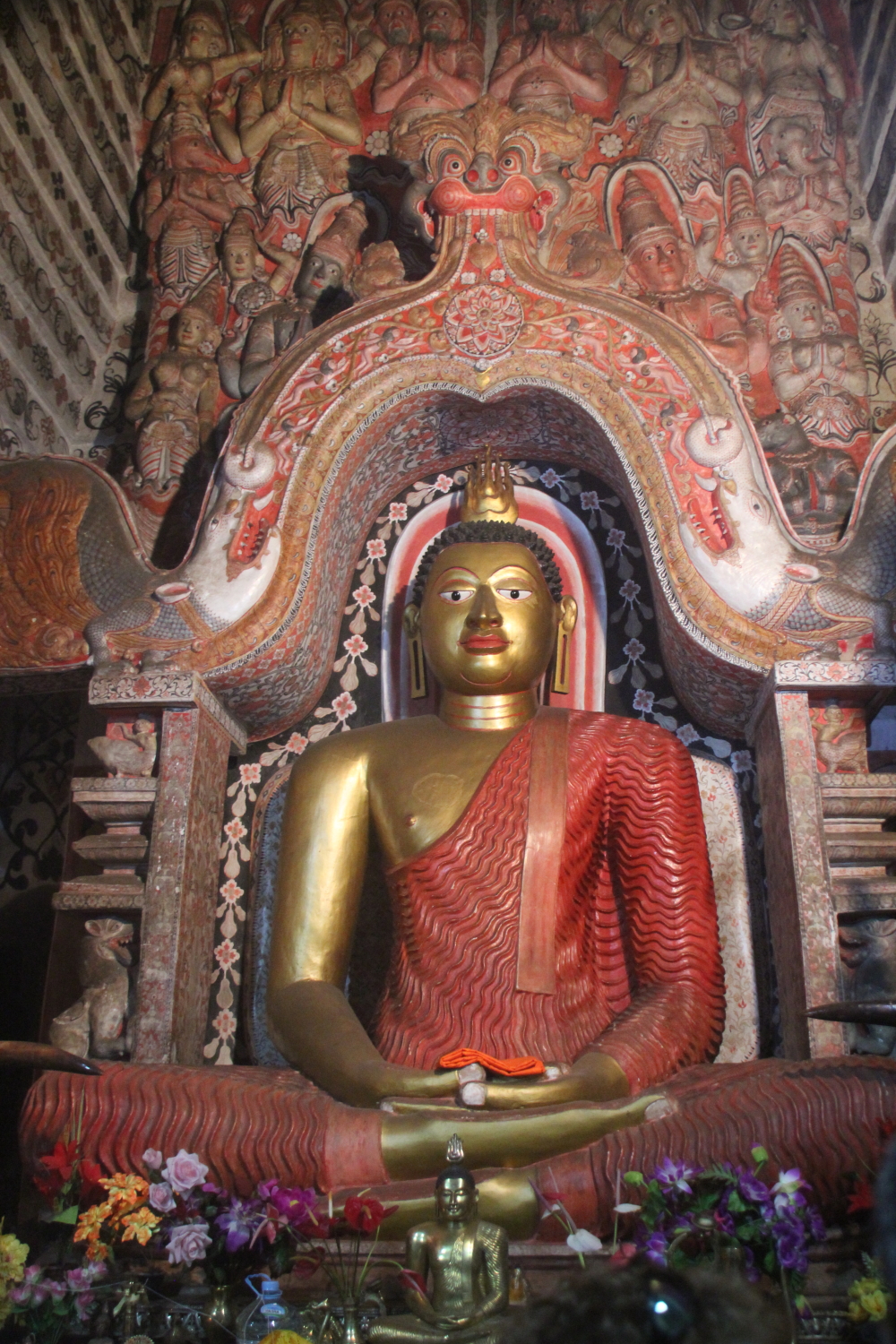
Cave temple at Natha Devale, Sri Lanka
A: It definitely requires some readjustment and a period – maybe a day or two – during which I feel removed from the painting on my easel and need time to become reacquainted with it. It’s a time to refocus, stay put, and reflect. For weeks I’ve led an action-packed life, exploring a fascinating country on the other side of the world. Over time, all of the experiences I’ve had will stay with me, or not, and in some ways begin to influence my work.
It’s funny. I often think of my studio as a cave. It’s a rather dark place and sometimes I have to force myself to go. In Sri Lanka I saw many ancient Buddhist cave temples, wild and vibrant, with colorful paintings on the walls and ceilings, chock full of statues of Buddha and other deities. My travels have given me a new appreciation of the riches to be found in caves of all sorts, including (especially) my own studio!
Comments are welcome!
Pearls from artists* # 57

Studio corner
* an ongoing series of quotations – mostly from artists, to artists – that offers wisdom, inspiration, and advice for the sometimes lonely road we are on.
You are talented and creative. You rarely block, and when you do block you know how to move yourself along. Your moods are not incapacitating and you haven’t stepped over into madness. Your personality is sufficiently integrated that your necessary arrogance doesn’t prevent you from having successful relationships, your nonconformity hasn’t made you a pariah, and your skepticism hasn’t bred in you a nihilistic darkness. You work happily in isolation but can also move into the world and have a life. You have, in short, met the challenges posed so far.
Are you home free? Unfortunately not. The next challenges you face are as great as any posed so far. They are the multiple challenges of doing the business of art: making money, developing a career, acknowledging and making the most of your limited opportunities, living with compromise, dealing with mass taste and commercialism, negotiating the marketplace, and making personal sense of the mechanics and metaphysics of the business environment of art.
Many artists grow bitter in this difficult arena. Many an artist flounders. Only the rare artist sits himself down to examine these matters, for they are painful to consider. But you have no choice but to examine them. If you are an artist, you want an audience. And if you want an audience, you must do business.
Comments are welcome!
Eric Maisel in A Life in the Arts
Q: What’s on the easel today?
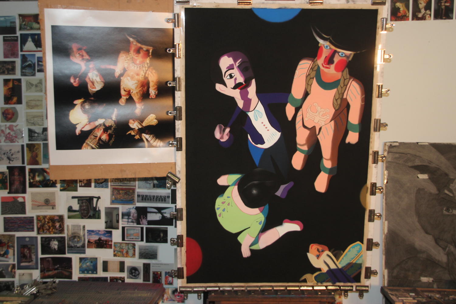
“The Ancestors,” soft pastel on sandpaper, 58″ x 38″, in progress
A: I’m putting in details on “The Ancestors.” At this stage I am doing very meticulous work and progress is difficult to see in photographs (above).
Comments are welcome!
Q: Would you speak about the practical realities – time and expenses – involved in making your pastel-on-sandpaper paintings? What might people be surprised to learn about this aspect of art-making?
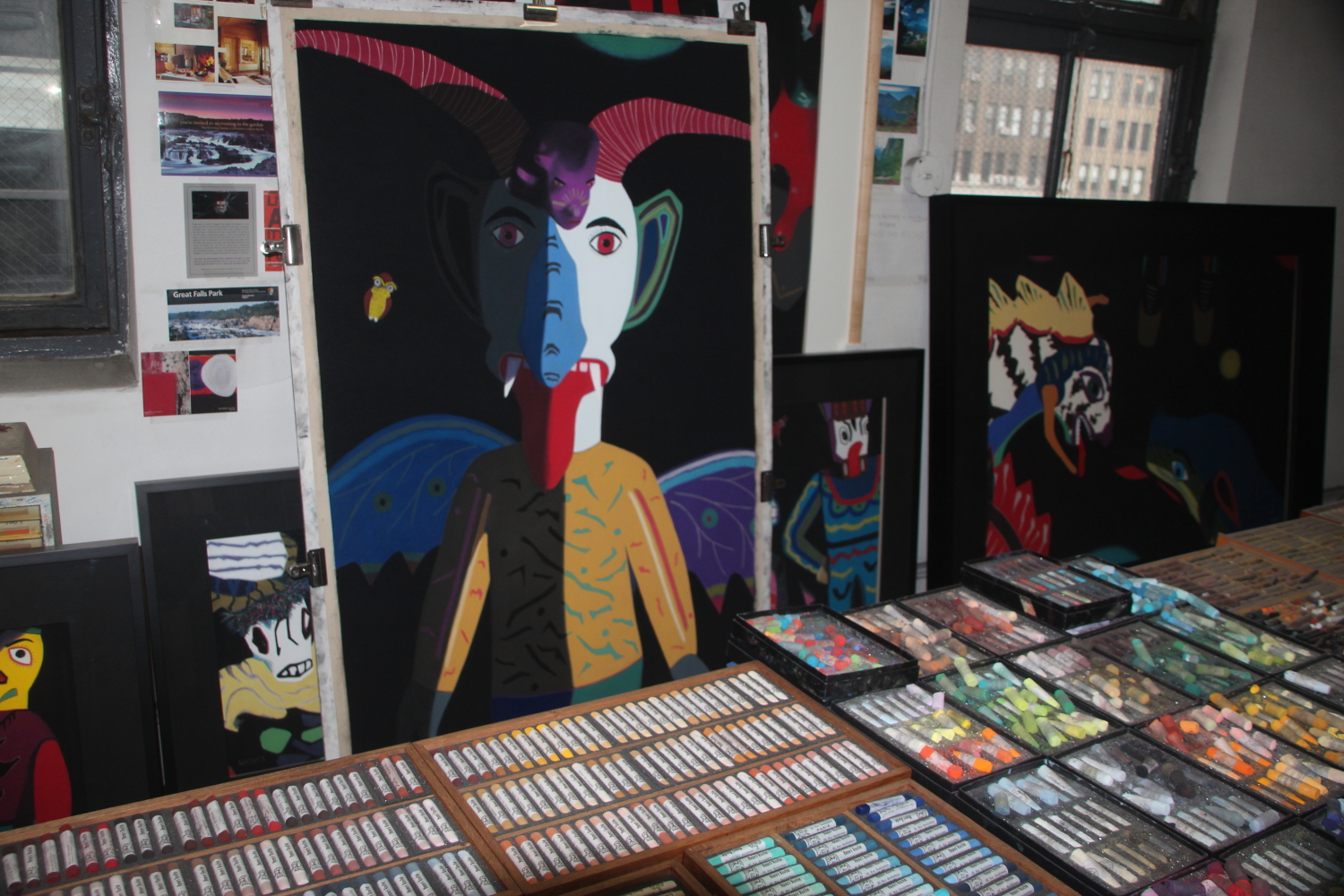
Studio
A: I have often said that this work is labor-intensive. In a good year I can complete five or six large (38″ x 58″) pastel paintings. In 2013 I am on track to make four, or, on average, one completed painting every three months. I try to spend between thirty-five and forty hours a week in the studio. Of course, I don’t work continuously all day long. I work for awhile, step back, look, make changes and additions, think, make more changes, step back, etc. Still, hundreds of hours go into making each piece in the “Black Paintings” series, if we count only the actual execution. There is also much thinking and preparation – there is no way to measure this – that happen before I ever get to stand before an empty piece of sandpaper and begin.
As far as current expenses, they are upwards of $12,000 per painting. Here is a partial breakdown:
$4500 New York studio, rent and utilities ($1350/month) for three months
$2500 Supplies, including frames (between $1500 – $1700), photographs, pastels (pro-rated), paper
$2000 Foreign travel to find the cultural objects, masks, etc. depicted in my work (approximate, pro-rated)
$3000 Business expenses, such as computer-related expenses, website, marketing, advertising, etc.
This list leaves out many items, most notably compensation for my time, shipping and exhibition expenses, costs of training (i.e. ongoing photography classes), photography equipment, etc. Given my overhead, the paintings are always priced at the bare minimum that will allow me to continue making art.
I wonder: ARE people surprised by these numbers? Anyone who has ever tried it knows that art is a tough road. Long ago I stopped thinking about the cost and began doing whatever is necessary to make the best paintings. The quality of the work and my evolution as an artist are paramount now. This is my life’s work, after all.
Comments are welcome!
Q: What is it that you most fear hearing about your work?

Studio
A: I’d say that the worst thing is when there is no reaction at all. I want people to engage with my work – like it or don’t like it – but say and feel SOMETHING. When there is no response, that means my work has failed to communicate anything and I have failed in my duty as an artist. Art is all about communication.
Comments are welcome!
Q: Would you please share a few more of your pastel portraits?

“Sam and Bobo,” soft pastel on sandpaper, 36″ x 31″, 1989
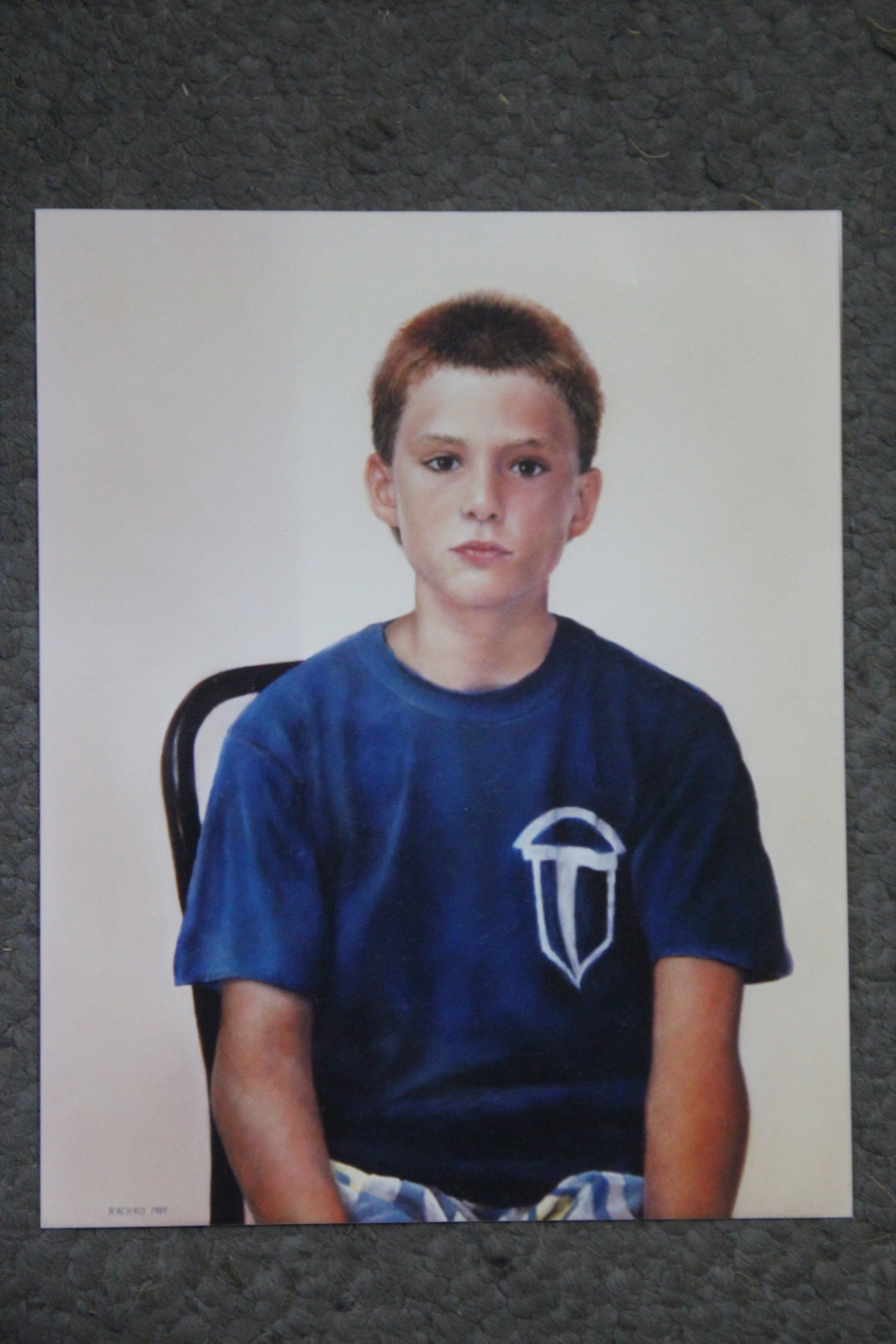
“Jules,” soft pastel on sandpaper, 28″ x 22″, 1989
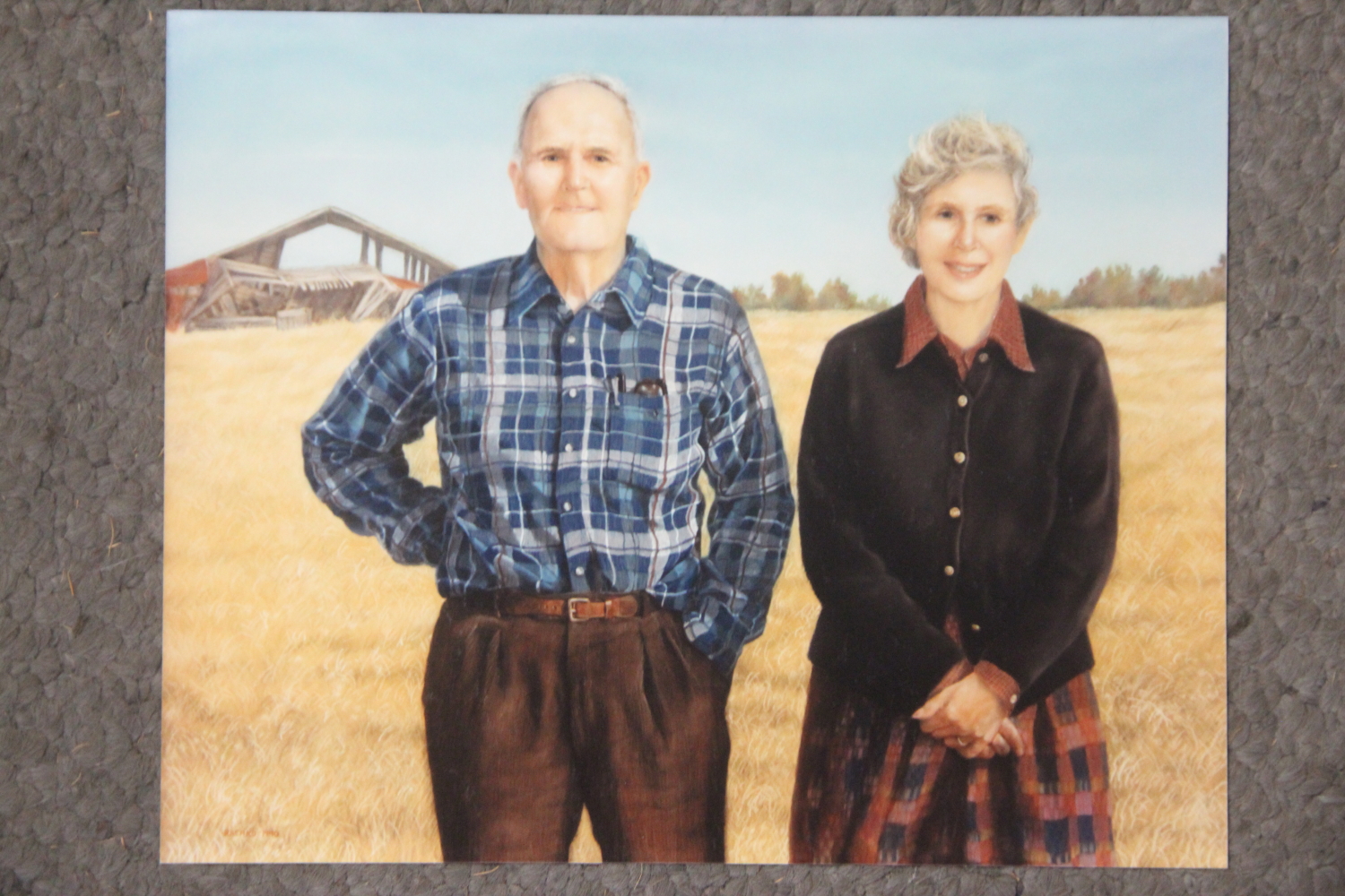
“The Post Oak Jacks,” soft pastel on sandpaper, 31″ x 39″, 1990

“Reunion,” soft pastel on sandpaper, 38″ x 58″, 1990
A: See the four above. As in my previous post, I reshot photographs from my portfolio book so the colors above have faded. Many years later, however, my originals are as vibrant as ever.
“Reunion” (bottom) is the last commissioned portrait I ever made. Early on I knew that portraiture was too restrictive and that I wanted my work to evolve in a completely different direction. However, I didn’t know yet what that direction would be.
Comments are welcome!
Q: Can we see some of your early potraits?
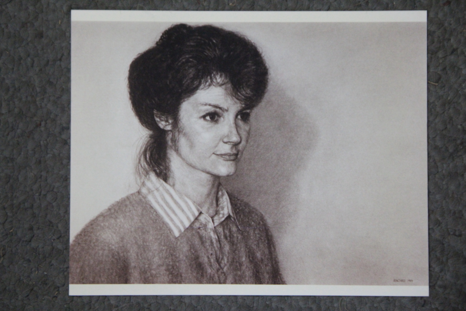
“Krystyn,” charcoal, 22″ x 30″, 1989
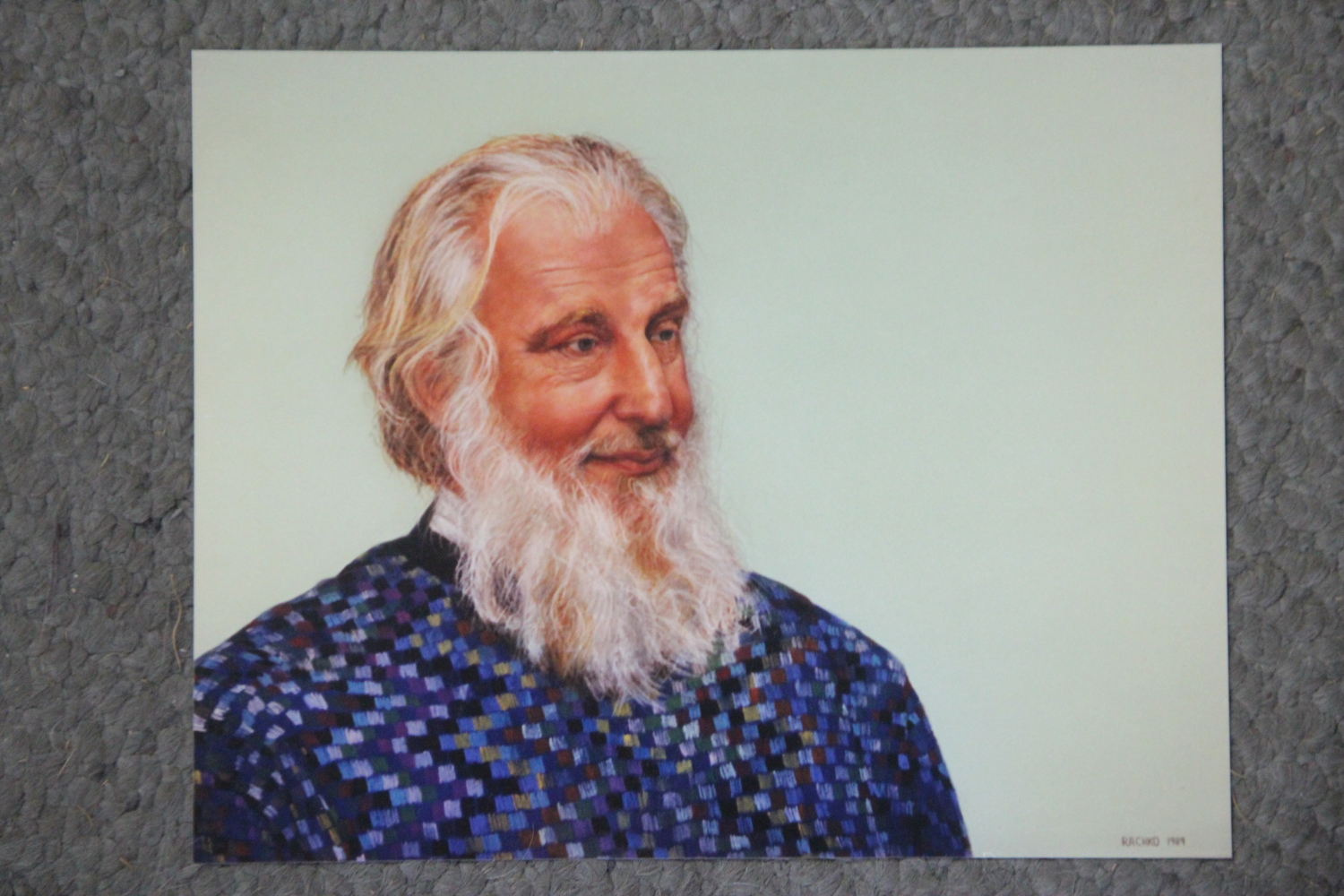
“John,” soft pastel on sandpaper, 22″ x 28″, 1989
A: The reproductions above are two of my earliest. The portrait of Bryan (see last week’s post) is hanging at the school that was named for him, Dr. Bryan C. Jack Elementary School, in Tyler, Texas. Krystyn’s portrait is hanging in my dining room in Alexandria, VA – I liked it too much to part with it. I have no idea where the one of John is now.
Note that the actual paintings are more vibrant than the 8 x 10’s shown above. For example, the background of John’s painting is a brilliant green. To obtain the images above I re-photographed photos from my portfolio book. These photos, unlike the originals, have faded over the years. That’s one more reason that my originals need to be seen in person.
Comments are welcome!
Q: You have sometimes spoken about your early work as a portrait artist. When and why did you start making portraits? Do you still do them?

“Bryan,” soft pastel on sandpaper, 22″ x 28″, 1988
A: In 1989 I was a Naval officer working at the Pentagon and I hated my job as a computer analyst. Although it was terrifying to leave the security of a paycheck for the uncertainty of an artist’s existence, I made the leap. In retrospect it was one of the best decisions of my life. When I resigned from active duty (I remained in the Navy Reserve, which provided a part-time job and a small income; in 2003 I retired as a Navy Commander), I needed a way to make a living.
Prior to this career change, I worked hard to develop my portrait skills. I volunteered to run a life drawing class at The Art League School in Alexandria, VA, where I made hundreds of figure drawings using charcoal and pastel. I spent a semester commuting between Washington, DC and New York to study artistic anatomy at the New York Academy of Art. I spent another semester studying gross anatomy with medical students at Georgetown University Medical School. So I was well prepared to devote myself to making portraits.
For a time I made a living making commissioned photo-realist portraits in soft pastel on sandpaper. However, after about two years I became bored. I remember thinking, “I did not leave a boring job just to make boring art!” Furthermore, I had no interest in doing commissions because what I wanted to accomplish as an artist did not coincide with what portrait clients wanted. I completed my final portrait commission in 1990 and never looked back. To this day I remain loathe to do a commission of any kind.
Comments are welcome!
Q: Your pastel-on-sandpaper paintings are very labor intensive. Do you typically have just one in progress at any given time?

Works in progress, soft pastel on sandpaper, 58″ x 38″
A: For many years I always worked on one at a time because I have only one or two ideas – never more than that – about what I will make next. Also, I believe that “all art is the result of one’s having gone through an experience to the end.” (It’s on a note taped to the wall near my easel). So I would work on one painting at a time until all of the problems in it were resolved. Each piece that I undertake represents an investment of several months of my life and after nearly three decades as an artist, I know that once I start a piece I will not abandon it for any reason. When it is the best painting that I can make – when adding or subtracting anything would be a diminishment – I pronounce it “finished.” In the past I would start the next one only when the completed piece was out of my sight and at the frame shop.
But a few years ago I began working on two pastel paintings at a time. When I get stuck – or just need a break from looking at the same image day after day (I am in my studio 5 days a week) – I switch to the other one. This helps me work more efficiently. The two paintings interact with each other; they play off of each other and one suggests solutions that help me to resolve problem areas in the other. I’m not sure exactly how this happens – maybe putting a piece aside for awhile alerts my unconscious to begin working deeply on it – but having two in progress at the same time is my preferred way of working now.
A note about the painting on the left above, which was previously called, “Judas.” I happen to be reading “Cloud Atlas,” by David Mitchell and came across the word “judasing” used as a verb meaning, “doing some evil to a person who profoundly trusted you.” I’d never heard the word before, but it resonated with an event in my personal life. So the new title of my painting is “Judasing.” This is a good reminder that work and life are inextricably (and inexplicably) woven together and that titles can come from anywhere!
Comments are welcome!