Category Archives: Creative Process
Q: What’s on the easel today?

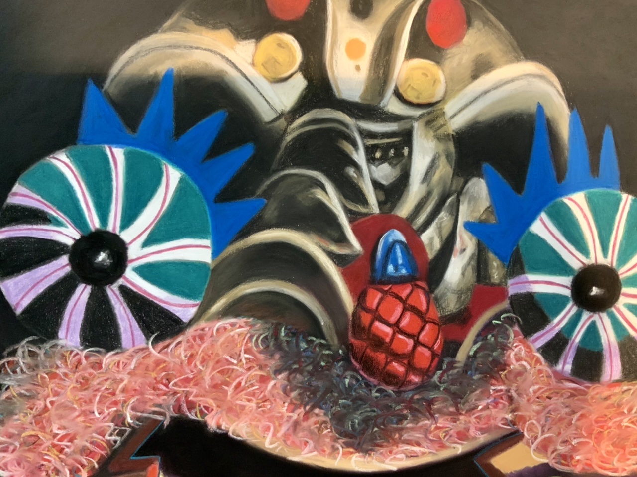
A: I’m trying to decide if “Impresario,” soft pastel on sandpaper, 58” x 38,” is finished. Pastel paintings are pronounced ’finished’ when every detail is as good as I can make it. I still need to give this one a final look-over.
Comments are welcome!
Q: What’s on the easel today?

A: “Impresario,” 58” x 38,” soft pastel on sandpaper is close to being finished… at last!
Comments are welcome!
Q: When did you start using the sandpaper technique and why (Question from “Arte Realizzata”)

A: In the late 1980s when I was studying at the Art League School in Alexandria, VA, I enrolled in a three-day pastel workshop with Albert Handel, an artist known for his southwest landscapes in pastel and oil paint. I had just begun working with soft pastel and was experimenting with paper. Handel suggested I try Ersta fine sandpaper. I did and nearly three decades later, I’ve never used anything else.
This paper is acid-free and accepts dry media, mainly pastel and charcoal. It allows me to build up layer upon layer of pigment and blend, without having to use a fixative. The tooth of the paper almost never gets filled up so it continues to hold pastel. (On the rare occasion when the tooth DOES fill up, which sometimes happens with problem areas that are difficult to resolve, I take a bristle paintbrush, dust off the unwanted pigment, and start again). My entire technique – slowly applying soft pastel, blending and creating new colors directly on the paper, making countless corrections and adjustments, rendering minute details, looking for the best and/or most vivid colors – evolved in conjunction with this paper.
I used to say that if Ersta ever went out of business and stopped making sandpaper, my artist days would be over. Thankfully, when that DID happen, UArt began making a very similar paper. I buy it in two sizes – 22″ x 28″ sheets and 56″ wide by 10-yard-long rolls. The newer version of the rolled paper is actually better than the old, because when I unroll it, it lays flat immediately. With Ersta I would lay the paper out on the floor for weeks before the curl would give way and it was flat enough to work on.
Comments are welcome!
Q: Why do you make a preliminary drawing before you begin a pastel painting?

A: I make a preliminary charcoal drawing because that’s how I like to begin thinking about and planning a new pastel painting. I always make preliminary drawings the same size as the upcoming pastel painting. While I draw, I make decisions about the overall composition, decide where the major light and dark shapes will be, and envision the likely problem areas that lie ahead. These drawings are done quickly. I spend perhaps an hour on them.
Once the drawing is in my head I no longer need it. So I put it away and when it’s time to begin a subsequent pastel painting, I erase it. I wipe it out with a paper towel and make the next preliminary charcoal drawing directly on top. These are ephemeral tools, existing only for as long as I need them.
Comments are welcome!
Pearls from artists* # 466

*an ongoing series of quotations – mostly from artists, to artists – that offers wisdom, inspiration, and advice for the sometimes lonely road we are on.
Within the initial artistic response to something is a core idea or feeling and most of our work comes from stripping away everything that is extraneous to it. To translate that vision means “to get across” the idea or feeling. How cleanly can that idea be isolated and honed, how much can be stripped away? Everything superfluous and tangential needs to be eliminated. Otherwise the idea may get buried and our intention deflected. And the viewer’s will also. The problem is seldom that an idea is too simple. Power comes from something deeply felt and simply stated. “Nothing astonishes men so much as common sense and plain dealing. All great actions have been simple, and all great pictures are.” (Quote from Ken Weber, The Eye of the Spirit, Shambala, 1998, p. 136).
Ian Roberts in Creative Authenticity: 16 Principles to Clarify and Deepen Your Artistic Vision
Comments are welcome!
Q: What’s on the easel today?
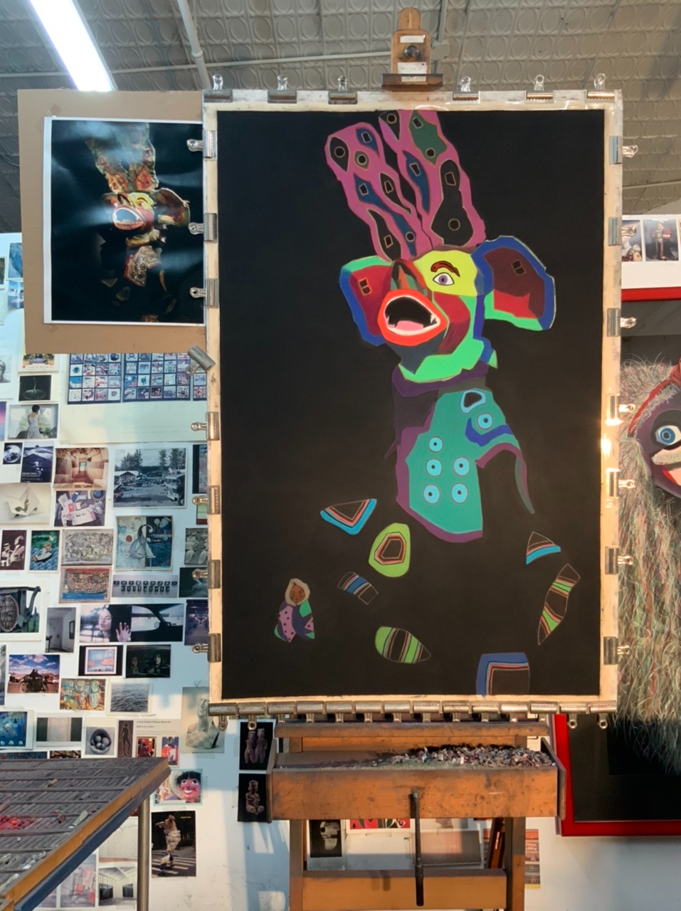
A: I’m continuing to work on a large (58” x 38”) pastel painting. I haven’t decided on an exact title yet, but it will be either “Impresario” or “Lost Cause.” The latter is the name of a new Billie Eilish song.
Comments are welcome!
Pearls from artists* # 463
*an ongoing series of quotations – mostly from artists, to artists – that offers wisdom, inspiration, and advice for the sometimes lonely road we are on.
When in doubt, when you are lost, don’t stop. Instead, concentrate on detail. Look around, find a detail to concentrate on and do that. Forget the big picture for a while. Just put your energy into the details of what is already there. The big picture will eventually open up and reveal itself if you can stay out of the way for a while. It won’t open up if you stop. You have to stay involved but you don’t always have to stay involved with the big picture.
While paying attention to the details and welcoming insecurity, while walking the tightrope between control and chaos and using accidents, while allowing yourself to go off balance and going through the back door, while creating the circumstances in which something might happen and being ready for the leap, while not hiding and being ready to stop doing homework, something is bound to happen. And it will probably be appropriately embarrassing.
Anne Bogart in A Director Prepares: Seven Essays on Art and Theatre
Comments are welcome!
Q: How do you work and approach your subject? (Question from “Arts Illustrated”)
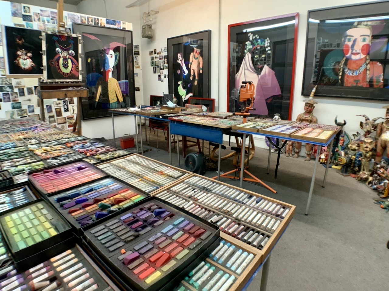
A: Undoubtedly, I could not make my work without UART sandpaper since my entire pastel technique evolved around it. I use 400 0r 500 grit. My favorite thing about it is its ‘tooth’ (i.e. texture or roughness).
Over the many months I spend creating a pastel painting, I build layer upon layer of soft pastel. Because the paper I use is relatively “toothy,” it accepts all of the pastel the painting needs. And as many people know, I own and use thousands of soft pastels!
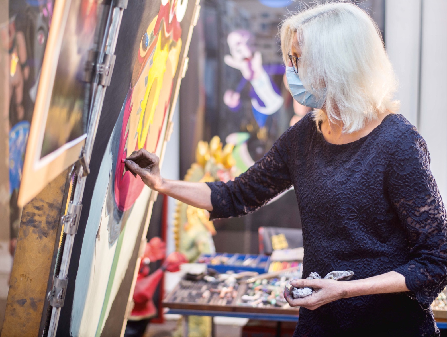
Many layers of soft pastel and several months of studio time go into creating each painting. My self-invented technique is analogous to the glazing techniques used by the Old Masters, who slowly built up layers of thin oil paint to achieve a high degree of finish. Colors were not only mixed physically, but optically.
Similarly, I gradually build up layers of soft pastel, as many as thirty, to create a pastel painting. After applying a color, I blend it with my fingers and push it into the sandpaper’s tooth. It mixes with the color beneath to create a new color, continually adding richness, saturation, and intensity to the piece. By the time a pastel painting is finished, the colors are bold, vibrant, and exciting.
From the beginning in the 1980s I used photographs as reference material and my late husband, Bryan, would shoot 4” x 5” negatives of my elaborate setups with his Toyo-Omega view camera. In those days I rarely picked up a camera except when we were traveling. After Bryan was killed on 9/11, I inherited his extensive camera collection – old Nikons, Leicas, Graphlex cameras, etc. – and I wanted to learn how to use them. In 2002 I enrolled in a series of photography courses (about 10 over 4 years) at the International Center of Photography in New York. I learned how to use all of Bryan’s cameras and how to make my own big color prints in the darkroom.
Along the way I discovered that the sense of composition, form, and color I developed over many years as a painter translated well into photography. The camera was just another medium with which to express my ideas. Astonishingly, in 2009 I had my first solo photography exhibition in New York.
It’s wonderful to be both a painter and a photographer. Pastel painting will always be my first love, but photography lets me explore ideas much faster than I ever could as a painter. Paintings take months of work. To me, photographs – from the initial impulse to hanging a framed print on the wall – are instant gratification.
For several years I have been using my iPad Pro to capture thousands of travel photographs. Most recently, I visited Gujarat and Rajasthan in India. I have never been inclined to use a sketchbook so composing photos on my iPad keeps my eye sharp while I’m halfway around the world, far from my studio practice.
My blog, “Barbara Rachko’s Colored Dust,” continues to be a crucial part of my overall art practice. Blogging twice a week forces me to think deeply about my work and to explain it clearly to others. The process has helped me develop a better understanding about why I make art and, I like to think, has helped me to become a better writer.
Comments are welcome!
Pearls from artists* # 459
*an ongoing series of quotations – mostly from artists, to artists – that offers wisdom, inspiration, and advice for the sometimes lonely road we are on.
Naturally we want freedom, flow and harmony in our work. These are qualities that give it eloquence. But we cannot find this flow by avoiding the obstacles that arise upon starting out. We welcome the resistances and then apply our God given ammunition – our imagination, energy and will – and finally watch the obstacles dissolve. Only then can we enjoy the new-found freedom and flow until the next obstacle appears. And the struggle begins anew. And hence, the paradox: we cultivate resistance in order to free our path of resistance. Real power is the removal of resistance from your path.
Anne Bogart in A Director Prepares: Seven Essays on Art and Theatre
Comments are welcome!
Q: What’s on the easel today?

A: I’m working on another large (58” x 38”) “Bolivianos” pastel painting based on old Bolivian masks encountered at the Museum of Folklore and Ethnography in La Paz four years ago. The masks were made to be worn in annual Carnival celebrations that happen in the mountain town of Ouroro, about a three-hour drive from La Paz.
Comments are welcome!

