Category Archives: Creative Process
Q: You make it look effortless when we know it is not. Would you explain how you started your blog 11 years ago? (Question from Colette C. McBratney via Facebook)
An Early Blog Post, Above
A: My blog turned 11 on July 15th. To learn how to set up, publish, and maintain a blog, I took a class at the International Center of Photography in New York. It was called “The Daily Blog” and that’s where I learned how to work with WordPress.
I decided to use a question and answer format because I had a backlog of material from interviews I had done over the years. During the class, which lasted five weeks, I published blog posts every day. Once the class ended, I cut back to a more manageable schedule of publishing posts twice a week.
Writing about my work quickly became an important part of my creative process. As most people probably know, I am very persistent so these days I just make sure to keep going!
Comments are welcome!

Q: What’s on the easel today?

Work in progress
A: I just started a new 58” x 38” pastel painting. This photo shows two days worth of work.
Comments are welcome!
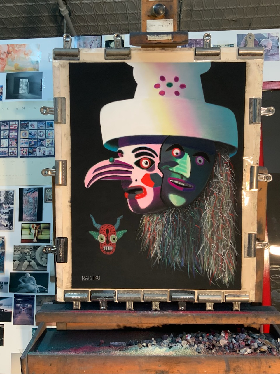
Q: Can you explain how your current work relates to Jungian archetypes?

In progress: “Wise One,” soft pastel on sandpaper, 58” x 38”
A: Here’s an example. The passage below is from Carl Jung: Knowledge in a Nutshell by Gary Bobroff.
The Wise Old Man or Woman is a figure found throughout folklore and mythology. They possess superior understanding and also often a more developed spiritual or moral character. Frequently, such characters provide the information or learning that the Hero needs to move forward in their quest. In Star Wars, Ben Kenobi plays the teacher to Luke, introducing purpose and knowledge into the young Hero’s life. Where the Hero brings drive, courage, and direct action, the Wise Old One introduces the importance of the opposing values of thought and questioning. Jung describes it thus: ‘Often the old man in fairytales asks questions like who? Why? Whence? Wither? For the purpose of inducing self-reflection and mobilizing the moral forces.’
The Wise One may appear in disguise to test the character of others. In the second Star Wars film, The Empire Strikes Back (1980), Luke’s mentor Yoda does not reveal himself as such when they first meet. He waits, asking questions that test Luke’s motivation for being there. Jung associated the Trickster archetype with the Wise One, and the use of disguise emphasizes this correlation.
Comments are welcome!
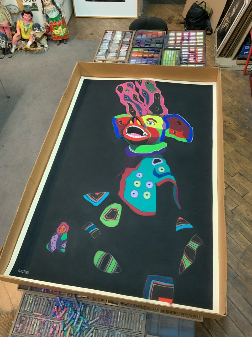
Q: What’s on the easel today?
Work in progress
A: “The Moralist,” soft pastel on sandpaper, 26”x 20,” awaits finishing touches.
Comments are welcome!
Pearls from artists* # 560

*an ongoing series of quotations – mostly from artists, to artists – that offers wisdom, inspiration, and advice for the sometimes lonely road we are on.
In describing her technique, Joan [Mitchell] once said, “I don’t go off and slop and drip. I ‘stop, look, and listen!’ at railroad tracks. I really want to be accurate.” One can imagine every stroke applied, every drizzle of pigment – both those visible in the finished work and those buried beneath its many layers – being the result of just such consideration. The majesty of Joan’s painting, which she would call City Landscape, was a quality it shared with all great art – the sense that it had always existed, and that during one inspired moment it had been dredged from the subconscious depths by a hand and mind graced with the talent and vision to retrieve it for the rest of us. That revealing work, so exuberant, so deep, so masterful, and so unlike the shards and violent explosions that had been her signature, was the result of Joan’s having survived a personal hell and her own imperfections. It was her prize for having persevered, and all who saw it were the beneficiaries.
Mary Gabriel in Ninth Street Women
Comments are welcome!
Q: Love your selection of pastels! Do you have favorites that you need to force yourself not to continually return to? (Question from Donina Asera via Facebook)

A: No, I don’t think so. Certainly, I do have general preferences. I prefer dark, vivid, intense colors so many of my pale pastels go mostly unused. The single pastel that I use most is Rembrandt black – I buy them buy the dozens – because it takes many layers of pigment to achieve my dark black backgrounds. Otherwise, I strive to be open to whatever the painting needs. My goal – always! – is to make a pastel painting that is exciting to look at and different from anything I have created before.
Thank you very much for the great question!
Comments are welcome!
Q: How has the use of photography in your work changed over the decades?
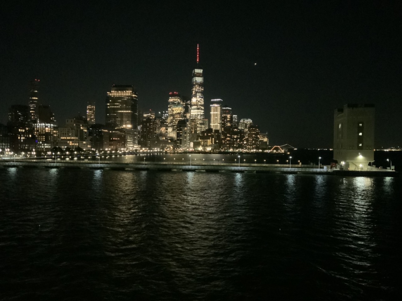
New York, NY
A: From the beginning in the mid-1980s I used photographs as reference material. My late husband, Bryan, would shoot 4” x 5” negatives of my elaborate setups using his Toyo-Omega view camera. In this respect Bryan was an integral part of my creative process as I developed the “Domestic Threats” pastel paintings. At that time I rarely picked up a camera, except to capture memories of our travels.
After Bryan was killed on 9/11, I inherited his extensive camera collection – old Nikons, Leicas, Graphlex cameras, and more. I wanted and needed to learn how to use them. Starting in 2002 I enrolled in a series of photography courses (about 10 over 4 years) at the International Center of Photography in New York. I learned how to use all of Bryan’s cameras and how to make my own big chromogenic prints in the darkroom.
Along the way I discovered that the sense of composition and color I had developed over many years as a painter translated well into photography. The camera was just another medium with which to express my ideas. Surprisingly, in 2009 I had my first solo photography exhibition at a gallery in New York. Bryan would have been so proud!
For several years now my camera of choice has been a 12.9” iPad Pro. It’s main advantage is that the large screen let’s me see every detail as I compose my photographs. I think of it as a portable, lightweight, and easy-to-use 8 x 10 view camera. My iPad is always with me when I travel and as I walk around exploring New York City.
It is a wonderful thing to be both a painter and a photographer! While pastel painting will always be my first love, photography has distinct advantages over my studio practice. Pastel paintings are labor-intensive, requiring months of painstaking work. Photography’s main advantage is speed. Photographs – from the initial impulse to hanging a print on a wall – can be made in minutes. Photography is instant gratification, allowing me to explore ideas much easier and faster than I ever could as a painter. Perhaps most importantly, composing photographs keeps my eye sharp whenever I am away from the studio. I credit photography as an important factor in the overall evolution of my work.
Comments are welcome!
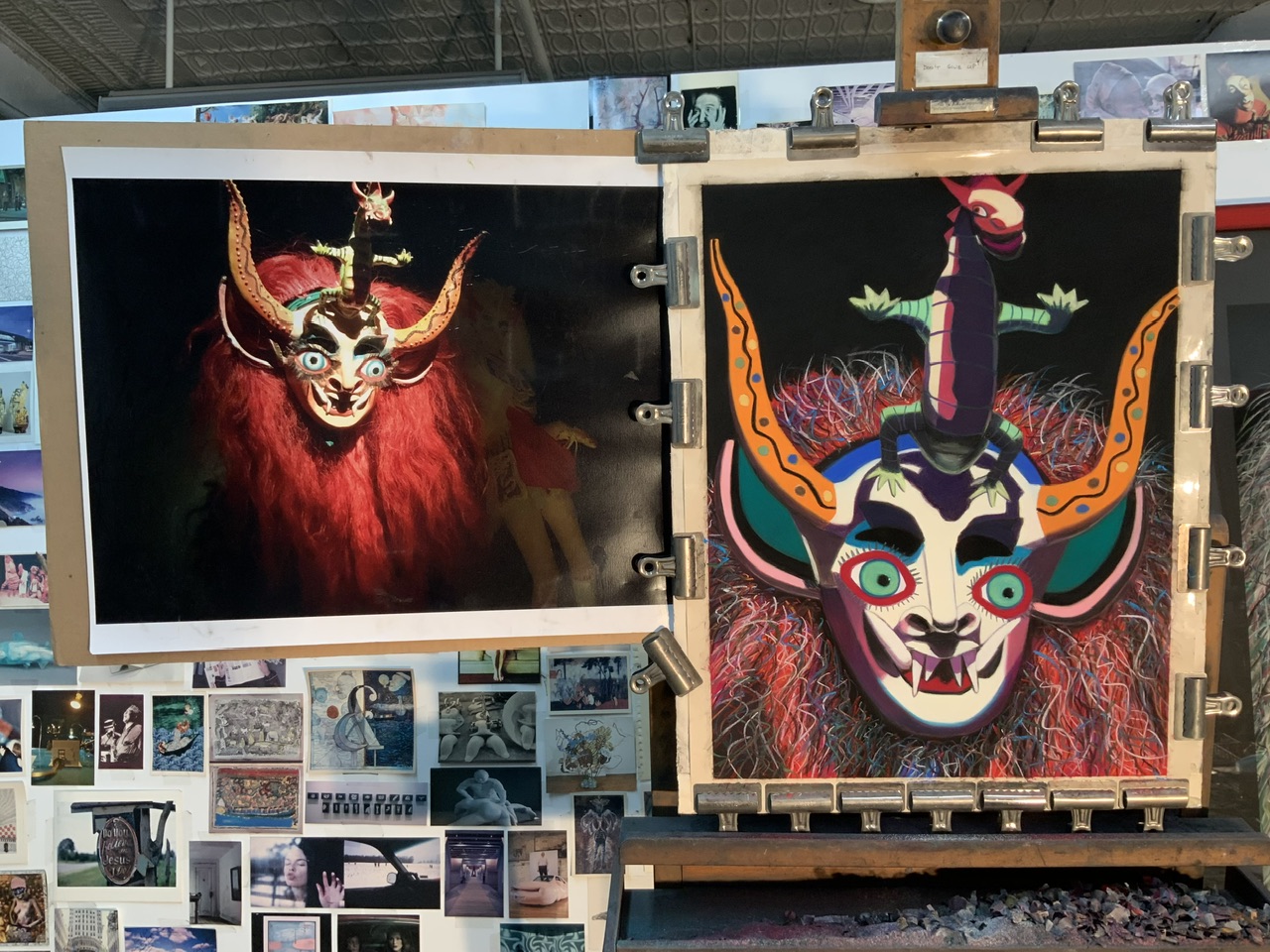
Q: What’s on the easel today?
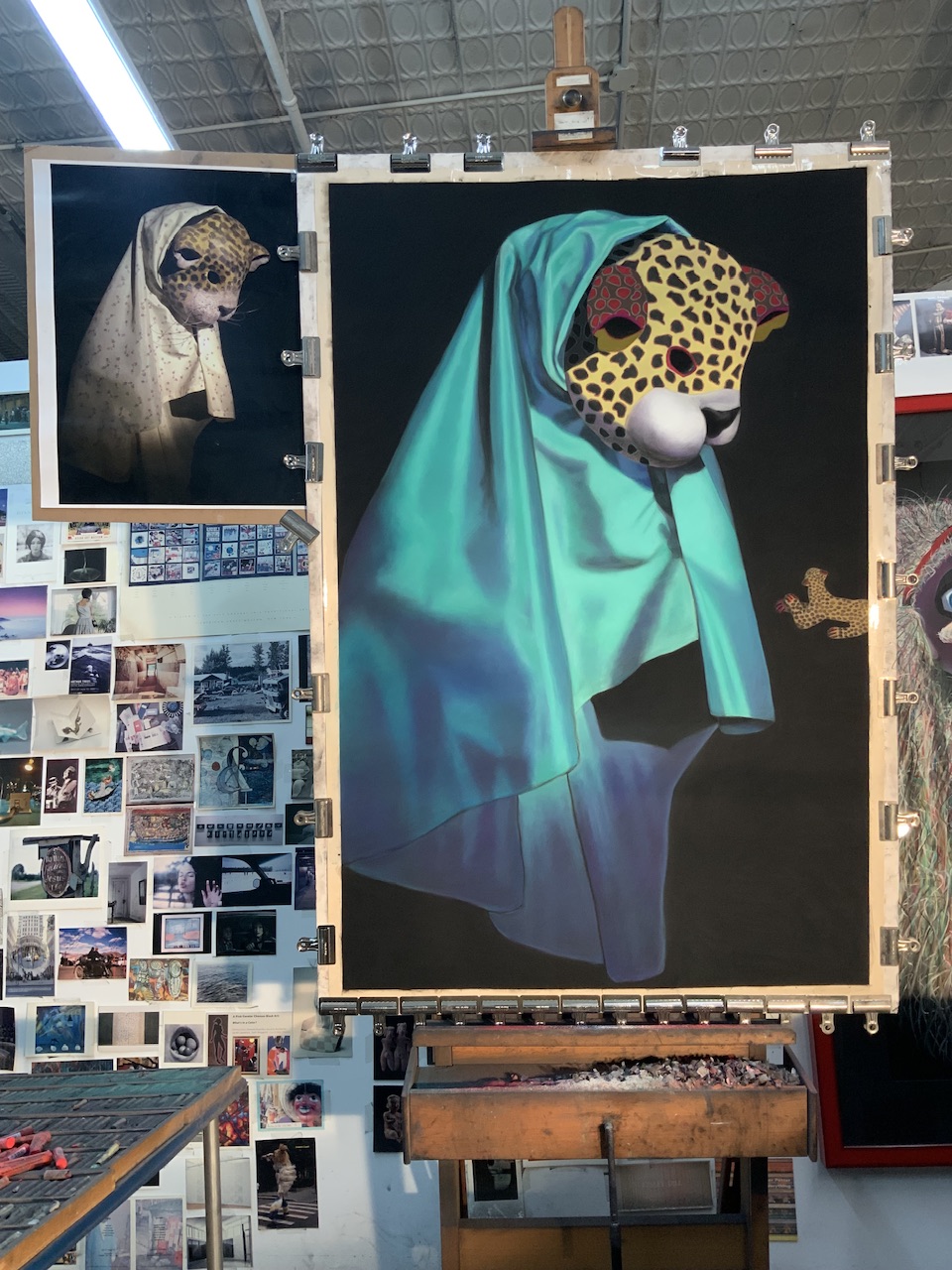
Work in progress
A: I continue adding details to “Wise One,” soft pastel on sandpaper, 58” x 38.”
Comments are welcome!
Q: It must be tricky moving pastel paintings from your New York studio to your framer in Virginia. Can you explain what’s involved? (Question from Ni Zhu via Instagram)
“Impresario” partially boxed for transport to Virginia
A: Well, I have been working with the same framer for three decades so I am used to the process.
Once my photographer photographs a finished, unframed piece, I carefully remove it from the 60” x 40” piece of foam core to which it has been attached (with bulldog clips) during the months I worked on it. I carefully slide the painting into a large covered box for transport. Sometimes I photograph it in the box before I put the cover on (see above).
My studio is in a busy part of Manhattan where only commercial vehicles are allowed to park, except on Sundays. Early on a Sunday morning, I pick up my 1993 Ford F-150 truck from Pier 40 (a parking garage on the Hudson River at the end of Houston Street) and drive to my building’s freight elevator. I try to park relatively close by. On Sundays the gate to the freight elevator is closed and locked so I enter the building around the corner via the main entrance. I unlock my studio, retrieve the boxed painting, bring it to the freight elevator, and buzz for the operator. He answers and I bring the painting down to my truck. Then I load it into the back of my truck for transport to my apartment.
I drive downtown to the West Village, where I live, and double park my truck. (It’s generally impossible to park on my block). I hurry to unload the painting, bring it into my building, and up to my apartment, all the while hoping I do not get a parking ticket. The painting will be stored in my apartment, away from extreme cold or heat, until I’m ready to drive to Virginia. On the day I go to Virginia, I load it back into my truck. Then I make the roughly 5-hour drive south.
Who ever said being an artist is easy was lying!
Comments are welcome!

