Blog Archives
Q: What’s on the easel today?

Work in progress
A: This is my second day working on a new “Bolivianos” pastel painting. Next I will layer black Rembrandt soft pastels for the background. It usually takes 4 or 5 layers just to cover the 400 grit sandpaper.
Comments are welcome!
Q: What makes you just want to run back to the studio and start something new?
View of Lower Manhattan
A: I always work in series, which means that one pastel painting generally leads into the next. Considerable thought and planning go into each one before I begin, so it would be rare for me to just start something new out of the blue.
Sometimes on days off from the studio when we have beautiful weather, I can can hardly wait to go outside for a walk. I grab my iPad Pro and search for new sights to photograph. After a couple of hours, I usually return home with a handful of interesting images. Photography is such a departure from the slowness of my work in the studio, considering that in a good year I make 3 or 4 pastel paintings.
Comments are welcome!
Q: What’s on the easel today?
Work in progress
A: I am working on a small, as yet untitled, pastel painting.
Comments are welcome!
Q: What’s on the easel today?
Ready to begin!
A: I’m ready to start a new 26” x 20” pastel painting that will be number 28 in the “Bolivianos” series.
Comments are welcome!
.")
Q: I saw your book of photos. Very nice. How do you keep track of inventory? I have struggled with that. (Question from Laura Fischer Saxon via Facebook).
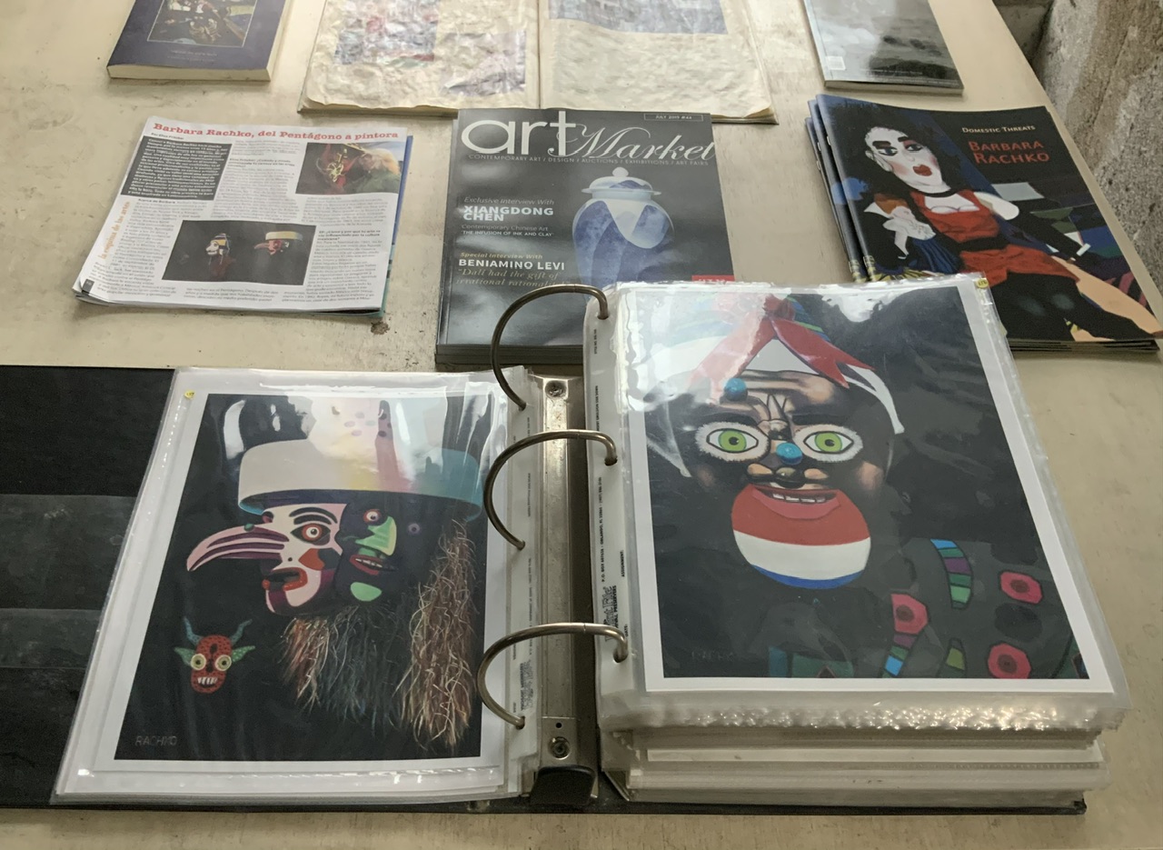
Barbara’s portfolio book
A: Every time I finish a pastel painting I order an 8” x 10” c-print at Duggal Visual Solutions. I started doing this in the 1980s when I was a portrait artist and the company that represented me needed photos of my work to show to potential clients. I’ve just continued making 8” x 10”photos all these years in order to document my work!
Pastel is an extremely slow medium so even though I have been working more than 37 years, the two pastel paintings in progress now are numbers 160 and 161. The portfolio book also has early press clippings, reviews from before the internet (when everything was on paper), and a few photos of early solo exhibitions in the 1990s.
BTW what a great question! No one has ever asked me this before!
Comments are welcome!
Q: The first pastel painting you see every morning when you arrive at your studio is “Myth Meets Dream.” It must have special meaning. Would you elaborate? (Question suggested by Marlissa Gardner via Facebook)

A: “Myth Meets Dream,” an early pastel painting from the “Domestic Threats” series, is one I have never wanted to sell. It marks the first time I included Mexican folk art figures in my work. In 1992 as a Christmas present, my future sister-in-law sent the two Oaxacan painted wooden figures you see depicted above – the blue winged creature and the red, white, and black figure behind it. The other three figures in this painting are hand-puppets.
Previously, I had been creating elaborate staged photographs in my Alexandria house using stuffed animals and hand-puppets. (The latter were made by a company called “Folk Tails”). I used the photos as reference material for pastel paintings. In other words, rather than work exclusively from life, I mostly looked at these photos while I made the painting. Although I have simplified my process since those early days, I still create pastel paintings using reference photographs.
In “Myth Meets Dream” you can see both puppets and my then new Oaxacan folk art figures. This pastel painting marks an important transition in subject matter and was the start of decades-worth of foreign travel, study, adventure, hard work, and yes, fun. It’s true that “Myth Meets Dream” hangs in my studio and is the first thing I see every morning. It brings back so many precious memories.
Every painting has a story!
If you’re interested to learn more, please see https://barbararachko.art/en/art-market
Comments are welcome!
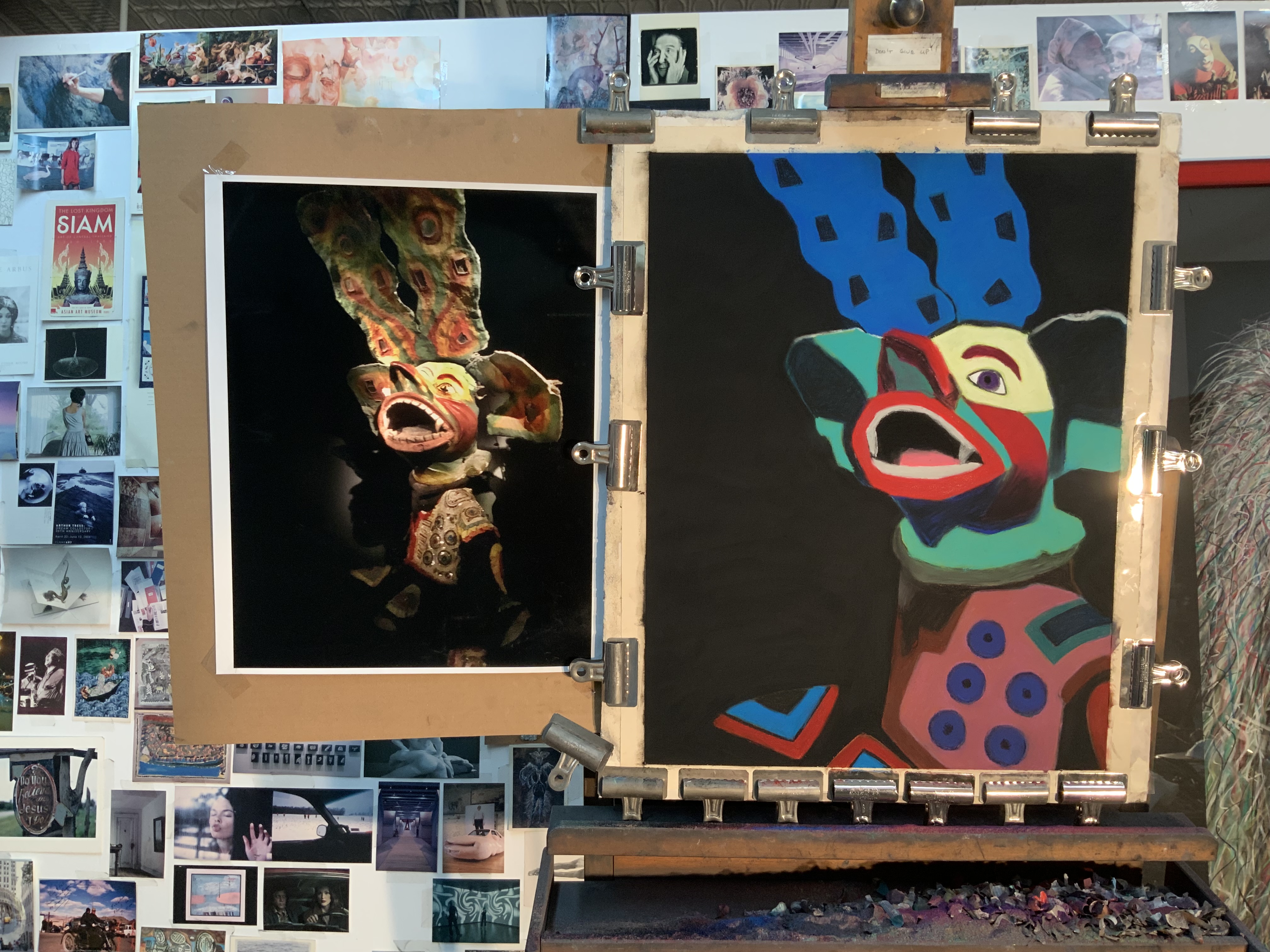
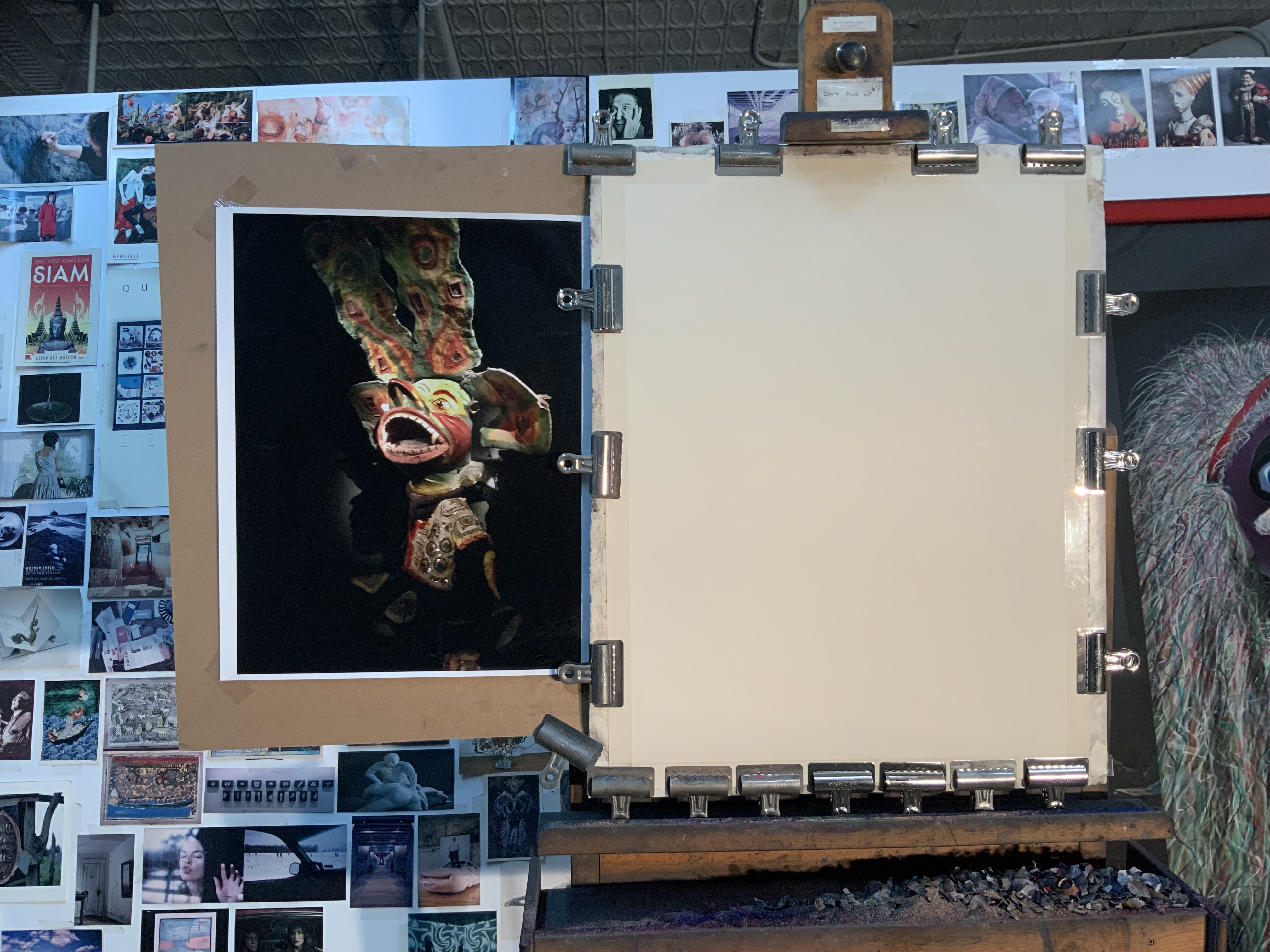
Q: Many of the world’s cultures have a mask tradition. Is there something special about Bolivian masks that first attracted you to them?

Bolivian Carnival Mask
A: My subject matter emerges directly from my travels. I visited Bolivia in 2017. What I especially liked then – and now – about Bolivian Carnival masks, is that they include additional textures – feathers, fur, costume jewelry, sequins, fabric, etc. that add to their physical presence. Masks from most of the other countries I’ve visited tend to be made of wood and/or paper mache and nothing else. In my view such masks are not as dramatic nor do they offer much expressive potential. They feel dead. They lack a certain “soulfulness.”
Furthermore, textures are challenging to render in soft pastel. For more than three decades I have been striving to improve my pastel techniques. By now I have a vast repertoire from which to select. As was true in my earlier series, with “Bolivianos” an important personal goal is to keep adding to the repertoire.
It takes months to create a pastel painting, which means I need masks that will hold my attention every day over the course of three or four months. I never want to be bored in the studio. If I am bored while making the work, those feelings will be directly transferred and I will make a boring pastel painting, something I hope never to do! The masks need to have a really strong ‘presence.’ Then as I slowly make a pastel painting, one that is exciting to work on from start to finish, I can transform my subject into something surprising and powerful that has never existed before!
Comments are welcome!
Q: What’s on the easel today?

Work in progress
A: I just started a new 58” x 38” pastel painting. This photo shows two days worth of work.
Comments are welcome!
Q: Love your selection of pastels! Do you have favorites that you need to force yourself not to continually return to? (Question from Donina Asera via Facebook)

A: No, I don’t think so. Certainly, I do have general preferences. I prefer dark, vivid, intense colors so many of my pale pastels go mostly unused. The single pastel that I use most is Rembrandt black – I buy them buy the dozens – because it takes many layers of pigment to achieve my dark black backgrounds. Otherwise, I strive to be open to whatever the painting needs. My goal – always! – is to make a pastel painting that is exciting to look at and different from anything I have created before.
Thank you very much for the great question!
Comments are welcome!
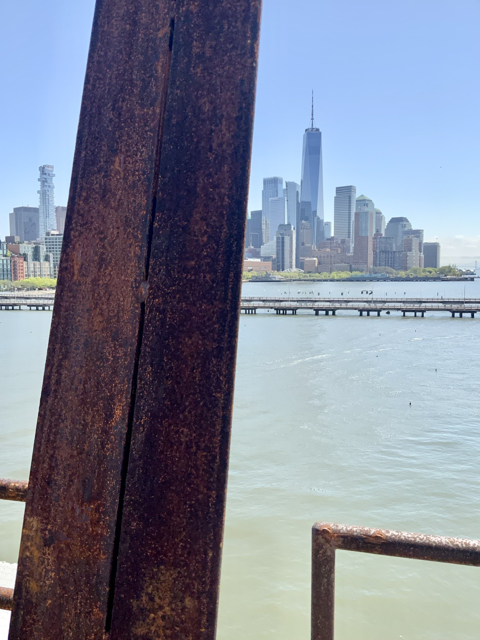
Q: How has the use of photography in your work changed over the decades?
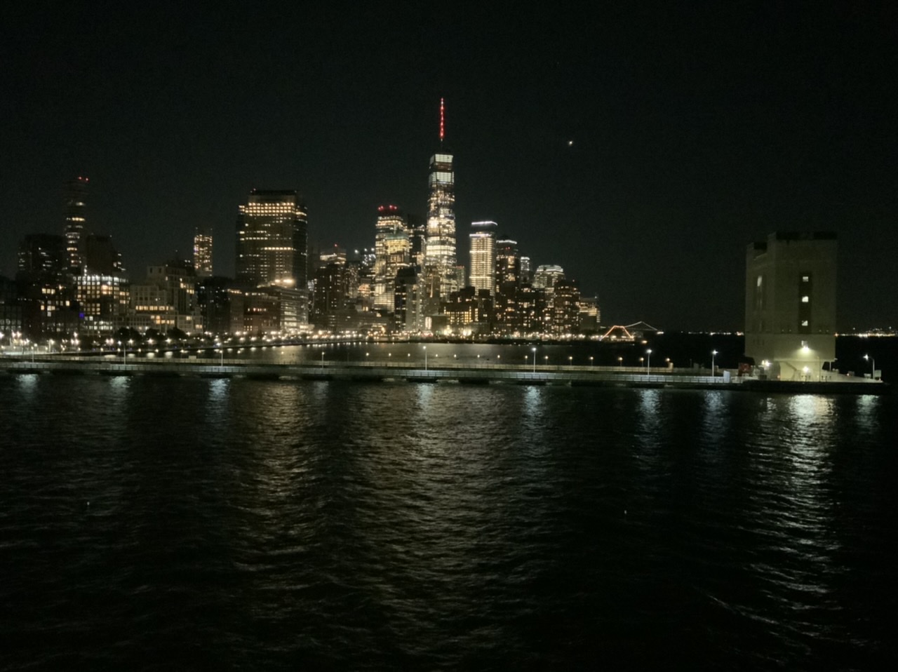
New York, NY
A: From the beginning in the mid-1980s I used photographs as reference material. My late husband, Bryan, would shoot 4” x 5” negatives of my elaborate setups using his Toyo-Omega view camera. In this respect Bryan was an integral part of my creative process as I developed the “Domestic Threats” pastel paintings. At that time I rarely picked up a camera, except to capture memories of our travels.
After Bryan was killed on 9/11, I inherited his extensive camera collection – old Nikons, Leicas, Graphlex cameras, and more. I wanted and needed to learn how to use them. Starting in 2002 I enrolled in a series of photography courses (about 10 over 4 years) at the International Center of Photography in New York. I learned how to use all of Bryan’s cameras and how to make my own big chromogenic prints in the darkroom.
Along the way I discovered that the sense of composition and color I had developed over many years as a painter translated well into photography. The camera was just another medium with which to express my ideas. Surprisingly, in 2009 I had my first solo photography exhibition at a gallery in New York. Bryan would have been so proud!
For several years now my camera of choice has been a 12.9” iPad Pro. It’s main advantage is that the large screen let’s me see every detail as I compose my photographs. I think of it as a portable, lightweight, and easy-to-use 8 x 10 view camera. My iPad is always with me when I travel and as I walk around exploring New York City.
It is a wonderful thing to be both a painter and a photographer! While pastel painting will always be my first love, photography has distinct advantages over my studio practice. Pastel paintings are labor-intensive, requiring months of painstaking work. Photography’s main advantage is speed. Photographs – from the initial impulse to hanging a print on a wall – can be made in minutes. Photography is instant gratification, allowing me to explore ideas much easier and faster than I ever could as a painter. Perhaps most importantly, composing photographs keeps my eye sharp whenever I am away from the studio. I credit photography as an important factor in the overall evolution of my work.
Comments are welcome!

