Blog Archives
Q: Many of the world’s cultures have a mask tradition. Is there something special about Bolivian masks that first attracted you to them?

Bolivian Carnival Mask
A: My subject matter emerges directly from my travels. I visited Bolivia in 2017. What I especially liked then – and now – about Bolivian Carnival masks, is that they include additional textures – feathers, fur, costume jewelry, sequins, fabric, etc. that add to their physical presence. Masks from most of the other countries I’ve visited tend to be made of wood and/or paper mache and nothing else. In my view such masks are not as dramatic nor do they offer much expressive potential. They feel dead. They lack a certain “soulfulness.”
Furthermore, textures are challenging to render in soft pastel. For more than three decades I have been striving to improve my pastel techniques. By now I have a vast repertoire from which to select. As was true in my earlier series, with “Bolivianos” an important personal goal is to keep adding to the repertoire.
It takes months to create a pastel painting, which means I need masks that will hold my attention every day over the course of three or four months. I never want to be bored in the studio. If I am bored while making the work, those feelings will be directly transferred and I will make a boring pastel painting, something I hope never to do! The masks need to have a really strong ‘presence.’ Then as I slowly make a pastel painting, one that is exciting to work on from start to finish, I can transform my subject into something surprising and powerful that has never existed before!
Comments are welcome!
Q: What’s on the easel today?

Work in progress
A: I just started a new 58” x 38” pastel painting. This photo shows two days worth of work.
Comments are welcome!
Q: Love your selection of pastels! Do you have favorites that you need to force yourself not to continually return to? (Question from Donina Asera via Facebook)

A: No, I don’t think so. Certainly, I do have general preferences. I prefer dark, vivid, intense colors so many of my pale pastels go mostly unused. The single pastel that I use most is Rembrandt black – I buy them buy the dozens – because it takes many layers of pigment to achieve my dark black backgrounds. Otherwise, I strive to be open to whatever the painting needs. My goal – always! – is to make a pastel painting that is exciting to look at and different from anything I have created before.
Thank you very much for the great question!
Comments are welcome!
Q: How has the use of photography in your work changed over the decades?
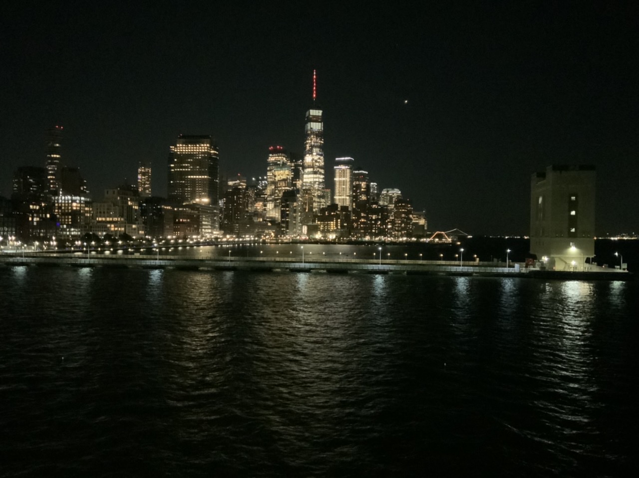
New York, NY
A: From the beginning in the mid-1980s I used photographs as reference material. My late husband, Bryan, would shoot 4” x 5” negatives of my elaborate setups using his Toyo-Omega view camera. In this respect Bryan was an integral part of my creative process as I developed the “Domestic Threats” pastel paintings. At that time I rarely picked up a camera, except to capture memories of our travels.
After Bryan was killed on 9/11, I inherited his extensive camera collection – old Nikons, Leicas, Graphlex cameras, and more. I wanted and needed to learn how to use them. Starting in 2002 I enrolled in a series of photography courses (about 10 over 4 years) at the International Center of Photography in New York. I learned how to use all of Bryan’s cameras and how to make my own big chromogenic prints in the darkroom.
Along the way I discovered that the sense of composition and color I had developed over many years as a painter translated well into photography. The camera was just another medium with which to express my ideas. Surprisingly, in 2009 I had my first solo photography exhibition at a gallery in New York. Bryan would have been so proud!
For several years now my camera of choice has been a 12.9” iPad Pro. It’s main advantage is that the large screen let’s me see every detail as I compose my photographs. I think of it as a portable, lightweight, and easy-to-use 8 x 10 view camera. My iPad is always with me when I travel and as I walk around exploring New York City.
It is a wonderful thing to be both a painter and a photographer! While pastel painting will always be my first love, photography has distinct advantages over my studio practice. Pastel paintings are labor-intensive, requiring months of painstaking work. Photography’s main advantage is speed. Photographs – from the initial impulse to hanging a print on a wall – can be made in minutes. Photography is instant gratification, allowing me to explore ideas much easier and faster than I ever could as a painter. Perhaps most importantly, composing photographs keeps my eye sharp whenever I am away from the studio. I credit photography as an important factor in the overall evolution of my work.
Comments are welcome!
Q: What’s on the easel today?

Work in progress
A: I am planning my next pastel painting and the photo above shows a preliminary charcoal sketch for it. I’m continuing to study the effects of scaling my work up or down. This piece will be a smaller, 26” x 20,” version of “The Orator,” 38” x 58” (image), 50” x 70” (framed), from 2017.
Comments are welcome!
Q: Can you explain how you choose colors? (Question from Maria Cox via Instagram)

A: I am wild about color! As I work to create a pastel painting, I apply a color, back up from my easel to see how it interacts with and affects the rest of the painting, and then I make revisions. This process necessitates countless color changes and hundreds of hours during months of work. I apply pastel using a meticulous layering process. Were you to x-ray one of them, the earlier, discarded versions of a pastel painting would be visible. All the while I carefully fine-tune and refine how the colors and shapes interact with each other.
The goal is to make an exciting painting that no one, especially me as the maker, has ever seen before. I have no desire to repeat myself, to make art that resembles work by any other artist, or to be forced into a niche.
I try to select intense, vibrant colors that are exciting to look at, that work well in relationship to each other, and that will grab the viewer. Sometimes I deliberately choose colors for their symbolic meanings. For example, I selected a dark purple for the alternating triangles (the ones with the pink dots above) in “Overlord” because purple denotes royalty.
I have been working with soft pastel for 37 years so I have a fairly intricate science of color at my disposal. No doubt, many unconscious factors are at play, too. More on that in future posts.
Comments are welcome!
Q: What’s on the easel today?
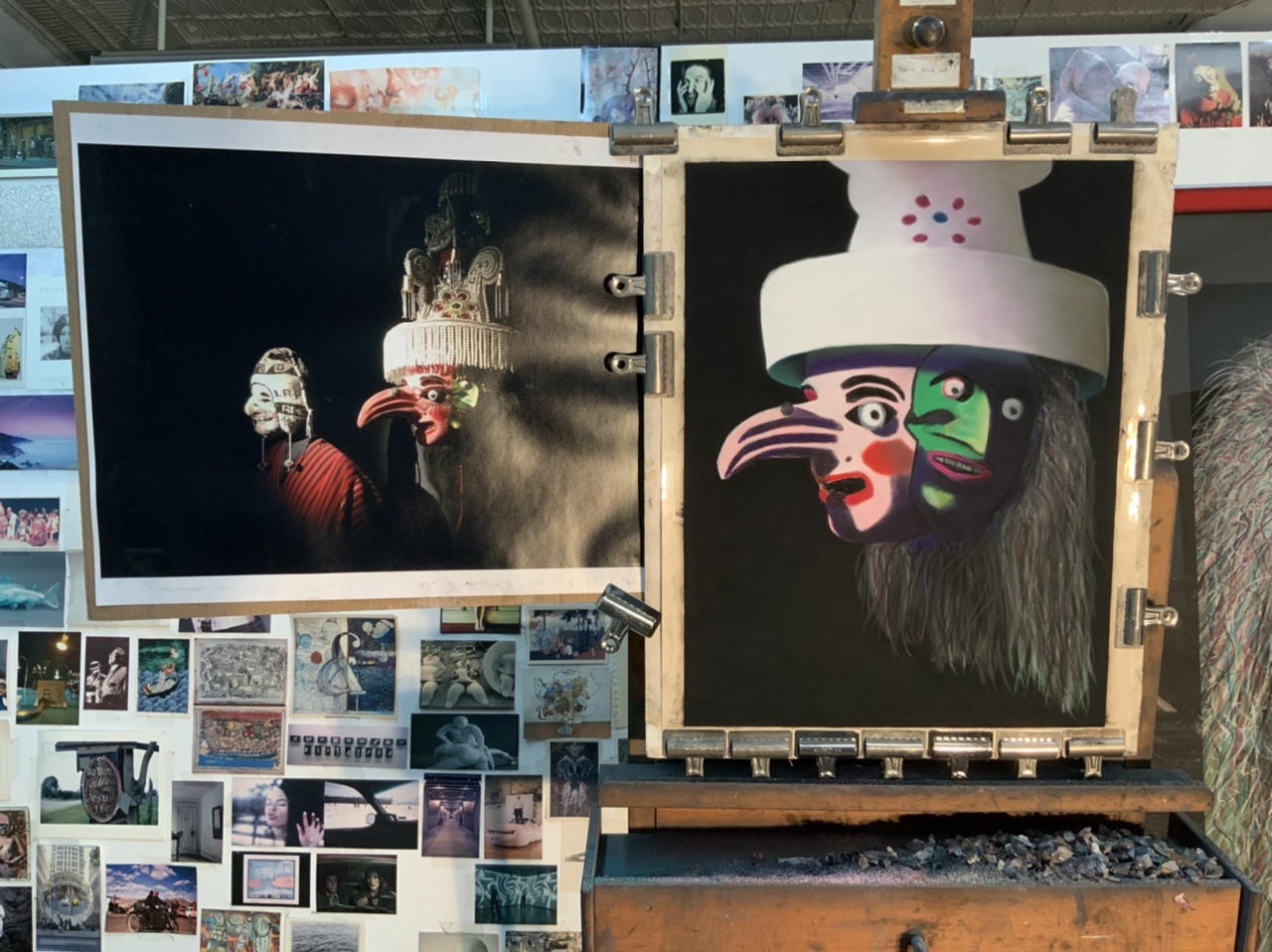
Work in progress
A: I recently began a 26” x 20” pastel painting tentatively titled, “Shadow.”
Comments are welcome!
Q: What does it feel like when you dop off a pastel painting at your Virginia framer’s shop? Are you sorry to see it go? (Question from Caroline Golden)
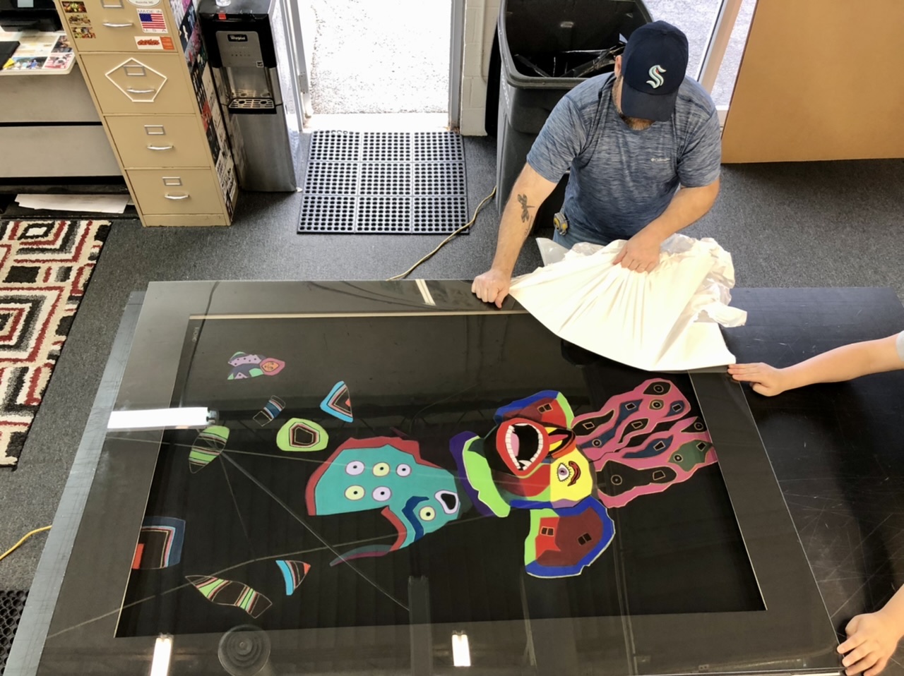
A: Actually, just the opposite since I have been looking at it on my easel for more than three months. Typically, I’m glad to say goodbye – temporarily – because I know when I pick it up in a month, I will have gained some distance and can begin to see and think about it more objectively. I can start reflecting on how this pastel painting relates to my overall body of work.
Comments are welcome!
Q: Would you speak about someone who made a difference in your professional life?
A: The first person who comes to mind is my favorite aunt, Teddie. In 1997 she was headed to northern California to attend a three-year-plus silent Tibetan Buddhist retreat at her teacher’s center. Teddie offered me her West 13th Street 6th-floor walkup apartment to live in while she was away. At the time I was based in Alexandria, VA and had just had my first solo exhibition at an important West 57th Street gallery, Brewster Fine Arts. I was becoming increasingly frustrated with the limited Washington, DC art scene, had outgrown everything it had to offer, and felt New York pulling me towards new and exciting professional adventures.
Teddie, recognizing my talent and ambition, made it possible for me to afford to move to New York. She had practiced Tibetan Buddhism for 35 years and was soon to become a Buddhist lama. She had an extraordinary mind and thought deeply about life. We used to talk for hours. Teddie was 7 years older and seemed more like a sister than an aunt. Indeed, she was my first soul mate. (I have been extremely fortunate to have had two such relationships in my life. The other was my late husband, Bryan).
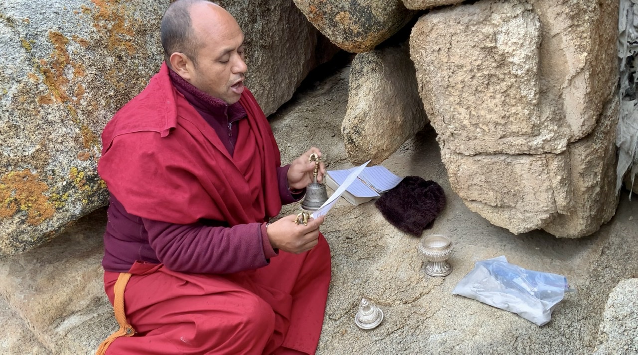
Unfortunately, dear Aunt Teddie died at the age of 67 of breast cancer. Recently, on September 25 I honored her life in a short ceremony on a mountain cliff in Leh, Ladakh (India). A Tibetan Buddhist monk recited prayers as he placed her ashes among the rocks.
Comments are welcome!
Q: To what extent will the world of art change in the post-COVID period – both in terms of what is created and also the business of art? (Question from artamour)
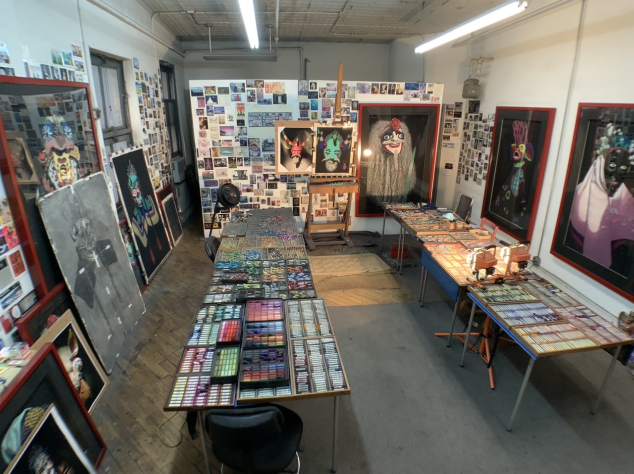
A: We all still wonder how the art world will change post-COVID. (Will there ever be a time when we can say we are post-COVID?). I know that I will continue refining and developing my art practice and seeking out new business opportunities. I have been an artist long enough to know that I will always follow my own path (each pastel painting points to the next one) regardless of what is going on in the larger world. How could I not do so? In large part due to an extensive social media program carried out by my two able assistants, the COVID period has been a personal boon. I completed a short documentary film about my life and work. It is in post-production now. I gained representation with three new international galleries. My blog is attracting approximately 1,000 – 2,000 new subscribers every month and I continue receiving requests for interviews from around the world.
Comments are welcome!