Category Archives: Working methods
Pearls from artists* # 48

“Big Deal,” with double portrait of the author
* an ongoing series of quotations – mostly from artists, to artists – that offers wisdom, inspiration, and advice for the sometimes lonely road we are on.
Until the invention of photography, the painted (or sculptural) portrait was the only means of recording and presenting the likeness of a person. Photography took over this role from painting and at the same time raised our standards for judging how much an informative likeness should include.
This is not to say that photographs are in all ways superior to painted portraits. They are more informative, more psychologically revealing, and in general more accurate. But they are less tensely unified. Unity in a work of art is achieved as a result of the limitations of the medium. Every element has to be transformed in order to have its proper place within these limitations. In photography the transformation is to a considerable extent mechanical. In a painting each transformation is largely the result of a conscious decision by the artist. Thus the unity of a painting is permeated by a far higher degree of intention. The total effect of a painting (as distinct from its truthfulness) is less arbitrary than that of a photograph; its construction is more intensely socialized because it is dependent on a greater number of human decisions. A photographic portrait may be more revealing and accurate about the likeness and character of the sitter; but it is likely to be less persuasive, less (in the very strict sense of the word) conclusive. For example, if the portraitist’s intention is to flatter or idealize, he will be able to do so far more convincingly in a painting than with a photograph.
Geoff Dyer, editor, Selected Essays: John Berger
Comments are welcome!
Q: Have you ever worked outside?

Reproductions of “Cardinal Rule” (top) and “Blue Ego,” originals are soft pastel on sandpaper, 30″ x 38″
A: As a pastel artist I’ve never worked outside – with so many pastels, it’s just not practical – but early on in the “Domestic Threats” series, I created two outdoor setups. Works in the series derived from elaborate scenes that I arranged and then photographed.
I used to take long walks along the Potomac River in Alexandria, VA, and there was a tree stump that was fascinating. It was mostly twisted roots, knotty branches, dark hidden spaces, etc. (top painting in photo). One morning I took several hand puppets and stuffed animals (my subject matter at the time) and carefully arranged them on the tree. Around me people were busy exercising their dogs. Soon I attracted quite a bit of attention – a tall blonde woman playing with puppets on a tree stump! Dogs came over to sniff. Their owners came over, too, and I was pressed into explaining, again and again, that I was an artist, that I was photographing this scene so I could paint it, etc. The interruptions were very annoying.
The second time I tried an outdoor setup was again along the Potomac River, but this time I selected a secluded strip of beach where I was undisturbed. I had forgotten to consider the light and inadvertently chose a cloudy day. I remember being disappointed that the light was flat and lacking shadows. The painting (bottom in photo) turned out to be one of my least favorites.
I resolved from then on to focus on interiors. Alfred Hitchcock famously used rear projection so that he could work in a studio rather than on location. One reason, he said, was that in a studio he had total control. I know what he meant. When I set up an interior scene and position the lights to make interesting shadows, indeed, I have control over the whole look. No aspect is left to chance. The accidents – improvements! – happen later when I work on the painting.
Comments are welcome!
Pearls from artists* # 46

Artist’s backyard
* an ongoing series of quotations – mostly from artists, to artists – that offers wisdom, inspiration, and advice for the sometimes lonely road we are on.
Some things will naturally excite us more than others. This is where art begins, when we separate our inner-directed impulse from the outer-directed deluge of other people’s work and opinion. “The artists are the ones who bare themselves to this experience of essence… Their vocation is to communicate that experience to others. Not to communicate it is to surrender the vision to atrophy; the artist must paint, or write, or sculpt – else the vision withers away and he or she is less apt to have it again.”
The trick is to be able to learn to juggle at least two things at once. We need to keep the initial impulse in its entirety before us as we start engaging in the execution of the parts.
Ian Roberts in Creative Authenticity: Sixteen Principles to Clarify and Deepen Your Artistic Vision
Comments are welcome!
Q: How do you decide on the titles for your pastel paintings?

“Stigmata,” soft pastel on sandpaper, 28″ x 48″
A: Usually a title suggests itself over the course of the months I spend on a painting. Sometimes it comes from a book I’m reading, from a piece of music, a film, bits of overheard conversation. A title can come from anywhere, but finding the best one is key. I like what Jean Cocteau says about this:
One title alone exists. It will be, so it is. Time conceals it from me. How discover it, concealed by a hundred others? I have to avoid the this, the that. Avoid the image. Avoid the descriptive and the undescriptive. Avoid the exact meaning and the inexact. The soft, the hard. Neither long nor short. Right to catch the eye, the ear, the mind. Simple to read and to remember. I had announced several. I had to repeat them twice and the journalists still got them wrong. My real title defies me. It enjoys its hiding place, like a child one keeps calling, and whom one believes drowned in the pond.
Once I have the best title, I make sure it fits the painting exactly. How I do that is difficult to explain. It’s an intuitive process that involves adjusting colors, shapes, and images so that they fit the painting’s meaning, i.e., the meaning hinted at by the title.
Comments are welcome!
Q: What is your best time of day to paint?

The High Line – Barbara’s morning commute to the studio
A: I have always been an early riser and a morning person, from my student pilot days when I’d be at an airport in New Jersey ready to takeoff in a Cessna by 6 a.m., through my days as a Naval officer starting work at the Pentagon at 7, until now when I typically get up before 6 (thanks to my cat, who likes to eat breakfast early). Always I am most energetic in the mornings so that’s when I am most productive and have my best ideas. Generally, I try to arrive at the studio before 10 a.m. and work until 5 p.m. or later.
Comments are welcome!
Pearls from artists* # 42
Balinese dancer
* an ongoing series of quotations – mostly from artists, to artists – that offers wisdom, inspiration, and advice for the sometimes lonely road we are on.
Things-as-they-are offer such an abundance of material that a photographer must guard against the temptation of trying to do everything. It is essential to cut from the raw material of life – to cut and cut, but to cut with discrimination. While working, a photographer must reach a precise awareness of what he is trying to do. Sometimes you have the feeling that you have already taken the strongest possible picture of a particular situation or scene; nevertheless, you find yourself compulsively shooting, because you cannot be sure in advance exactly how the situation, the scene is going to unfold. You must stay with the scene, just in case elements of the situation shoot off from the core again. At the same time, it’s essential to avoid shooting like a machine-gunner and burdening yourself with useless recordings which clutter your memory and spoil the exactness of the reportage as a whole.
Henri Cartier-Bresson in Images a la sauvette
Comments are welcome!
Q: Why do you need to use a photograph as a reference source to make a pastel painting?
One of Barbara’s reference photos
A: When I was about 4 or 5 years old I discovered that I had a natural ability to draw anything that I could see. It’s the way my brain is wired and it is a gift! One of my earliest memories as an artist is of copying the Sunday comics. Always it has been much more difficult to draw what I CANNOT see, i.e., to recall how things look solely from memory or to invent them outright.
The evolution of my pastel-on-sandpaper paintings has been the opposite of what one might expect. I started out making extremely photo-realistic portraits. I remember feeling highly unflattered when after months of hard work, someone would look at my completed painting and say, “It looks just like a photograph!” I know this was meant as a compliment, but to me it meant that I had failed as an artist. Art is so much more than copying physical appearances.
So I resolved to move away from photo-realism. It has been slow going and part of me still feels like a slacker if I don’t put in all the details. But after nearly three decades I have arrived at my present way of working, which although still highly representational, contains much that is made up, simplified, and/or stylized. As I have always done, I continue to work from life and from photographs, but at a certain point I put everything aside and work solely from memory.
Comments are welcome!
Pearls from artists* # 41
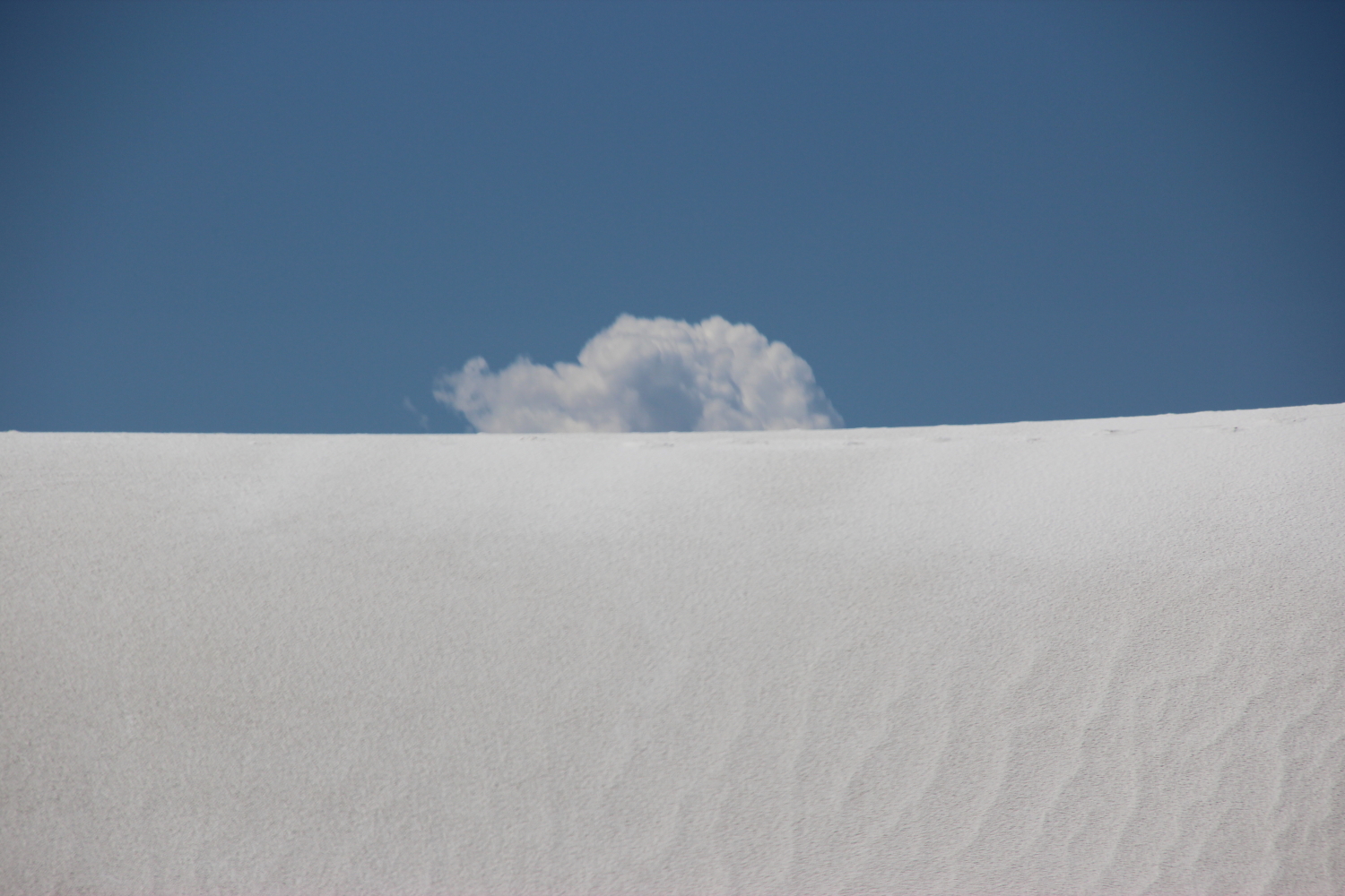
White Sands, NM
* an ongoing series of quotations – mostly from artists, to artists – that offers wisdom, inspiration, and advice for the sometimes lonely road we are on.
If you look at the work of an artist over a lifetime there is always transformation. Some hit a lively place early and then seem to lose it later. Others find that place progressively throughout their life; others still, find it late. But regardless, they are all learning to isolate the poetic place within them. That focus on the poetic in our own work increases our appreciation of the beauty around us, increases our growth, and increases our divine connection.
One thing you see in many artists’ work is that as they continue over the decades to translate their experience of the poetic into form, they learn to communicate better. They strip away all the extraneous stuff and artistic baggage they had. They say more with less.
The problem is seldom that what we truly, deeply experience is too simple to simplify. There is power in stripping everyhing away to reveal the vision. That’s what takes a lifetime.
Ian Roberts in Creative Authenticity: 16 Principles to Clarify and Deepen Your Artistic Vision
Comments are welcome!
Q: What’s on the easel today?
“The Ancestors,” in progress
A: I’m continuing to work on a 58″ x 38″ pastel-on-sandpaper painting that I started some weeks ago. It’s working title is “The Ancestors.”
Comments are welcome!
Q: What is it about soft pastel that you find so intriguing that you use it as your primary fine art medium?

Some of Barbara’s pastels
A: For starters it’s the medium that I fell in love with many years ago. I recently read this article online, “What is Pastel?” by Mike Mahon, and will quote it because it neatly sums up what I love about working with pastel.
Pastel is the most permanent of all media when applied to conservation ground and properly framed. Pastel has no liquid binder that may cause it to oxidize with the passage of time as oftentimes happens with other media.
In this instance, Pastel does not refer to pale colors, as the word is commonly used in cosmetic and fashion terminology. The pure, powdered pigment is ground into a paste with a minimum amount of gum binder, rolled into sticks and dried. The infinite variety of colors in the Pastel palette range from soft and subtle to hard and brilliant.
An artwork is created by stroking the stick of dry pigment across an abrasive ground, embedding the color in the “tooth” of the ground. If the ground is completely covered with Pastel, the work is considered a Pastel painting; whereas, leaving much of the ground exposed produces a Pastel sketch. Techniques vary with individual artists. The Pastel medium is favored by many artists because it allows a spontaneous approach. There is no drying time, therefore, no change in color occurs after drying as it does in other media.
Did you know that a particle of Pastel pigment seen under a microscope looks like a diamond with many facets? It does! Therefore, Pastel paintings reflect light like a prism. No other medium has the same power of color or stability.
Historically, Pastel can be traced back to the 16th century. Its invention is attributed to the German painter, Johann Thiele. A Venetian woman, Rosalba Camera, was the first to make consistent use of Pastel. Chardin did portraits with an open stroke, while La Tour preferred the blended finish. Thereafter, a galaxy of famous artists—Watteau, Copley, Delacroix, Millet, Manet, Renoir, Toulouse Lautrec, Vuillard, Bonnard, Glackens, Whistler, Hassam, William Merritt Chase—used Pastel for a finished work rather than for preliminary sketches.
Pastels from the 16th century exist today, as fresh as the day they were painted. Edgar Degas was the most prolific user of Pastel and its champion. His protégé, Mary Cassat, introduced Pastel to her friends in Philadelphia and Washington, and thus to the United States. In the Spring of 1983, Sotheby Parke Bernet sold at auction, two Degas Pastels for more than $3,000,000 each! Both Pastels were painted about 1880.
Note: Do not confuse Pastel with “colored chalk.” Chalk is a porous, limestone substance impregnated with dyes, whereas, Pastel is pure pigment—the same as is used in other permanent painting media.
Today, Pastel paintings have the stature of oil and watercolor as a major fine art medium. Many of our most renowned, living artists have distinguished themselves in Pastel and have enriched the art world with this beautiful medium.
So knowing all this, I often wonder, why don’t more artists use pastel? Is it because framing is a big issue? Works on paper need to be framed and pastel paintings have unique problems (see my April 27, 2013 blog post). Second only to the cost of maintaining a studio in New York City, frames are my single largest business expense. Sometimes I am grateful that pastel is a very slow medium. I typically finish 4 or 5 paintings in a year, which means I only have to pay for 4 or 5 frames!
Comments are welcome!

