Category Archives: Pastel Painting
Pearls from artists* # 389

Henri Roche pastels: nine trays (four at the top, five on the bottom).
* an ongoing series of quotations – mostly from artists, to artists – that offers wisdom, inspiration, and advice for the sometimes lonely road we are on.
Color vision must be universal. The human eye and brain work the same way for nearly all people as a property of their being human – determining that we all see blue. But the color lexicon, meaning not merely the particular words but also the specific chromatic space they are said to mark, clearly has been shaped by the particularities of culture. Since the spectrum of visible colors is a seamless continuum, where one color is thought to stop and another begun is arbitrary. The lexical discrimination of particular segments is conventional rather than natural. Physiology determines what we see; culture determines how we name, describe, and understand it. The sensation of color is physical; the perception of color is cultural.
David Scott Kastan in On Color
Comments are welcome
Q: What is your favorite thing about creating on sandpaper? (Cassandra Alvarado Oliphant via Instagram)
Ready to start
A: Undoubtedly, I could not make my work without UART sandpaper since my entire pastel technique evolved around it. I use 400 and 500 grit. My favorite thing about it is its ‘tooth’ (i.e. texture or roughness).
Over the many months I spend creating a painting, I build layer upon layer of soft pastel. Because this paper is relatively “toothy,” it accepts all of the pastel the painting needs. And as many people know, I own and use thousands of soft pastels!
Many layers of soft pastel and several months of studio time go into creating each painting. My self-invented technique is analogous to the glazing techniques used by the Old Masters, who slowly built up layers of thin oil paint to achieve a high degree of finish. Colors were not only mixed physically, but optically.
Similarly, I gradually build up layers of soft pastel, as many as thirty, to create a pastel painting. After applying a color, I blend it with my fingers and push it into the sandpaper’s tooth. It mixes with the color beneath to create a new color, continually adding richness, saturation, and intensity to the piece. By the time a pastel painting is finished, the colors are bold, vibrant, and exciting.
Comments are welcome!
Pearls from artists* # 387

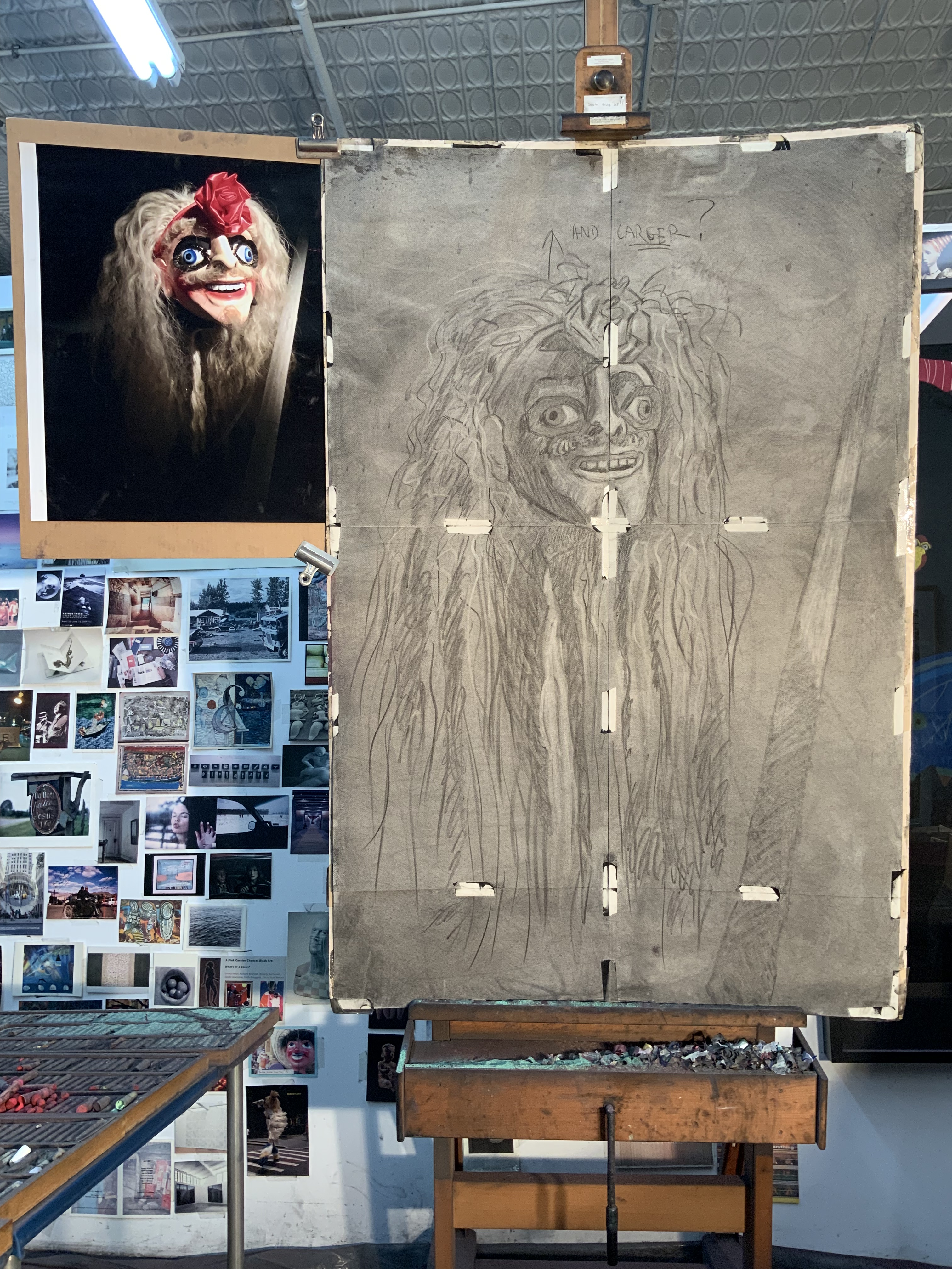
Barbara at work on “Schemer,” Soft Pastel on Sandpaper, 26” x 20”
* an ongoing series of quotations – mostly from artists, to artists – that offers wisdom, inspiration, and advice for the sometimes lonely road we are on.
You know, you don’t go into the studio and say, “Oh, here I am this marvelous heroine, this wonderful woman doing my marvelous painting so all these marvelous women artists can come after me and do their marvelous painting.” There you are alone in this huge space and you are not conscious of the fact that you have breasts and a vagina. You are inside yourself, looking at a damned piece of rag on the wall that you are supposed to make a world out of. That is all you are conscious of. I simply cannot believe that a man feels differently… Inside yourself, you are looking at this terrifying unknown and trying to feel, to pull everything you can out of all your experience, to make something. I think a woman or a man creating feels very much the same way. I bring my experience, which is different from a man’s, yes, and I put it where I can. But once that is done, I don’t know if it is a woman’s experience I’m looking at.
Grace Hartigan quoted in Ninth Street Women by Mary Gabriel
Comments are welcome!
Q: How long did it take you to discover the properties of pastel? (Liliana Mileo via facebook.com/BarbaraRachko/)
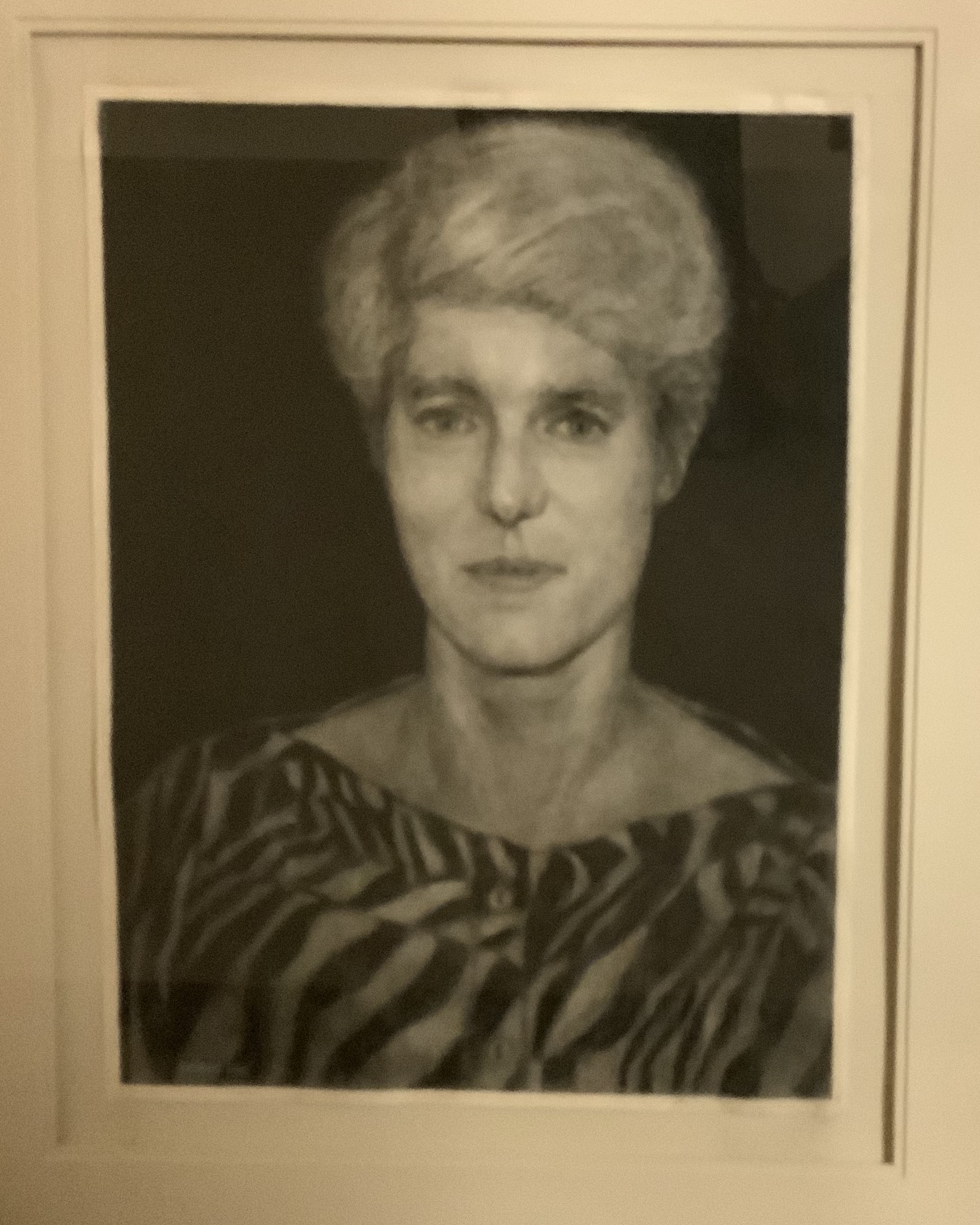
A charcoal self-portrait from 1988
A: After I moved to Alexandria, Virginia in the mid-1980s, I began taking classes at The Art League School. I was extremely unhappy with my career as a Navy Lieutenant. I worked as a computer analyst for the Joint Chiefs of Staff at the Pentagon and was searching for something more meaningful to do with my life.
I began with a basic drawing class and liked it. I enrolled in more classes and decided to spend two years working exclusively in black and white media, such as charcoal and graphite, before advancing to color. Fortunately, early on I found an excellent teacher in Lisa Semerad. I remain deeply grateful for the strong foundational drawing skills she imparted to me during this period.
After two years I tried water color and soon discovered it was not for me, a perfectionist who needs to refine my work. Then I tried etching and found it extremely tedious, the antithesis of instant gratification.
Finally I began studying soft pastel with Diane Tesler, another gifted teacher, and fell in love with this medium! At The Art League School I also completed a one-week workshop with Albert Handell, who introduced me to the archival sandpaper that I have been using ever since.
While I fell in love with pastel three decades ago, I continue to learn about its unique properties. I am pushing pastel to new heights as my techniques continually evolve. This is a lifetime journey of learning. I hope to never know all there is to know.
Comments are welcome! Ask anything and I may answer in a future blog post, as you’ve seen here with Liliana’s question.
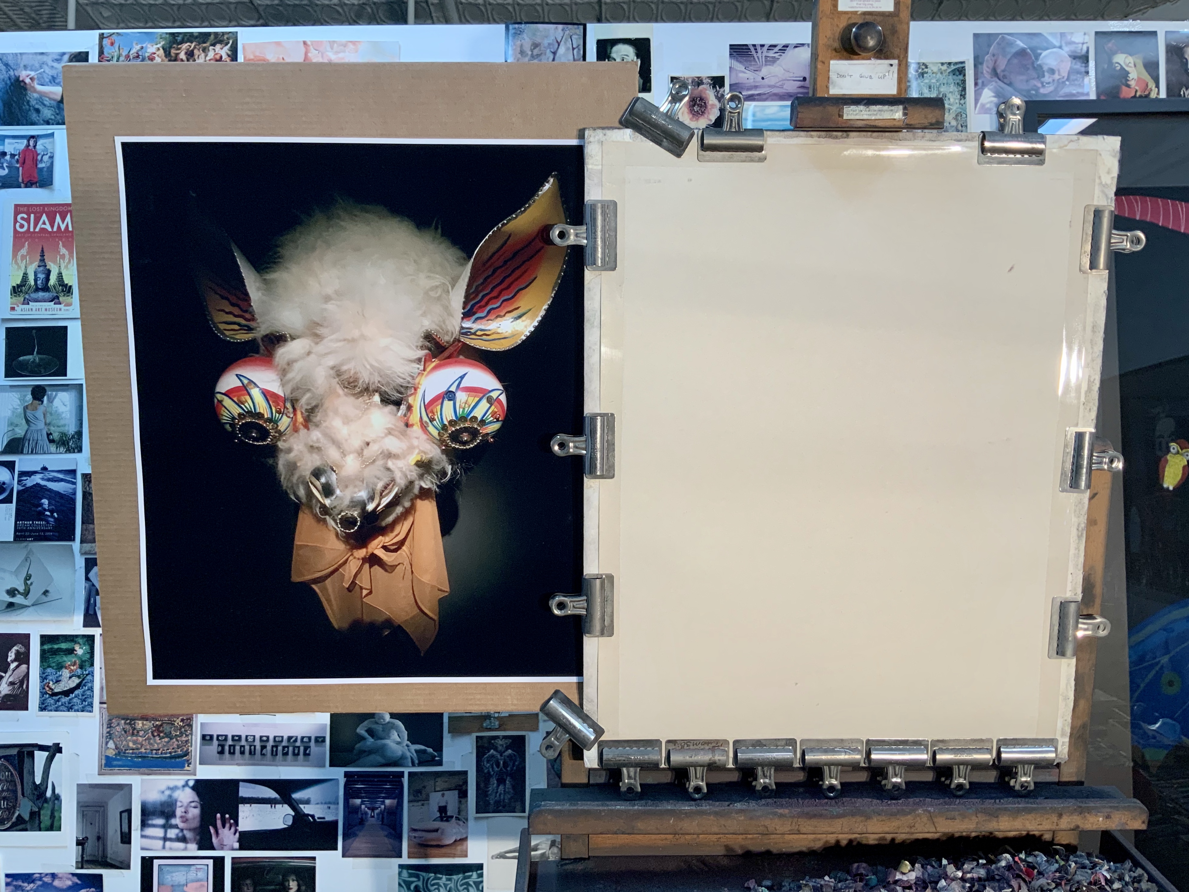
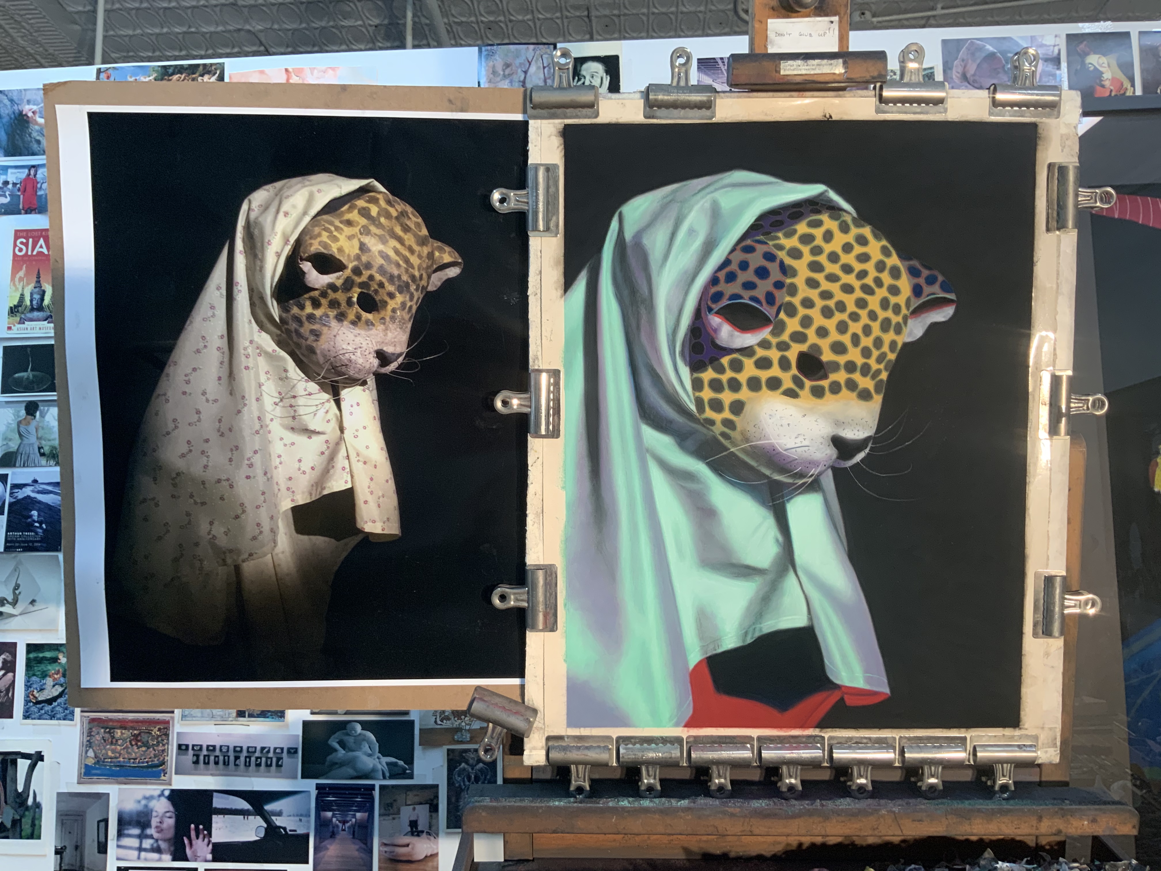
Q: What’s on the easel today?
Work in progress
A: I’m slowly working on a small, 20” x 26,” pastel painting. The tentative title is “Majordomo,” although I’m searching for something better.
Comments are welcome!
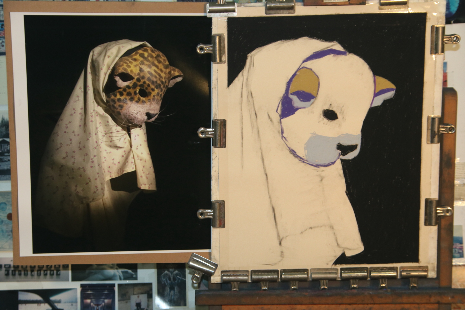
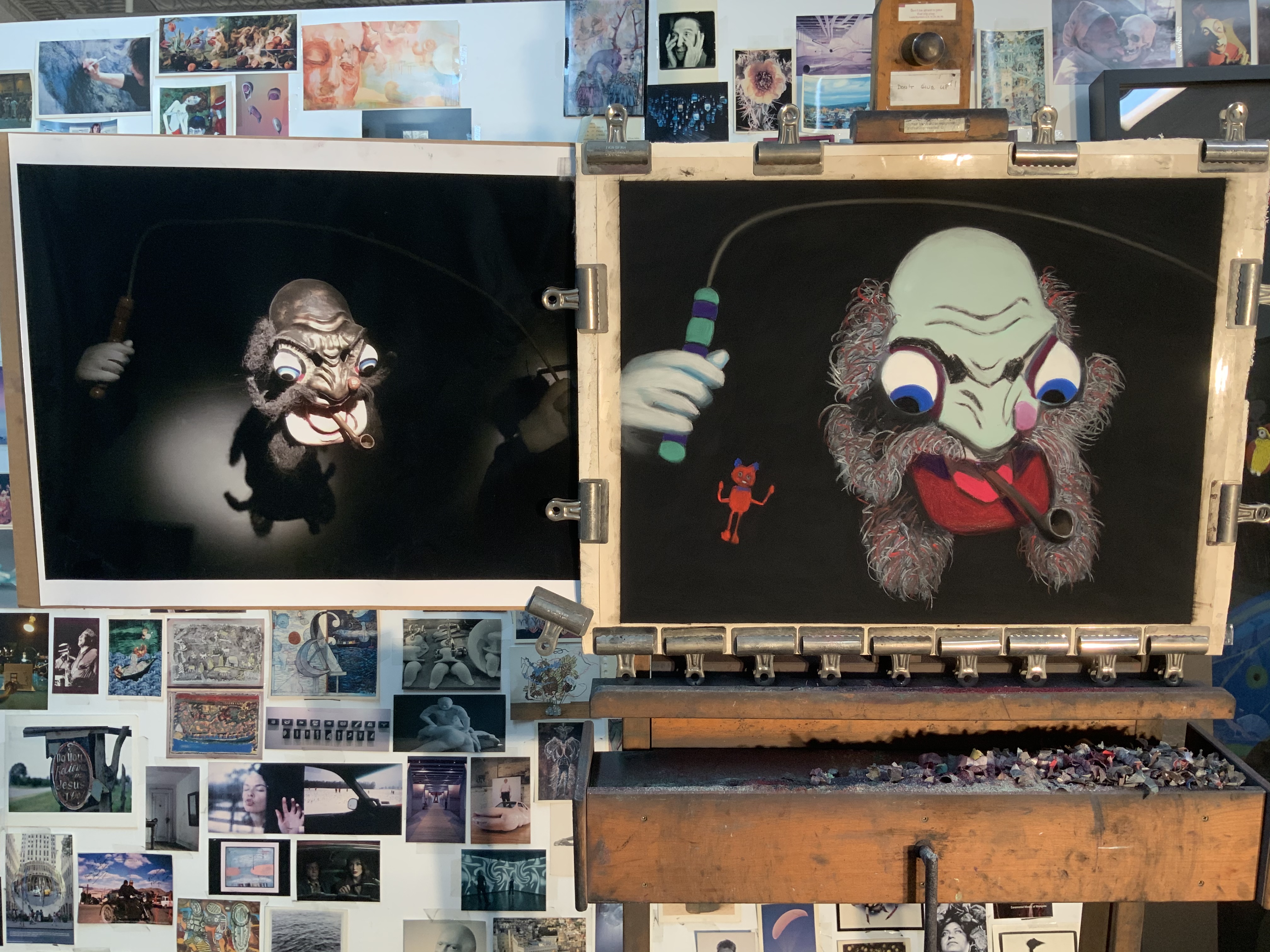
Q: What’s on the easel today?
Work in progress
A: “Avenger,” soft pastel on sandpaper, 58” x 38” awaits finishing touches.
Comments are welcome!
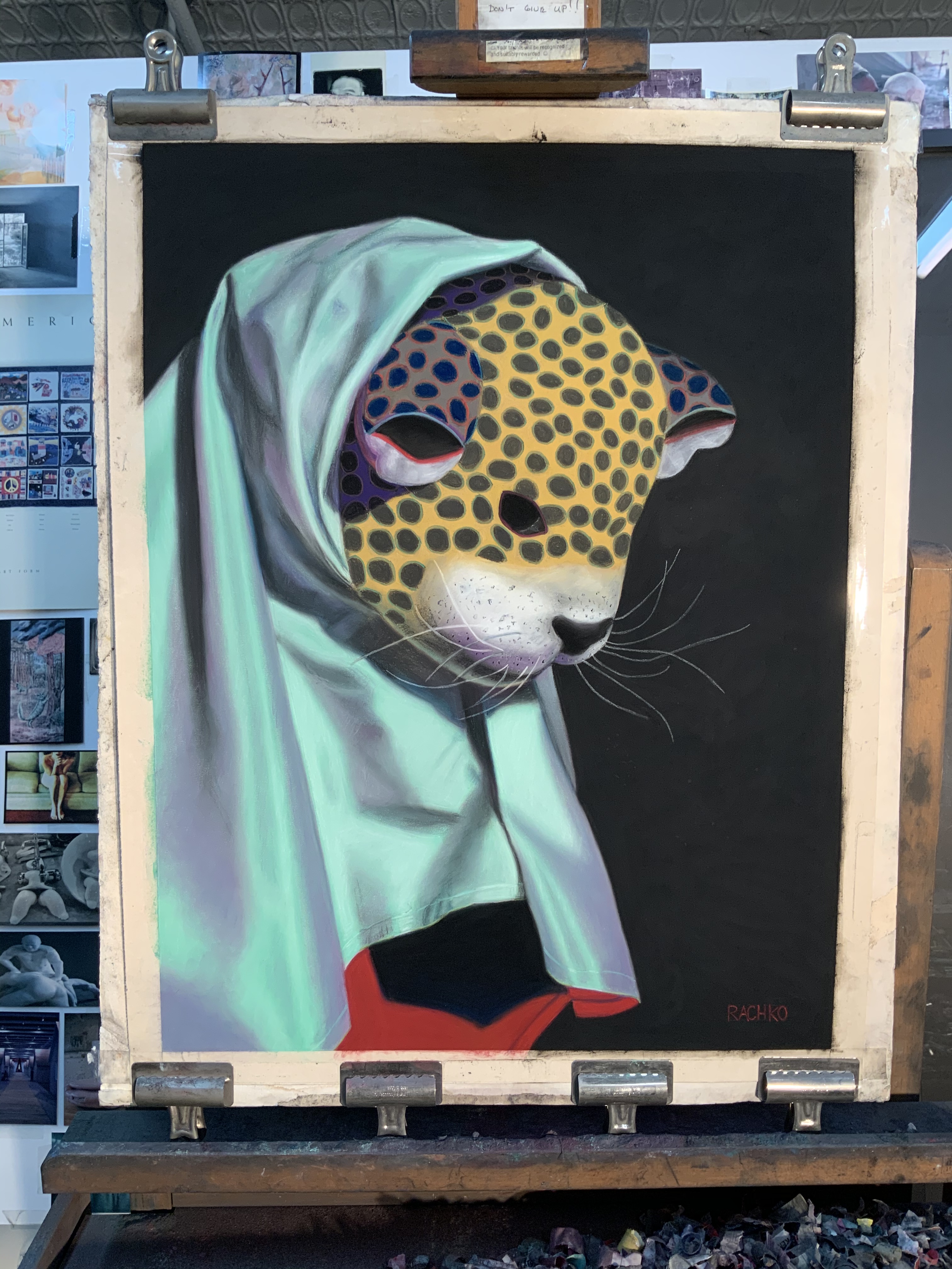
Q: What’s on the easel today?
Work in progress
A: “Schemer,” Soft Pastel on Sandpaper, 26” x 20” is nearly finished. Among other things, I will do more blending to soften the transitions from light to dark in the fabric.
Comments are welcome!
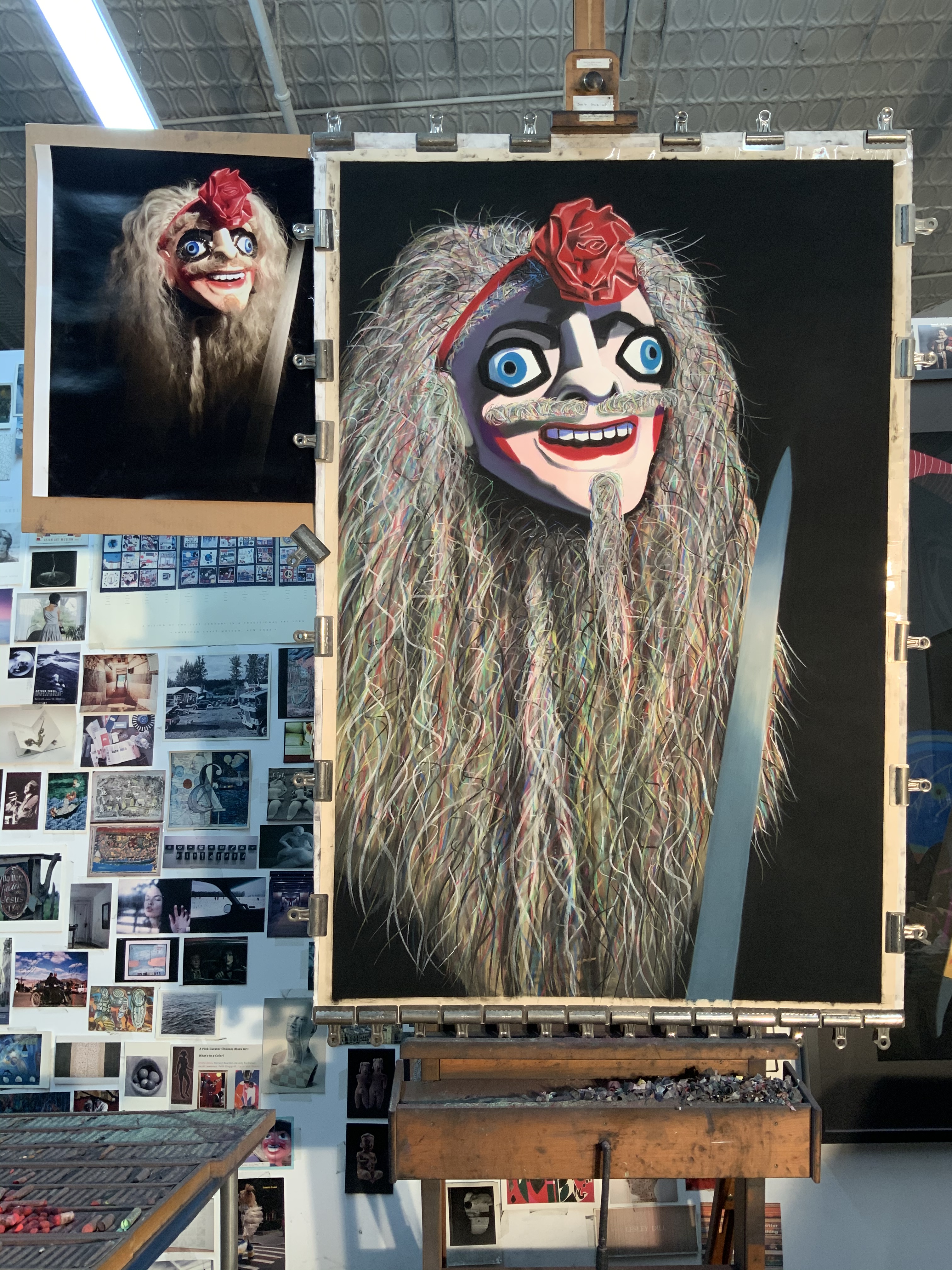
Q: What’s on the easel today?
Preliminary sketch
A: This is a preliminary charcoal sketch for my next large (58” x 38”) pastel painting. I loved seeing “The Champ,” 26” x 20,” blown-up as a poster in the London Underground so I decided to create a larger original. Now I can’t wait to tackle all that hair! So far the sketch resembles a Rastafarian, but who knows if that will carry over to the pastel painting! Stay tuned.
Comments are welcome!
Q: You are a multi-talented woman! Tell us about your book, “From Pilot to Painter,” and how writing, for you, compares to painting and photography. Which do you prefer?
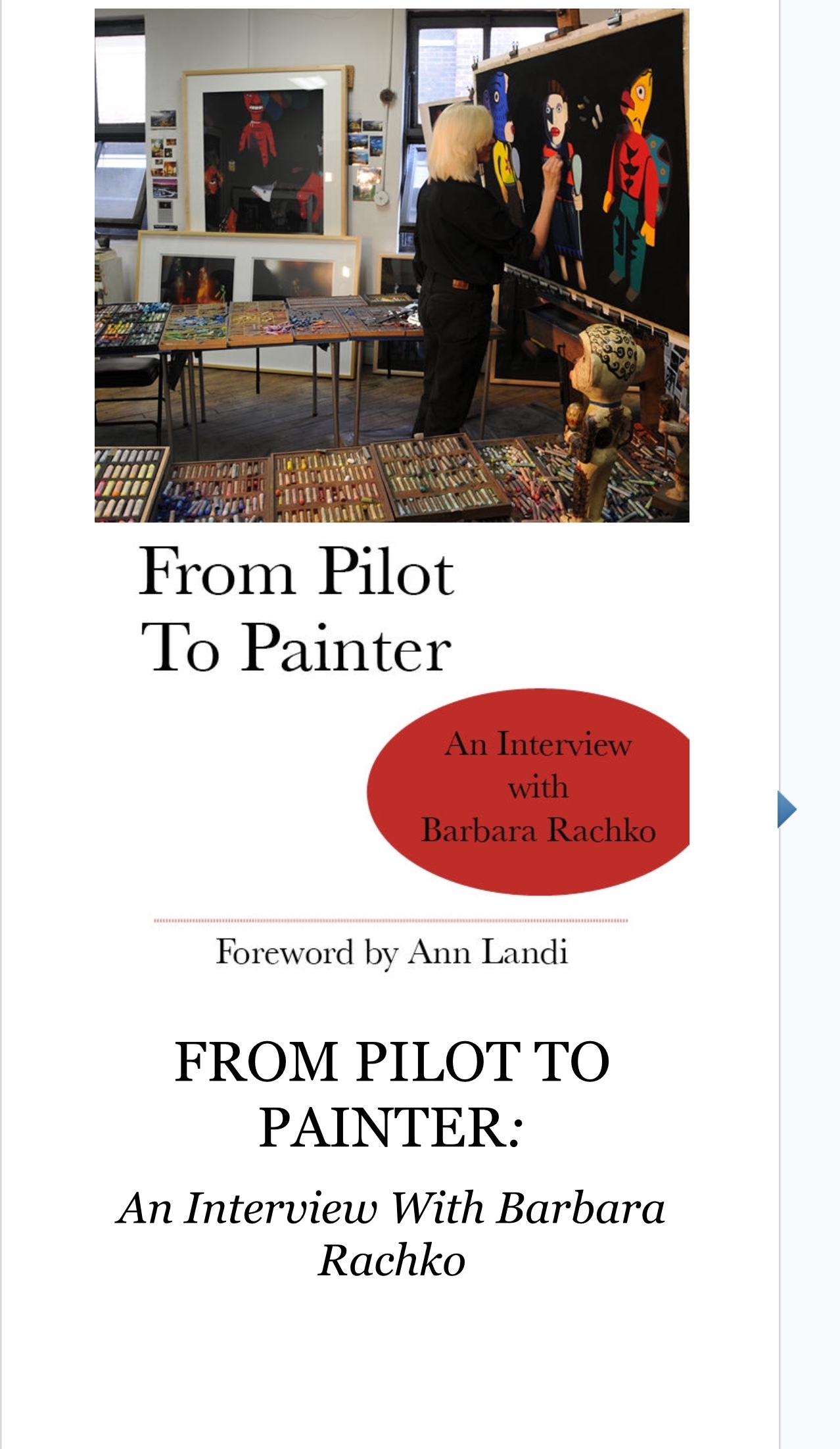
“From Pilot to Painter”
A: I am pleased that my eBook FROM PILOT TO PAINTER is available on Amazon and iTunes. It is based on my blog and is part memoir, including my personal loss on 9/11, insights into my creative practice, and intimate reflections on what it’s like to be an artist living in New York City now. The eBook includes new material not found on the blog, plus 25+ reproductions of my vibrant pastel-on-sandpaper paintings, a Foreword by Ann Landi (who writes for ARTnews and The Wall Street Journal), and more.
“Barbara Rachko’s Colored Dust” (the title of my blog) continues to be a crucial part of my overall art practice. Blogging twice a week forces me to think deeply about my work and to explain it clearly to others. The process has helped me develop a better understanding about why I make art and has encouraged me to become a better writer.
From the beginning in the 1980s I used photographs as reference material and Bryan would shoot 4” x 5” negatives of my elaborate setups with his Toyo-Omega view camera. In those days I rarely picked up a camera except when we were traveling. After Bryan was killed on 9/11, I inherited his extensive camera collection – old Nikons, Leicas, Graphlex cameras, etc. – and I wanted to learn how to use them. In 2002 I enrolled in a series of photography courses (about 10 over 4 years) at the International Center of Photography in New York. I learned how to use all of Bryan’s cameras and how to make my own big color prints in the darkroom. Along the way I discovered that the sense of composition, form, and color I developed over many years as a painter translated well into photography. The camera was just another medium with which to express my ideas. Astonishingly, in 2009 I had my first solo photography exhibition in New York.
It’s wonderful to be both a painter and a photographer. Pastel painting will always be my first love, but photography lets me explore ideas much faster than I ever could as a painter. Paintings take months of work. To me, photographs – from the initial impulse to hanging a framed print on the wall – are instant gratification.
For two years I have been using my iPad Pro to capture thousands of travel photographs. Most recently, I visited Gujarat and Rajasthan in India. I have never been inclined to use a sketchbook so composing photos on my iPad keeps my eye sharp while I’m halfway around the world, far from my studio practice.
Comments are welcome!

