Category Archives: Working methods
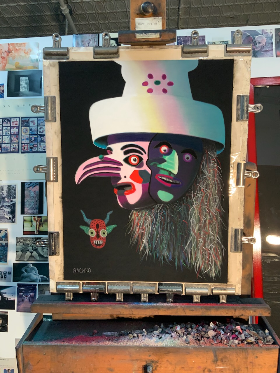
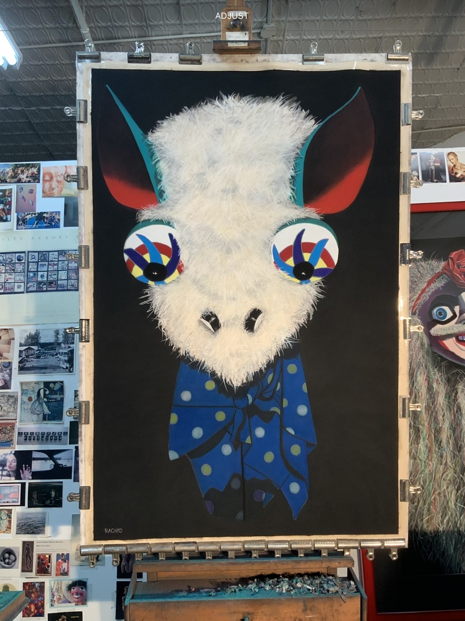
Q: What’s on the easel today?
Work in progress
A: I continue adding details to “Wise One,” soft pastel on sandpaper, 58” x 38.”
Comments are welcome!
Q: It must be tricky moving pastel paintings from your New York studio to your framer in Virginia. Can you explain what’s involved? (Question from Ni Zhu via Instagram)
“Impresario” partially boxed for transport to Virginia
A: Well, I have been working with the same framer for three decades so I am used to the process.
Once my photographer photographs a finished, unframed piece, I carefully remove it from the 60” x 40” piece of foam core to which it has been attached (with bulldog clips) during the months I worked on it. I carefully slide the painting into a large covered box for transport. Sometimes I photograph it in the box before I put the cover on (see above).
My studio is in a busy part of Manhattan where only commercial vehicles are allowed to park, except on Sundays. Early on a Sunday morning, I pick up my 1993 Ford F-150 truck from Pier 40 (a parking garage on the Hudson River at the end of Houston Street) and drive to my building’s freight elevator. I try to park relatively close by. On Sundays the gate to the freight elevator is closed and locked so I enter the building around the corner via the main entrance. I unlock my studio, retrieve the boxed painting, bring it to the freight elevator, and buzz for the operator. He answers and I bring the painting down to my truck. Then I load it into the back of my truck for transport to my apartment.
I drive downtown to the West Village, where I live, and double park my truck. (It’s generally impossible to park on my block). I hurry to unload the painting, bring it into my building, and up to my apartment, all the while hoping I do not get a parking ticket. The painting will be stored in my apartment, away from extreme cold or heat, until I’m ready to drive to Virginia. On the day I go to Virginia, I load it back into my truck. Then I make the roughly 5-hour drive south.
Who ever said being an artist is easy was lying!
Comments are welcome!
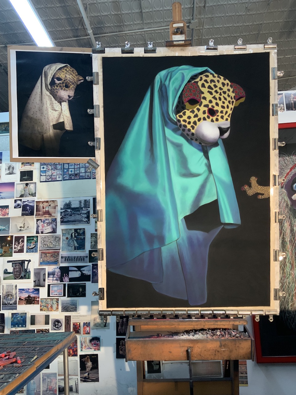
Q: What’s on the easel today?
Just about finished!
A: I am putting finishing touches on “Shadow,” soft pastel on sandpaper, 26” x 20.”
Comments are welcome!
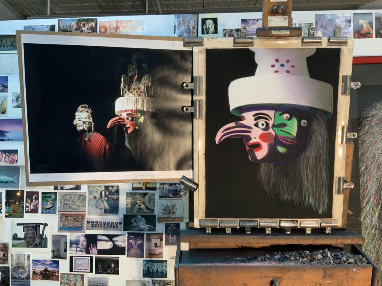
Q: What’s on the easel today?

Work in progress
A: I am planning my next pastel painting and the photo above shows a preliminary charcoal sketch for it. I’m continuing to study the effects of scaling my work up or down. This piece will be a smaller, 26” x 20,” version of “The Orator,” 38” x 58” (image), 50” x 70” (framed), from 2017.
Comments are welcome!
Start/Finish of “Disruptor,” soft pastel on sandpaper, 26” x 20” image, 35” x 28.5” framed

Start

Finish
Comments are welcome!
Q: How do you determine what size to make your pastel paintings? (Question from Prince North via Facebook)

A: For three decades I have been making pastel paintings in two sizes: 26” x 20” and 58” x 38.” These sizes are dictated by practical considerations.
The smaller ones are because 28” x 22” sheets of acid-free sandpaper are what’s available. (I mask off an inch all around for mats so the paintings are 20″ x 26″). For large paintings I buy rolls of acid-free sandpaper that measure 54 inches wide by 30 feet. I cut this down to 40″ x 60″ for paintings and mask off an inch all around on these, too.
And why specifically make them 58” x 38”? This is the absolute largest size I can make and I prefer making big paintings!
Again, practical factors come into play: the size of my truck, the cost and size of mat board, and the weight of the frames.
My pastel paintings need to lie flat when they are moved. Framed paintings are 70” x 50,” the largest size that can fit flat in the back of my Ford F-150. 58” x 38” is the largest size that will fit in a 8 feet by 4 feet sheet of mat board. (60 inch wide mat board is available, but the cost goes up considerably). Lastly, I’ve never weighed them but my large framed paintings are already rather heavy. It takes two people to carry them.
Comments are welcome!
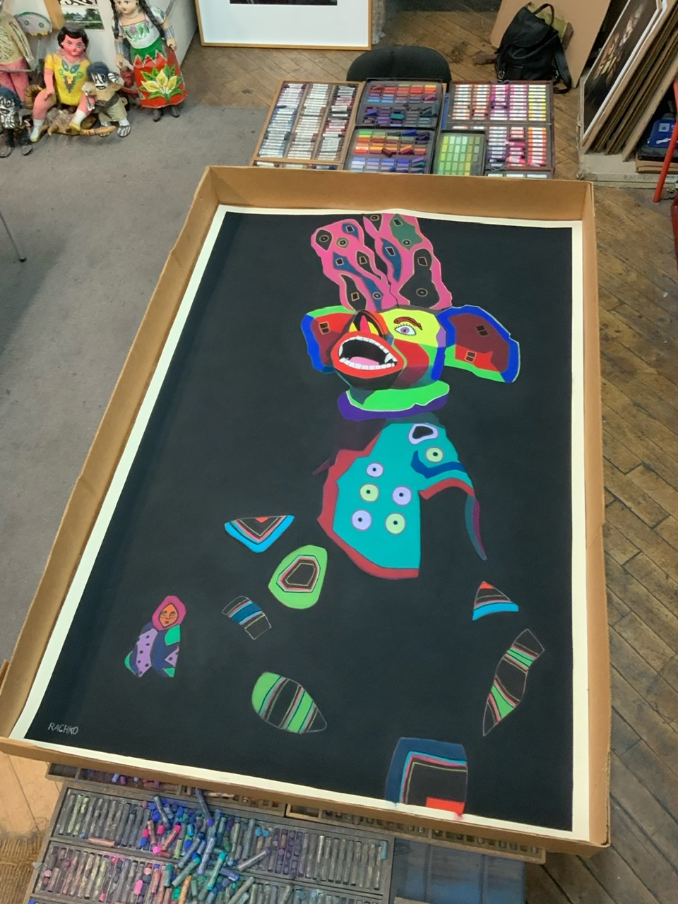
Start/Finish of “Sacrificial,” soft pastel on sandpaper, 58” x 38”
Comments are welcome!
Q: Can you explain how you choose colors? (Question from Maria Cox via Instagram)

A: I am wild about color! As I work to create a pastel painting, I apply a color, back up from my easel to see how it interacts with and affects the rest of the painting, and then I make revisions. This process necessitates countless color changes and hundreds of hours during months of work. I apply pastel using a meticulous layering process. Were you to x-ray one of them, the earlier, discarded versions of a pastel painting would be visible. All the while I carefully fine-tune and refine how the colors and shapes interact with each other.
The goal is to make an exciting painting that no one, especially me as the maker, has ever seen before. I have no desire to repeat myself, to make art that resembles work by any other artist, or to be forced into a niche.
I try to select intense, vibrant colors that are exciting to look at, that work well in relationship to each other, and that will grab the viewer. Sometimes I deliberately choose colors for their symbolic meanings. For example, I selected a dark purple for the alternating triangles (the ones with the pink dots above) in “Overlord” because purple denotes royalty.
I have been working with soft pastel for 37 years so I have a fairly intricate science of color at my disposal. No doubt, many unconscious factors are at play, too. More on that in future posts.
Comments are welcome!
Q: What’s on the easel today?

Work in progress
A: I continue working on “Shadow,” soft pastel on sandpaper, 26” x 20”
Comments are welcome!
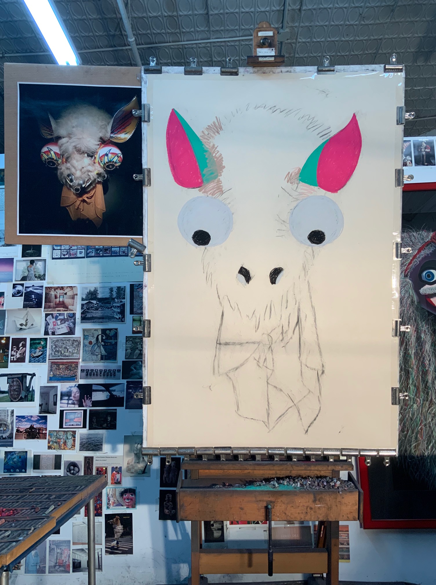
Q: What’s on the easel today?
Work in progress
A: I recently began a 26” x 20” pastel painting tentatively titled, “Shadow.”
Comments are welcome!

