Blog Archives
Pearls from artists* # 624

Machu Picchu (Peru), June 2016
*an ongoing series of quotations – mostly from artists, to artists – that offers wisdom, inspiration, and advice for the sometimes lonely road we are on.
If we were speaking from the point of view of the historian, and if we desired to know as concretely as possible how those peoples of the past or present conceived of their world, we should have to turn to their philosophy to find how they thought about their world, and to their sciences to analyze the atomic factors that contributed to those thoughts, and to their applied arts for the understanding of how this notion appeared when necessarily vulgarized to the common denominator of intelligence. But we would have to turn to their art to understand how they “felt about their world,” to know how their notions of reality found expression in their sensual perception of the world. And we know, of course, how those expressions can differ by simply examining Christian art, which consciously discarded the reality of its predecessor, Greek Hellenistic art.
Mark Rothko in The Artist’s Reality: Philosophies of Art
Comments are welcome!
Q: Can you explain how you choose colors? (Question from Maria Cox via Instagram)

A: I am wild about color! As I work to create a pastel painting, I apply a color, back up from my easel to see how it interacts with and affects the rest of the painting, and then I make revisions. This process necessitates countless color changes and hundreds of hours during months of work. I apply pastel using a meticulous layering process. Were you to x-ray one of them, the earlier, discarded versions of a pastel painting would be visible. All the while I carefully fine-tune and refine how the colors and shapes interact with each other.
The goal is to make an exciting painting that no one, especially me as the maker, has ever seen before. I have no desire to repeat myself, to make art that resembles work by any other artist, or to be forced into a niche.
I try to select intense, vibrant colors that are exciting to look at, that work well in relationship to each other, and that will grab the viewer. Sometimes I deliberately choose colors for their symbolic meanings. For example, I selected a dark purple for the alternating triangles (the ones with the pink dots above) in “Overlord” because purple denotes royalty.
I have been working with soft pastel for 37 years so I have a fairly intricate science of color at my disposal. No doubt, many unconscious factors are at play, too. More on that in future posts.
Comments are welcome!
Q: Do you enjoy being interviewed?
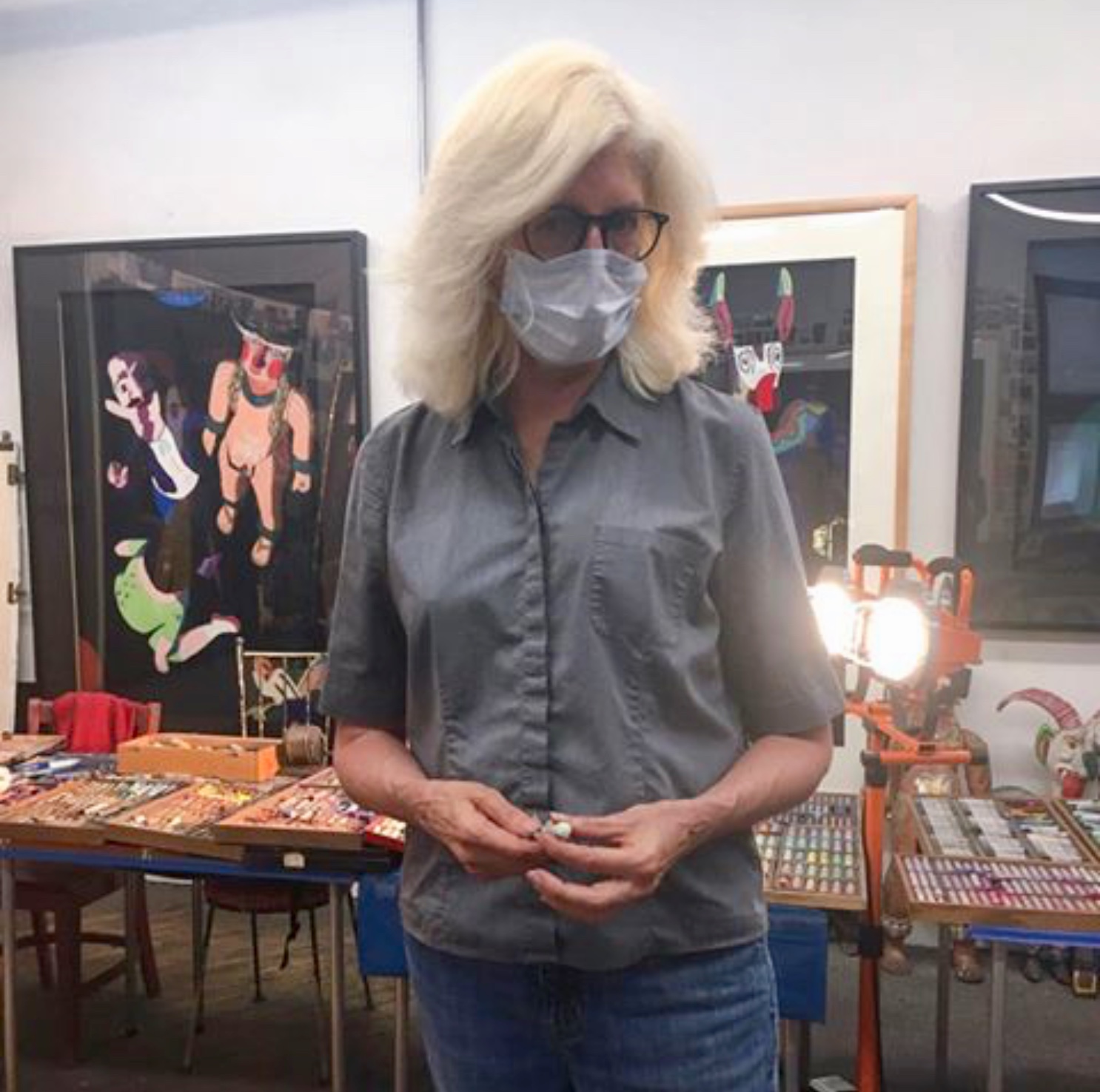
In the studio
A: I do very much. Each new interview is another opportunity to discover what is remembered, what is kept because it still seems important, and how certain details are selected from amongst all the accumulated memories of a lifetime. My own story is continually evolving as some facts are left out or rearranged, and others added. New connections keep being made while some others are discarded. I find it fascinating to read over old interviews and compare them with what I remember in the present.
Comments are welcome!

